
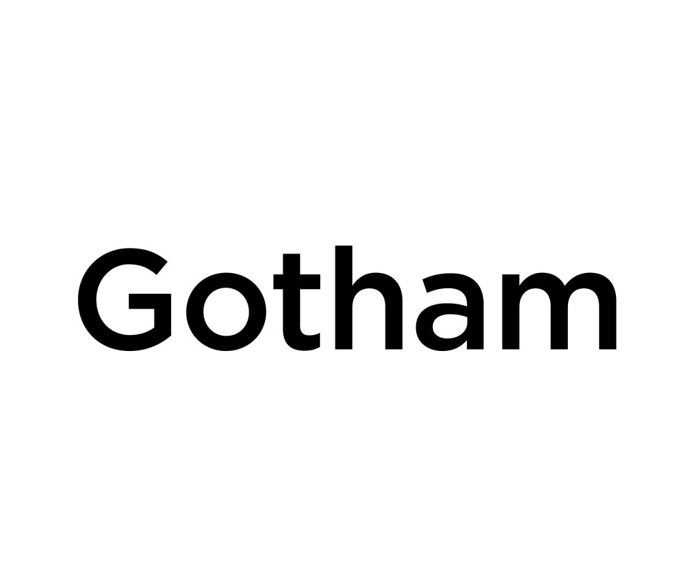
Gotham has one of the most recognizable origin stories in modern type design — Tobias Frere-Jones drew it from the flat-cut, geometric capital letters stamped on mid-century New York signage, then Hoefler & Co. turned it into the default typeface of American confidence (Obama’s 2008 campaign, GQ, countless tech logos). None of that comes cheap: a single desktop license runs $200, and the complete family is $1,200. If you just need that bold, trustworthy geometric look for a one-off project, these five Google Fonts get you most of the way there for free. If you’ve been searching for free alternatives to gotham, this list is built exactly for that.
Montserrat
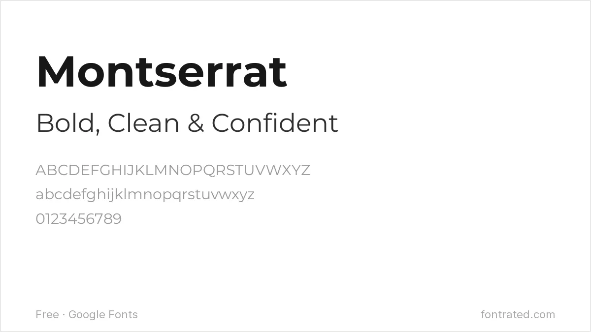
The font most commonly named as Gotham’s free stand-in, and for good reason: Julieta Ulanovsky drew it after the geometric lettering on old signs in Buenos Aires’ Montserrat neighborhood — the same design impulse that produced Gotham, just a different city. It’s rounder in the bowls than Gotham but shares the same confident, geometric skeleton.
Poppins
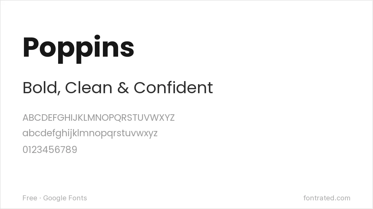
More circular than Gotham — look at the perfectly round “o” and “e” — which gives it a friendlier, less corporate edge. Reach for Poppins when you want Gotham’s geometric clarity without its slightly stiff, buttoned-up feel.
Figtree
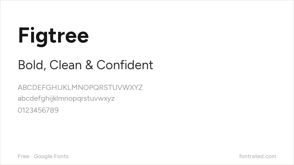
A newer addition to Google Fonts, drawn with capital letters that lean directly on the Gotham/Proxima Nova style of geometric-but-humanist sans. It reads as current and UI-native in a way Gotham, now 25 years old, sometimes doesn’t.
Questrial
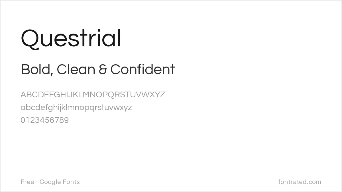
A single-weight geometric sans with almost architectural restraint — no bold, no italics, just one clean cut. That’s a real limitation for body text, but for a headline or wordmark that needs Gotham’s minimal confidence, it’s hard to beat.
Archivo
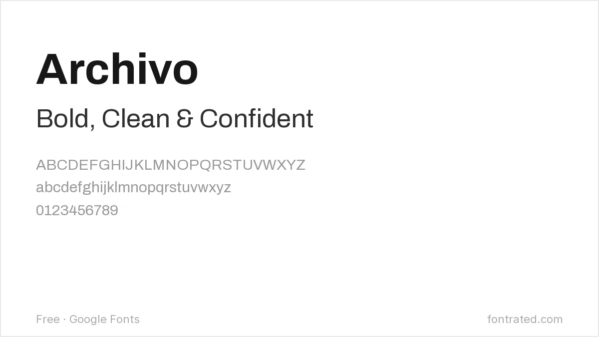
Less purely geometric than the others — it’s technically a grotesque with geometric influence — but it comes in far more weights and widths than Gotham’s free alternatives usually offer, which matters if your project needs a full type system, not just a headline font.
Quick Comparison
| Font | Style | Best For |
|---|---|---|
| Montserrat | Geometric sans | All-around Gotham substitute |
| Poppins | Geometric sans (rounder) | Friendlier, less corporate feel |
| Figtree | Geometric-humanist | Modern UI and product design |
| Questrial | Geometric sans (single weight) | Headlines and wordmarks only |
| Archivo | Grotesque-geometric | Full type systems needing many weights |
The picks below include affiliate links — see our disclosure.
Want the authentic Gotham?
These are close, but none of them are Gotham — the specific proportions Frere-Jones drew have been imitated for 25 years and never quite duplicated. If the project justifies it, the real thing is available directly from Hoefler & Co.
Get the authentic Gotham on MyFonts →
Want something more unique?
If you don’t want the exact look everyone else already has (free or paid), BROOKLYN is a minimalist geometric family from Creative Market with its own distinct personality — less obviously “Gotham-inspired” than most alternatives on this list.
See BROOKLYN on Creative Market →
Gotham is one of the most common logo fonts around — for a full roundup of free options built specifically for branding, see 10 Best Free Fonts for Logo & Branding.
Gotham sits in the same geometric-sans family as a few other much-copied typefaces, so it is worth comparing side by side: free alternatives to Proxima Nova covers the humanist-leaning cousin that replaced Gotham on a lot of startup sites, while free alternatives to Avenir covers the warmer, more open option. If the end goal is a site header rather than a logo, our website header font roundup shows these styles at display size.
Frequently Asked Questions
Is it legal to use a font that looks like Gotham instead of buying it?
Yes. Typeface designs themselves have very limited copyright protection in most jurisdictions (including the US) — only the specific software/font file is protected, not the visual style. Montserrat, Poppins, and the other fonts here are independently designed, fully licensed fonts, not copies of Gotham’s font files.
Why is Gotham so expensive?
You’re licensing decades of design refinement and Hoefler & Co.’s reputation, plus a huge family of widths and weights (120+ styles). Desktop licenses from major foundries are typically priced per number of users, which is why a single style can run into the hundreds.
Can I use Montserrat or Poppins commercially, like on a logo I plan to sell products with?
Yes — both are licensed under the SIL Open Font License, which explicitly permits commercial use with no royalties or attribution required.
What’s the biggest visual difference between Gotham and Montserrat?
Montserrat’s rounded letterforms (like the “a” and “e”) are slightly more open and less mechanically geometric than Gotham’s — side by side, Gotham reads a touch more rigid and architectural, Montserrat a touch warmer.


Leave a Reply