
Hermann Zapf designed Optima between 1952 and 1958, drawing inspiration from Renaissance-era lettering he studied on a trip to Florence — the result is a genuinely unusual hybrid, a sans-serif with subtle flared strokes at the stem ends instead of true serifs, giving it warmth a typical grotesque doesn’t have. More than 50 years later, Zapf worked with Akira Kobayashi to redraw it as Optima Nova for digital typesetting. That flared-stroke quality is genuinely difficult to find for free — these five Google Fonts get closer to Optima’s elegant warmth than a typical geometric sans, though none fully replicate its distinctive flare. Licensing the original today runs $57.99 for a single style up to $576.99 for the complete 20-font family. If you’ve been searching for free alternatives to optima, this list is built exactly for that.
Nunito Sans

Nunito Sans doesn’t have Optima’s flared strokes, but its rounded, humanist warmth lands in a similar emotional register — approachable rather than clinical.
Jost
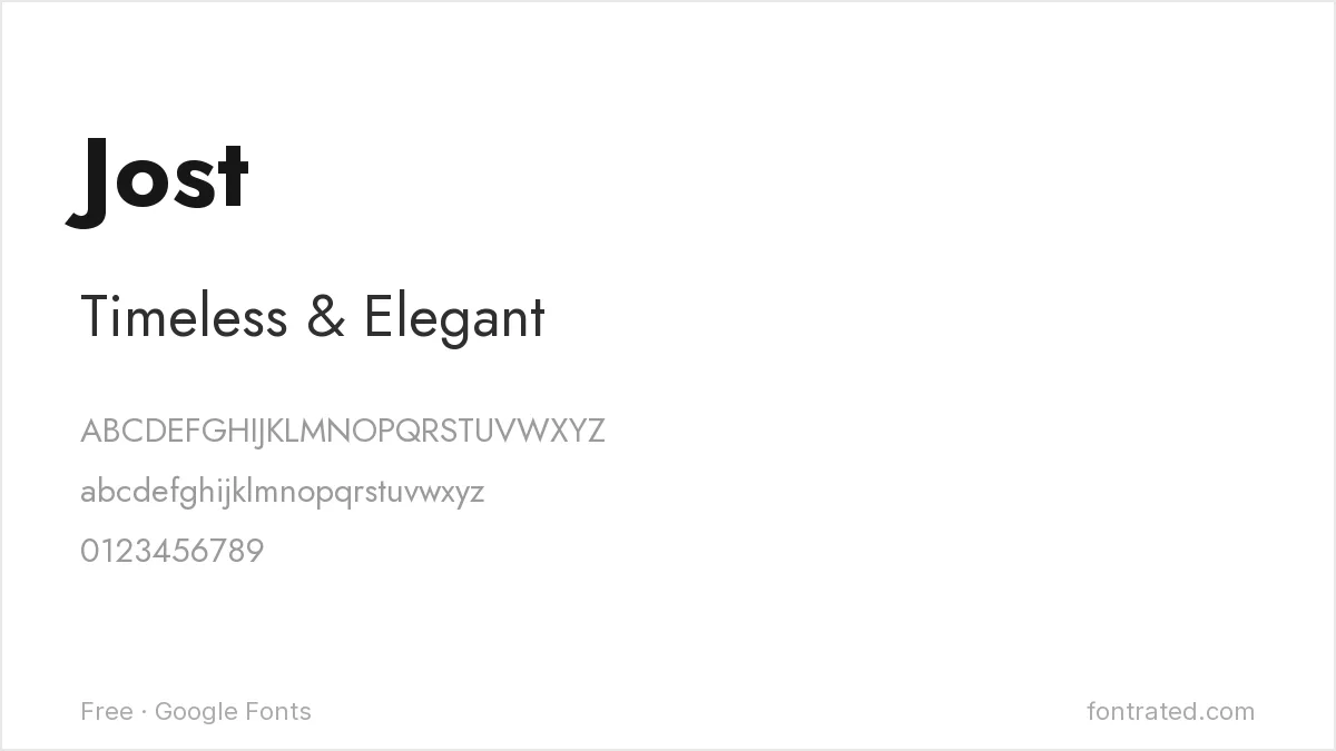
More geometric and less warm than Optima, Jost works when a project wants Optima’s clean confidence without chasing the flared-stroke detail specifically.
Questrial
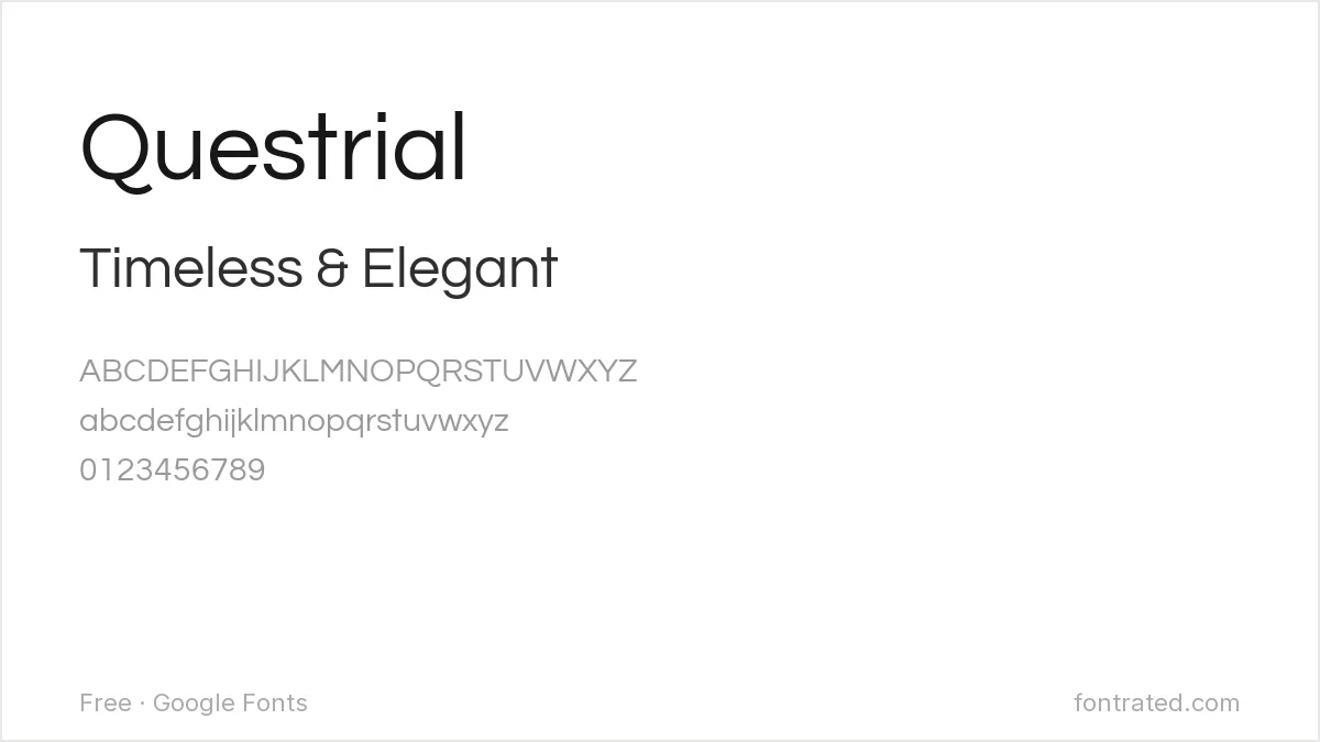
A single-weight geometric sans with real restraint, Questrial suits a headline that wants some of Optima’s elegant simplicity, though it can’t cover the multi-weight range a full project needs.
Mulish
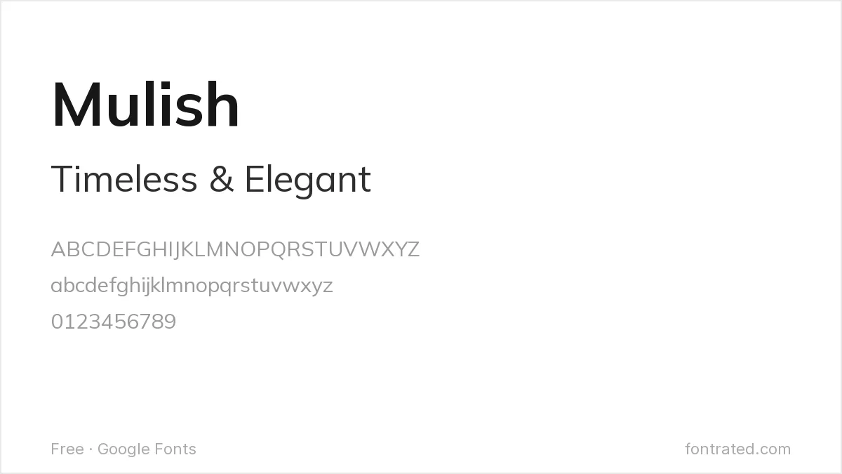
About as neutral as a sans-serif gets, Mulish offers Optima-adjacent restraint for body text without competing for attention.
Karla
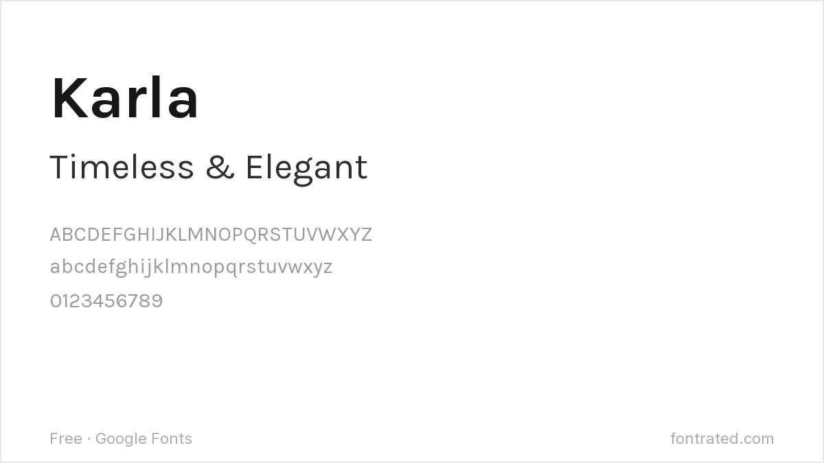
Karla’s rounded corners add a touch of the warmth Optima is known for, in a more conventional grotesque package.
Quick Comparison
| Font | Style | Best For |
|---|---|---|
| Nunito Sans | Rounded humanist sans | Closest general warmth |
| Jost | Geometric sans | Cleaner, more restrained option |
| Questrial | Geometric sans (single weight) | Minimal headline text |
| Mulish | Low-contrast humanist sans | Neutral body text |
| Karla | Grotesque, rounded corners | Approachable branding text |
The picks below include affiliate links — see our disclosure.
Want the authentic Optima?
None of these free options actually replicate Optima’s signature flared strokes — that specific Renaissance-inspired detail is genuinely hard to find outside Zapf’s own design. If the project needs the real thing, Optima Nova is available through Linotype’s catalog on MyFonts.
Get the authentic Optima Nova on MyFonts →
Want something more unique?
Figura Sans from Jen Wagner Co is a 12-font ‘luxe sans’ built to perform well at both display and body sizes — a good option if the brief wants Optima’s elegant versatility without hunting for an exact flared-stroke match.
See Figura Sans on Creative Market →
Frequently Asked Questions
Is there really no free font with Optima’s flared strokes?
Not an exact match on Google Fonts as of this writing — the flared, sans-serif-meets-Renaissance-lettering detail Zapf drew is unusual enough that free alternatives approximate its general warmth rather than the specific stroke detail.
Is it legal to use a font that looks like Optima instead of buying it?
Yes. Typeface designs have very limited copyright protection in most jurisdictions, including the US — only the specific font file is protected. Nunito Sans, Jost, and the others here are independently designed, fully licensed fonts.
Why is Optima associated with memorials and formal signage?
Its elegant, timeless quality (it was famously used on the Vietnam Veterans Memorial) made it a common choice for formal, dignified contexts where a typical grotesque sans might feel too casual and a serif too old-fashioned.
Can I use Nunito Sans or Jost commercially, including for a memorial or formal project?
Yes — both are licensed under the SIL Open Font License, which permits commercial use with no royalties or attribution required.

Leave a Reply