
A website header gets one shot to set the tone before a visitor decides whether to keep scrolling — which means it needs more personality than body text, but still has to render cleanly across every browser and screen size a header actually faces. These ten are built for that specific job: big, confident, and still technically solid at hero-section scale. If you’ve been searching for free fonts for website headers, these picks are curated with exactly that in mind.
We picked these for visual impact at large display sizes, modern character (a header font that looks dated undercuts the whole site), and reliable web-font rendering. All ten are Google Fonts under the SIL Open Font License, free to self-host or load via the Google Fonts API.
Quick Comparison
| Font | Style | Best For |
|---|---|---|
| Sora | Geometric-rounded sans | Tech and SaaS hero sections |
| Space Grotesk | Grotesque, quirky details | Product and developer-tool headers |
| Unbounded | Variable geometric display | Bold, maximalist hero headers |
| Syne | Unconventional grotesque | Creative agency and portfolio headers |
| Instrument Serif | Editorial display serif | Premium and lifestyle brand headers |
| Bricolage Grotesque | Expressive variable grotesque | Modern brand headers with personality |
| Familjen Grotesk | Scandinavian minimal sans | Clean, minimal headers |
| Fraunces | Soft serif with character | Editorial and lifestyle brand headers |
| Onest | Modern neutral sans | Clean product headers |
| Red Hat Display | Bold, wide-range display sans | Statement headers needing many weights |
Sora
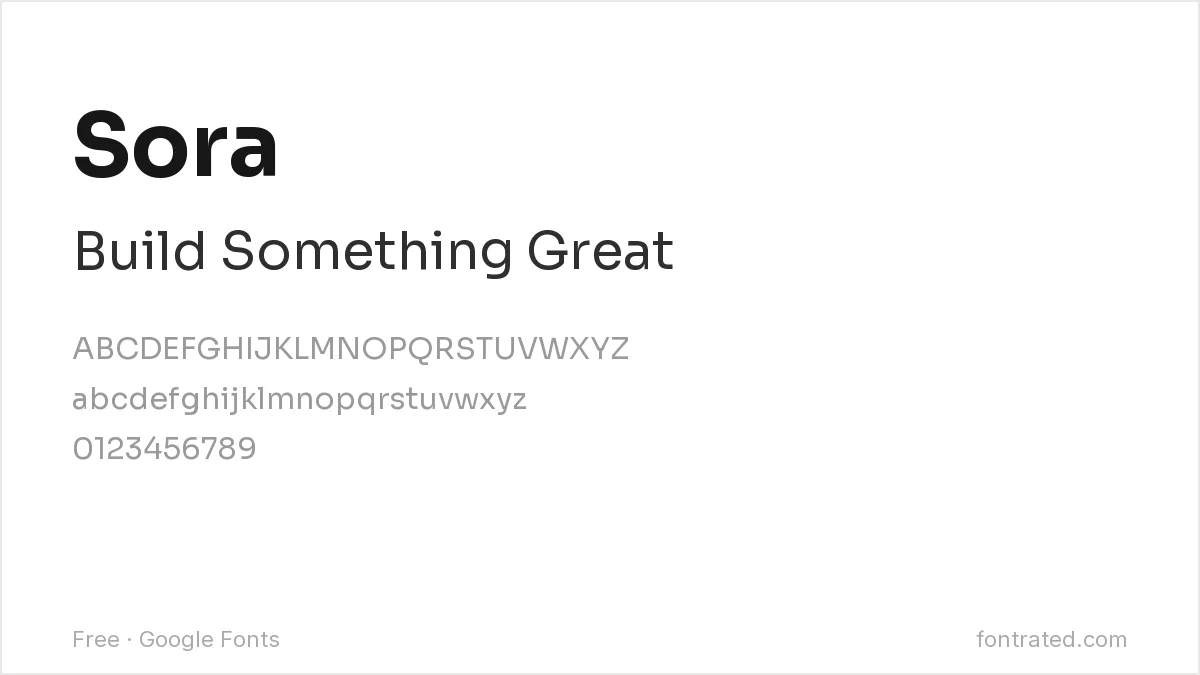
A clean, slightly rounded geometric sans that’s become a common choice in tech and SaaS branding, Sora reads as current and trustworthy without tipping into generic startup-template territory.
Space Grotesk
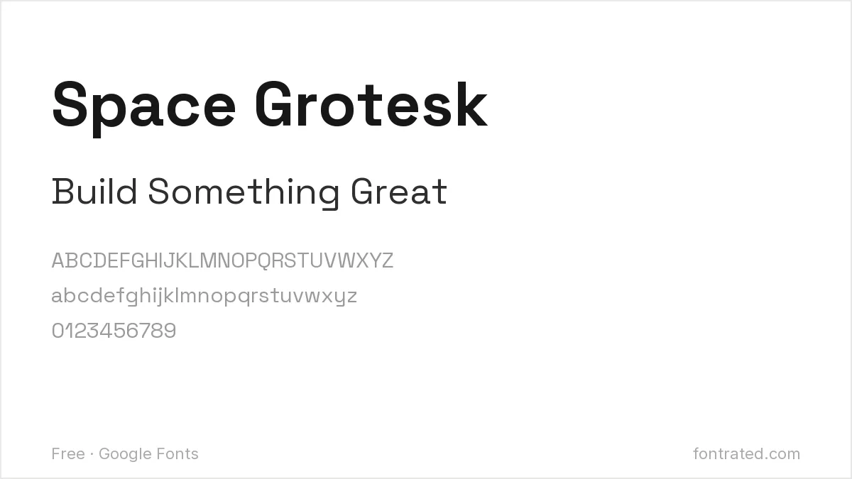
Adapted from the monospaced Space Mono, Space Grotesk keeps a few distinctive details (the lowercase “g” especially) that give a header more personality than a fully neutral grotesque.
Unbounded

A genuinely bold variable display font with thick, confident strokes, Unbounded works well when a header wants to make an unmistakable visual statement rather than play it safe.
Syne

Syne’s slightly irregular proportions (it was originally designed for an art fair) give it a deliberately unconventional feel — a strong pick for a creative agency or design portfolio that wants a header to feel intentional rather than templated.
Instrument Serif
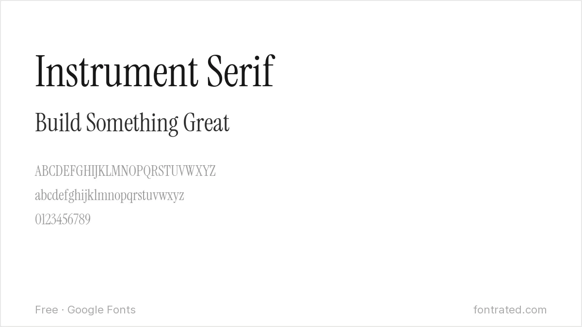
A high-contrast editorial serif with real elegance at large sizes, Instrument Serif suits a premium, lifestyle, or content-driven brand that wants a header to feel more considered than the default startup sans-serif.
Bricolage Grotesque
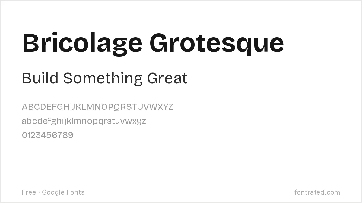
A variable grotesque with intentionally imperfect, expressive letterforms, Bricolage Grotesque gives a header a distinctive character while still functioning as a legitimate, flexible type system.
Familjen Grotesk
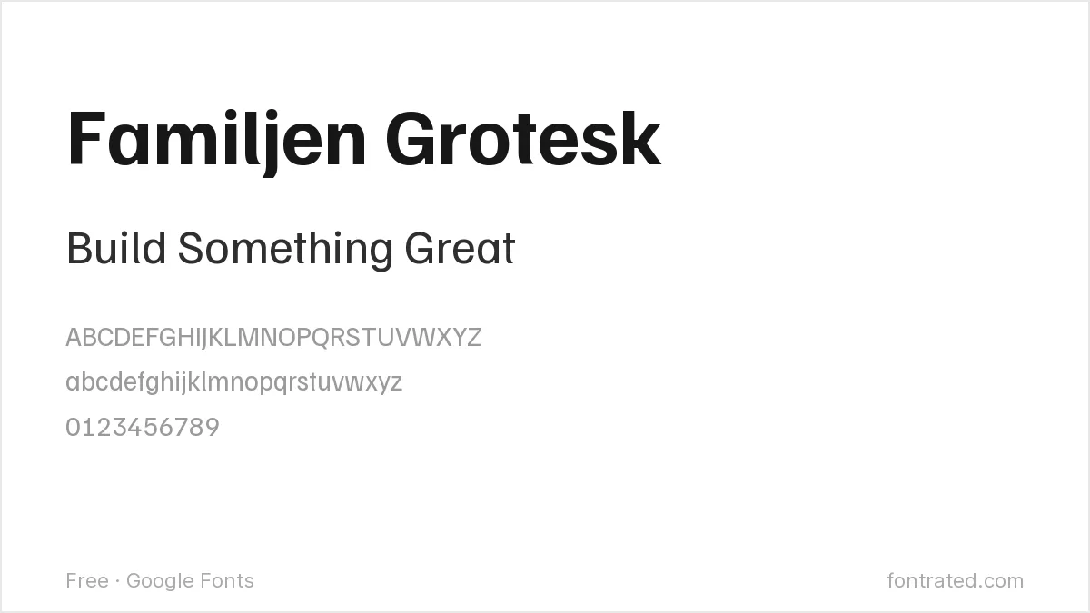
A restrained, Scandinavian-influenced grotesque, Familjen Grotesk suits a header that wants to look considered and minimal rather than loud — a quieter alternative to a bolder display font.
Fraunces
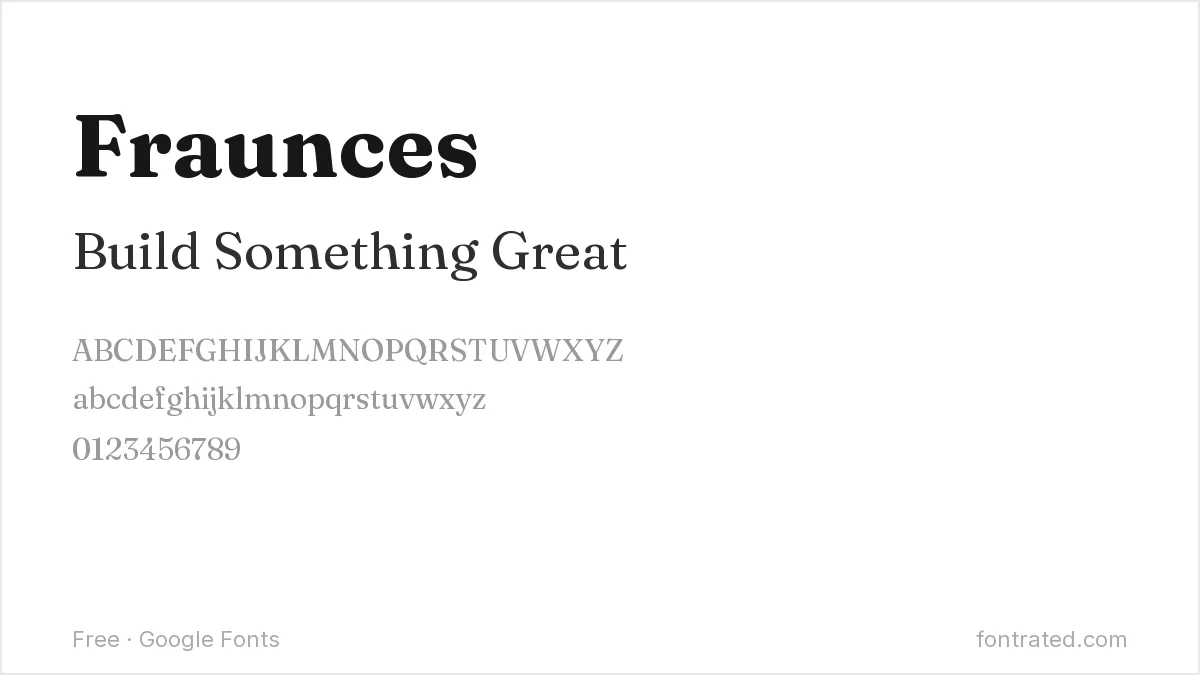
A serif with soft, almost hand-finished curves, Fraunces brings warmth to a header in a way a harder-edged serif wouldn’t — a good fit for editorial, food, or lifestyle brands.
Onest

A newer, neutral geometric sans built for product and interface use, Onest works well when a header needs to feel modern and unobtrusive rather than make its own visual statement.
Red Hat Display

Built by Red Hat’s own design team with a wide range of weights, Red Hat Display gives a header room to build real hierarchy (a huge headline plus a supporting subhead) from one consistent family.
Which one should you actually pick? Sora or Space Grotesk for a tech/SaaS header, Instrument Serif or Fraunces when the brand wants to feel more editorial than technical. Always test the font at actual hero-section scale (often 60-100px+) before committing — a font that looks great in a mockup can render differently once real browser font rendering kicks in.
Looking for more? Browse the rest of our Branding & Logos font picks.
Frequently Asked Questions
Are these fonts free to use on a commercial website, including a client project?
Yes. All ten are Google Fonts under the SIL Open Font License, which permits commercial use — including client websites — with no royalties or attribution required, whether you self-host the files or load them through the Google Fonts API.
Should I self-host these fonts or load them from Google’s servers?
Self-hosting generally loads faster and avoids an extra third-party request, which matters for page-speed scores; loading from Google’s CDN is simpler to set up and benefits from Google’s caching across sites, though it adds a small privacy/tracking consideration some site owners prefer to avoid.
Will a bold display font like Unbounded slow down my website?
Any web font adds some load time, but the impact is usually small if you load only the specific weights you use (rather than an entire family) and use font-display: swap so text still renders immediately in a fallback font while the custom font loads.
Can I use one of these fonts for my header and a different one for body text?
Yes, and it’s common practice — many sites pair a distinctive display font (like Instrument Serif or Unbounded) for headers with a plainer, more neutral font (like Inter or Public Sans) for body text, since a header font’s personality can become fatiguing over paragraphs of text.
Want the font a huge share of modern branding is chasing?
Gotham was drawn by Tobias Frere-Jones directly from the flat-cut lettering on mid-century New York storefront signage — the same confident, geometric character that’s made it one of the most licensed display typefaces for headers and branding over the last two decades.
If a header specifically needs that exact geometric, all-American confidence rather than one of the free fonts chasing the same feeling, the original is worth the license.
This pick includes an affiliate link — see our disclosure.



Leave a Reply