
Adrian Frutiger designed Avenir in 1988 — the name is French for ‘future’ — as a deliberate answer to Futura, which he felt sacrificed legibility for pure geometric purity. Avenir keeps the circular bones of a geometric sans but rounds off the optical corrections a strict compass-and-ruler approach misses, which is a large part of why Apple leaned on it (and its successor Avenir Next) across marketing and iOS for years before moving to its own San Francisco typeface. Licensing the original today through Monotype runs from around $43 for a single style to $430 for the complete family. These five Google Fonts borrow the same humanist-geometric logic for free. If you’ve been searching for free alternatives to avenir, this list is built exactly for that.
Poppins

The most commonly reached-for Avenir stand-in, though it’s rounder and a touch friendlier than Frutiger’s more restrained original — close enough for the overwhelming majority of everyday uses.
Jost
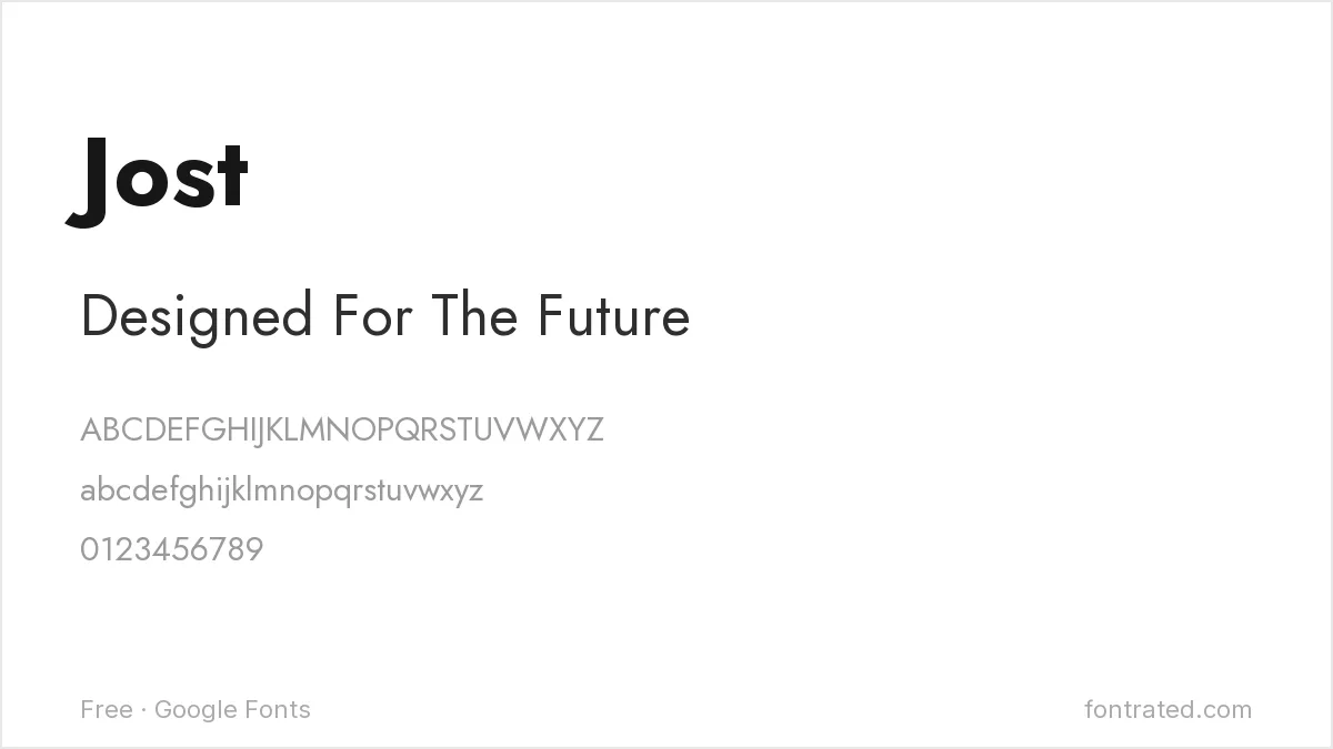
Drawn explicitly in the spirit of 1920s geometric sans-serifs, Jost sits closer to Avenir’s underlying geometric logic than Poppins does, at the cost of a little of Avenir’s own optical warmth.
Questrial
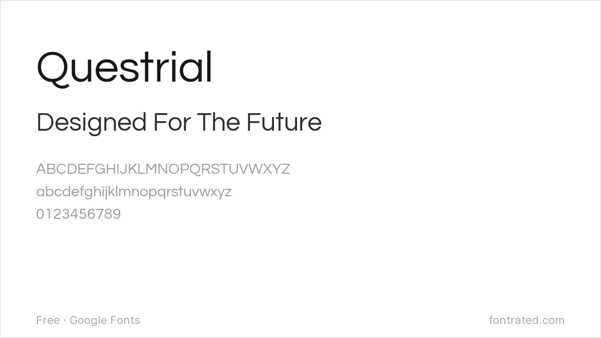
A single-weight geometric sans with real architectural restraint — no bold, no italics — that captures Avenir’s clean confidence for a headline or wordmark, though it can’t cover the full weight range a body-text project needs.
Mulish

Less geometric than the others here, Mulish leans into the same optically-corrected neutrality Frutiger was after with Avenir — a safe choice specifically for long-form body text.
Josefin Sans
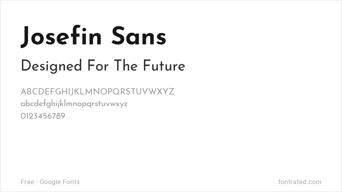
Narrower and more overtly stylized than Avenir, Josefin Sans works well when a project wants a geometric sans with a bit more period character than Avenir’s own studied neutrality.
Quick Comparison
| Font | Style | Best For |
|---|---|---|
| Poppins | Geometric sans (rounder) | General-purpose Avenir substitute |
| Jost | Geometric sans | Closer to Avenir’s strict geometry |
| Questrial | Geometric sans (single weight) | Headlines and wordmarks only |
| Mulish | Low-contrast humanist sans | Neutral body text |
| Josefin Sans | Art Deco geometric sans | Editorial contexts with more character |
The picks below include affiliate links — see our disclosure.
Want the authentic Avenir?
These get close, but none fully replicate the optical corrections Frutiger built into every curve — decades of refinement that are hard to copy exactly. If the project justifies it, the original is available through Monotype’s own catalog on MyFonts.
Get the authentic Avenir on MyFonts →
Want something more unique?
Gingham from Silktype takes a similarly clean, versatile sans approach but adds up to eight alternate glyphs per letter for custom-built branding — a good option if you want Avenir’s neutrality with more room to make a wordmark your own.
See Gingham on Creative Market →
Frequently Asked Questions
Is it legal to use a font that looks like Avenir instead of buying it?
Yes. Typeface designs have very limited copyright protection in most jurisdictions, including the US — only the specific font software file is protected, not the general visual style. Poppins, Jost, and the others here are independently designed, fully licensed fonts.
Why does Apple’s branding look so much like Avenir even now?
Apple used Avenir and Avenir Next extensively across marketing and iOS for years, which shaped a huge amount of the broader ‘clean geometric sans’ design language that followed — including Apple’s own current San Francisco typeface.
What’s the biggest visual difference between Avenir and Poppins?
Poppins’ bowls are more perfectly circular and its overall feel rounder and friendlier; Avenir’s geometry is more optically corrected and restrained, which reads as slightly more formal side by side.
Can I use Poppins or Jost commercially, including on a product I sell?
Yes — both are licensed under the SIL Open Font License, which permits commercial use with no royalties or attribution required.


Leave a Reply