
Hannes von Döhren released Brandon Grotesque through his Berlin foundry HVD Fonts in 2010, and it spent much of the following decade as one of the default typefaces of contemporary branding — warm, rounded geometric proportions (that distinctive near-circular “O”) turning up on everything from packaging to Instagram-era logo design so often it became something of a design cliché in its own right. Licensing the original today runs $40 for a single style up to $249 for the complete 12-font family. These five Google Fonts borrow the same warm-geometric feel without the licensing bill. If you’ve been searching for free alternatives to brandon grotesque, this list is built exactly for that.
Poppins

The rounded bowls and even geometry make Poppins the most obvious free stand-in for Brandon Grotesque’s warmth, though it leans a touch friendlier and less restrained than the original.
Jost
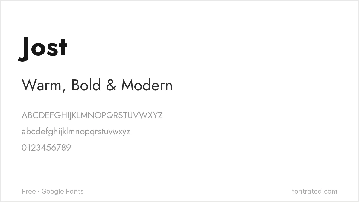
Jost’s tighter, more architectural geometry sits closer to Brandon Grotesque’s underlying structure than Poppins, at the cost of some of Brandon’s own rounded warmth.
Josefin Sans

Narrower and more stylized than Brandon Grotesque, Josefin Sans works well when a brand wants a geometric sans with more period elegance than Brandon’s straightforward friendliness.
Quicksand
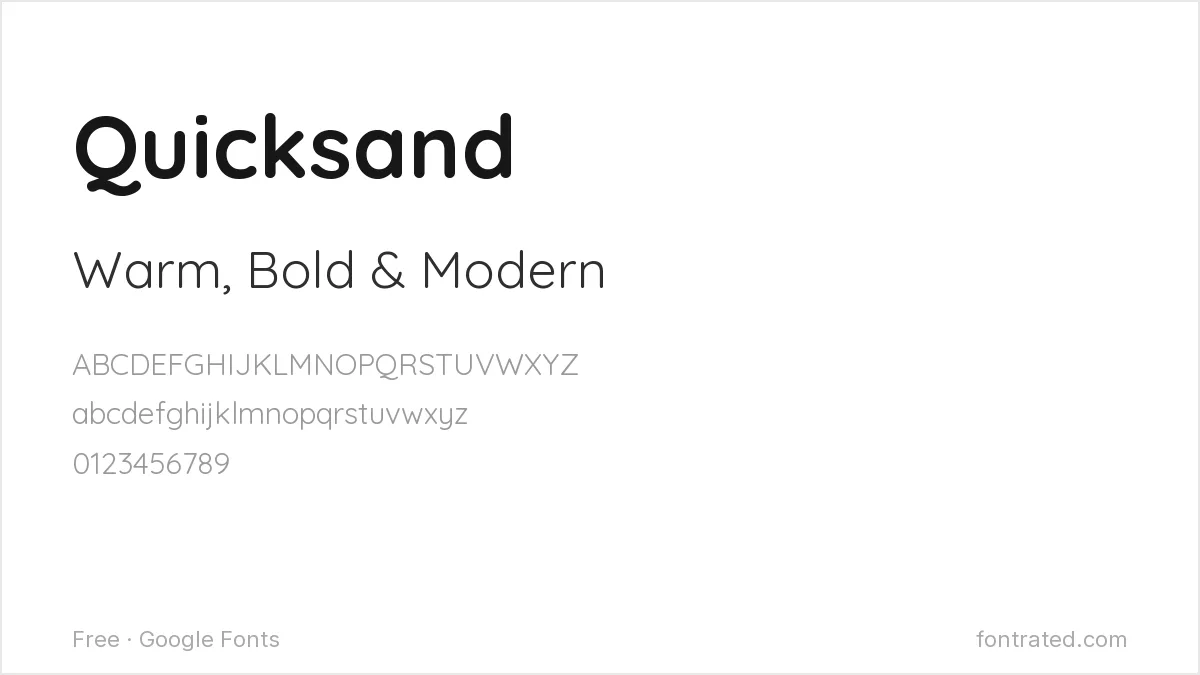
Rounder and softer than Brandon Grotesque itself, Quicksand pushes further into the warm, approachable territory Brandon made popular — a good choice for a brand that wants to lean even friendlier.
Karla
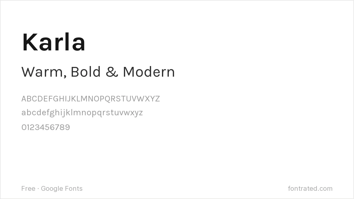
Less geometric than the others here, Karla’s slightly rounded corners give it enough warmth to pair with Brandon Grotesque’s display weights while staying legible at body-text sizes Brandon itself isn’t optimized for.
Quick Comparison
| Font | Style | Best For |
|---|---|---|
| Poppins | Geometric sans (rounder) | General-purpose Brandon substitute |
| Jost | Geometric sans | Closer to Brandon’s strict geometry |
| Josefin Sans | Art Deco geometric sans | Editorial and boutique branding |
| Quicksand | Rounded geometric sans | Playful, approachable branding |
| Karla | Grotesque, rounded corners | Text-heavy branded content |
The picks below include affiliate links — see our disclosure.
Want the authentic Brandon Grotesque?
These capture the general warmth, but Hannes von Döhren’s exact proportions — refined across a 12-style family — aren’t fully replicated by any free alternative. If the project justifies it, the original is available on MyFonts.
Get the authentic Brandon Grotesque on MyFonts →
Want something more unique?
Silk Sans from Silktype takes a more editorial, sophisticated approach than Brandon Grotesque’s straightforward warmth — worth a look if the brief wants a geometric-adjacent sans that reads as considered rather than another warm, rounded logo font.
See Silk Sans on Creative Market →
Frequently Asked Questions
Is it legal to use a font that looks like Brandon Grotesque instead of buying it?
Yes. Typeface designs have very limited copyright protection in most jurisdictions, including the US — only the specific font file is protected. Poppins, Jost, and the others here are independently designed, fully licensed fonts, not copies of Brandon Grotesque’s files.
Why did Brandon Grotesque become so common in branding?
Its warm, rounded geometry hit a sweet spot between Futura-style geometric coldness and a fully humanist sans — designers reached for it constantly through the 2010s, to the point where overuse became a common critique of the typeface’s own popularity.
What’s the biggest visual difference between Brandon Grotesque and Poppins?
Poppins’ letterforms are more perfectly circular and slightly more casual; Brandon Grotesque’s proportions are a bit more restrained and refined, which reads as marginally more premium side by side.
Can I use Poppins or Josefin Sans commercially, including for a client’s logo?
Yes — both are licensed under the SIL Open Font License, which permits commercial use, including client branding work, with no royalties or attribution required.


Leave a Reply