
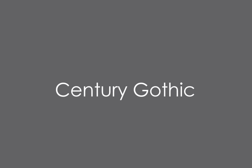
Sol Hess drew Century Gothic in 1936 for Monotype, based on an even older typeface called 20th Century, and it spent decades as one of the most-seen typefaces in the world for a simple reason: Microsoft bundled it with Windows and Office for years, so anyone who ever opened Word or PowerPoint on an older PC had it sitting in their font menu by default. That familiarity created a common misconception — Century Gothic being pre-installed on a work computer isn’t the same as being licensed to use it commercially outside that specific Microsoft software, and buying it properly today runs $41 for a single style up to $123 for the family. These five Google Fonts capture the same simple, geometric-circle feel for free. If you’ve been searching for free alternatives to century gothic, this list is built exactly for that.
Questrial
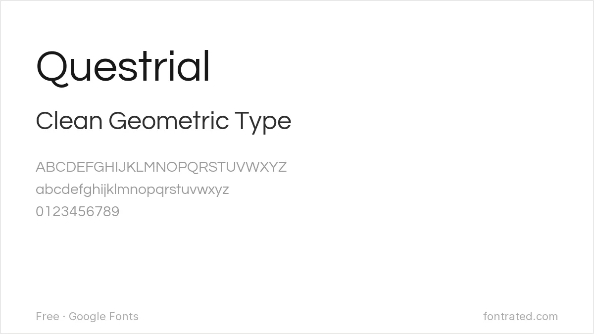
A single-weight geometric sans built from the same near-perfect circles and even strokes as Century Gothic, Questrial is usually the closest free match on Google Fonts — the main tradeoff is no bold or italic styles.
Jost
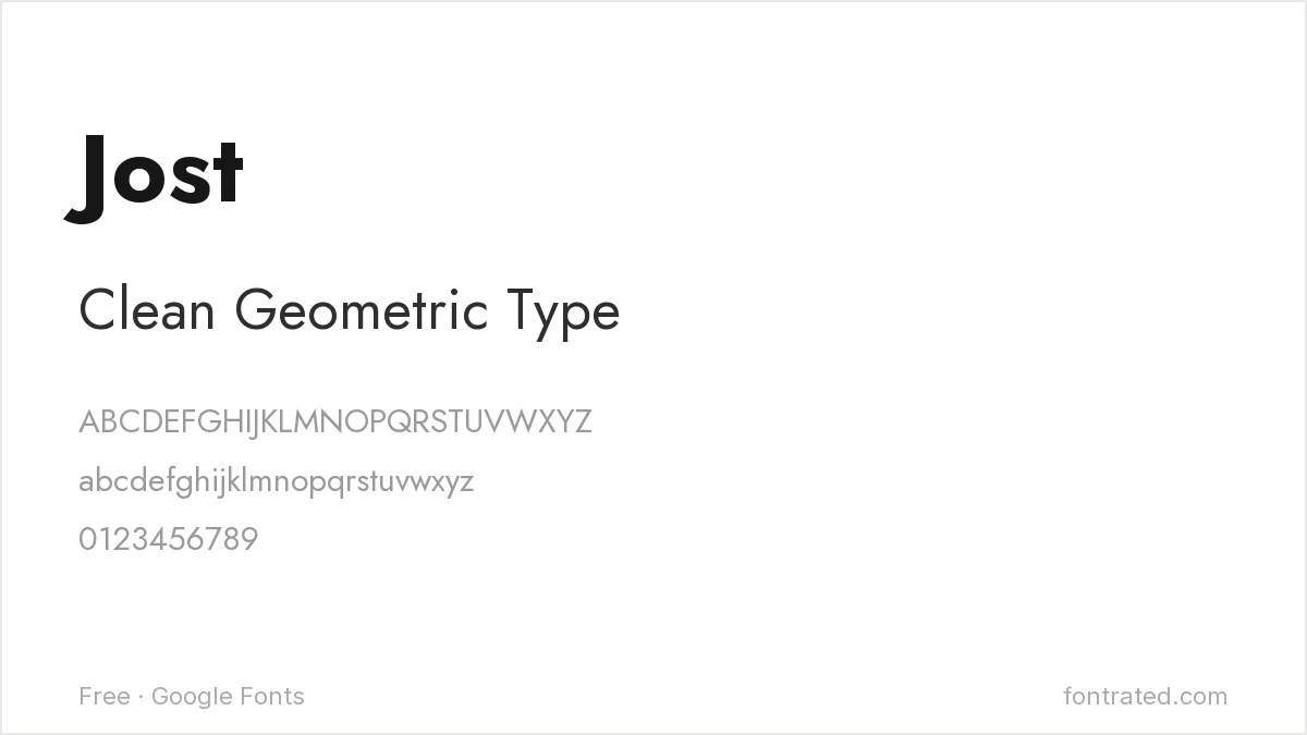
When a project needs bold or multiple weights that Questrial can’t cover, Jost’s similarly strict geometric structure is the next-closest match with a fuller family behind it.
Poppins
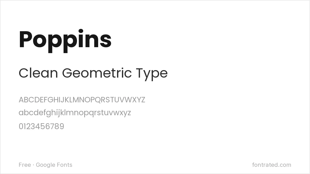
Rounder and warmer than Century Gothic’s strict circles, Poppins works well when a project wants that same geometric DNA without Century Gothic’s slightly clinical, spreadsheet-header feel.
Quicksand
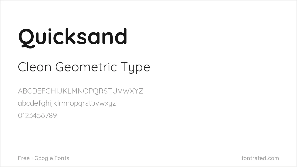
Quicksand takes Century Gothic’s geometric circles and softens every corner, landing somewhere between a corporate default and something a little more approachable.
Comfortaa
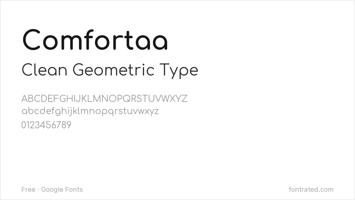
Bubblier and more casual than Century Gothic, Comfortaa suits a project that wants the same simple geometric skeleton in a more relaxed, contemporary register.
Quick Comparison
| Font | Style | Best For |
|---|---|---|
| Questrial | Geometric sans (single weight) | Closest free match |
| Jost | Geometric sans | Full weight range needed |
| Poppins | Geometric sans (rounder) | Friendlier, less austere feel |
| Quicksand | Rounded geometric sans | Softer headline text |
| Comfortaa | Rounded geometric sans | Casual, modern contexts |
The picks below include affiliate links — see our disclosure.
Want the authentic Century Gothic?
If a project specifically needs the licensed original — not just the copy that shipped with an old copy of Office — it’s sold directly through Monotype’s catalog on MyFonts.
Get the authentic Century Gothic on MyFonts →
Want something more unique?
TAN-THISTLE from TanType swaps Century Gothic’s plain geometry for a bold, 70s-flavored display face with real personality — a good option when the brief wants more character than a font this familiar can offer.
See TAN-THISTLE on Creative Market →
Century Gothic is essentially a re-cut of an older idea, so the closest reading comes from its relatives: free alternatives to Futura covers the original geometric sans, and free alternatives to Brandon Grotesque covers the modern revival of the same 1920s geometry. For social graphics in this style, see our Instagram and social media font picks.
Frequently Asked Questions
If Century Gothic came with my copy of Microsoft Office, can I still use it for other projects?
Not necessarily — a font bundled with Office is licensed for use within that Microsoft software, not as a general-purpose license to use the font file anywhere else (a printed product, a piece of software you distribute, and so on). Using it outside that context typically requires its own license, which is exactly what makes a free alternative useful.
Is Questrial really that close to Century Gothic?
Very close in spirit — both are built from simple, near-perfect geometric circles with minimal adjustment — though Questrial only ships in one weight, so it can’t fully replace Century Gothic in a project that needs bold text too.
Can I use Questrial or Poppins commercially, including in a business I run?
Yes — both are licensed under the SIL Open Font License, which permits commercial use with no royalties or attribution required.
Why does Century Gothic feel so ‘corporate default’ compared to these alternatives?
Decades of ubiquity as an unremarkable Office default did a lot of the work — the typeface itself is a competent 1930s geometric design, but familiarity from appearing in countless unremarkable slide decks and memos gives it a flatter, more generic feel than fonts without that history.


Leave a Reply