
Lucas de Groot designed Calibri in 2002, specifically built to look sharp under Microsoft’s then-new ClearType subpixel rendering — a technical problem as much as an aesthetic one. Microsoft made it the default font in Word, Excel, and PowerPoint from 2007 until 2023, when it was finally replaced by Aptos, which means an entire generation of documents, resumes, and slide decks were built on a font most people never consciously chose or licensed for use outside Office itself. Buying it properly today runs $49 for a single style up to $149 for the complete family. These five Google Fonts capture Calibri’s clean, rounded-humanist feel for free. If you’ve been searching for free alternatives to calibri, this list is built exactly for that.
Lato
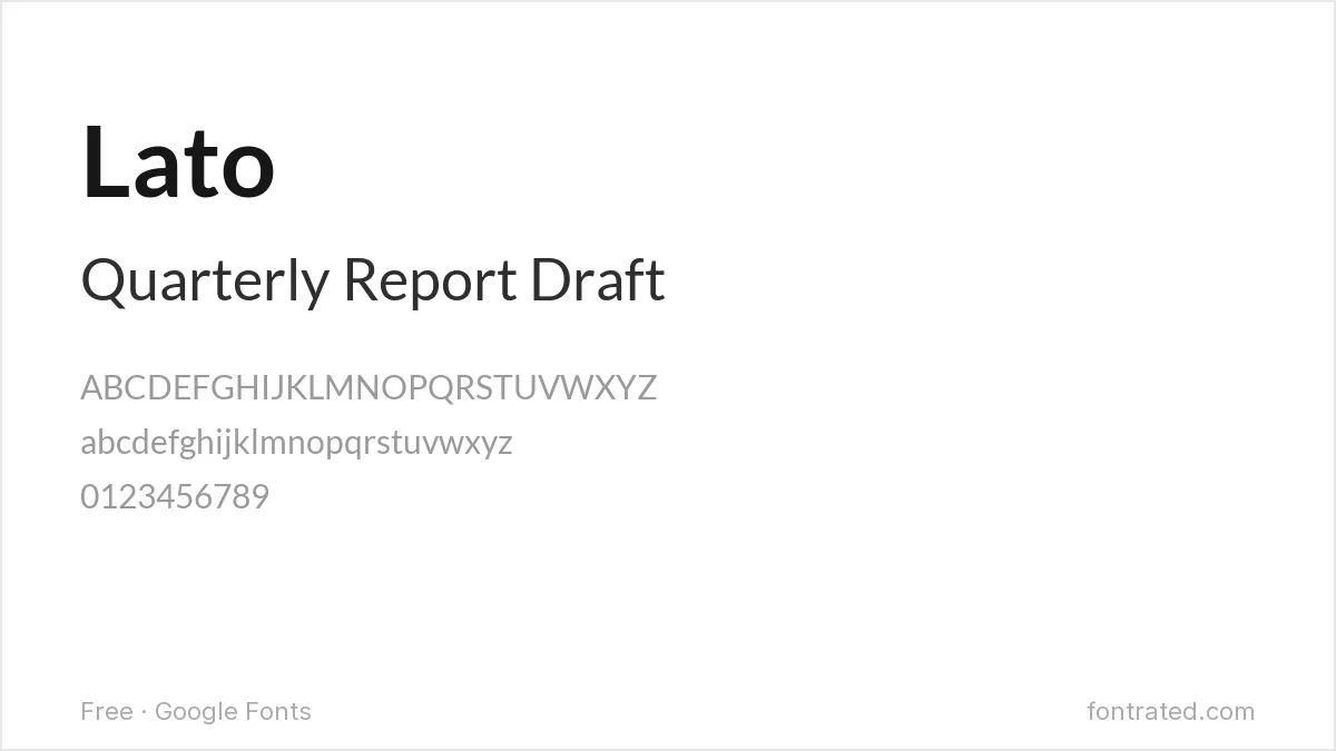
The font most commonly cited as Calibri’s free stand-in, and for good reason: Lato’s semi-rounded terminals and warm, neutral character land in almost the same register as Calibri’s own understated humanism.
Karla
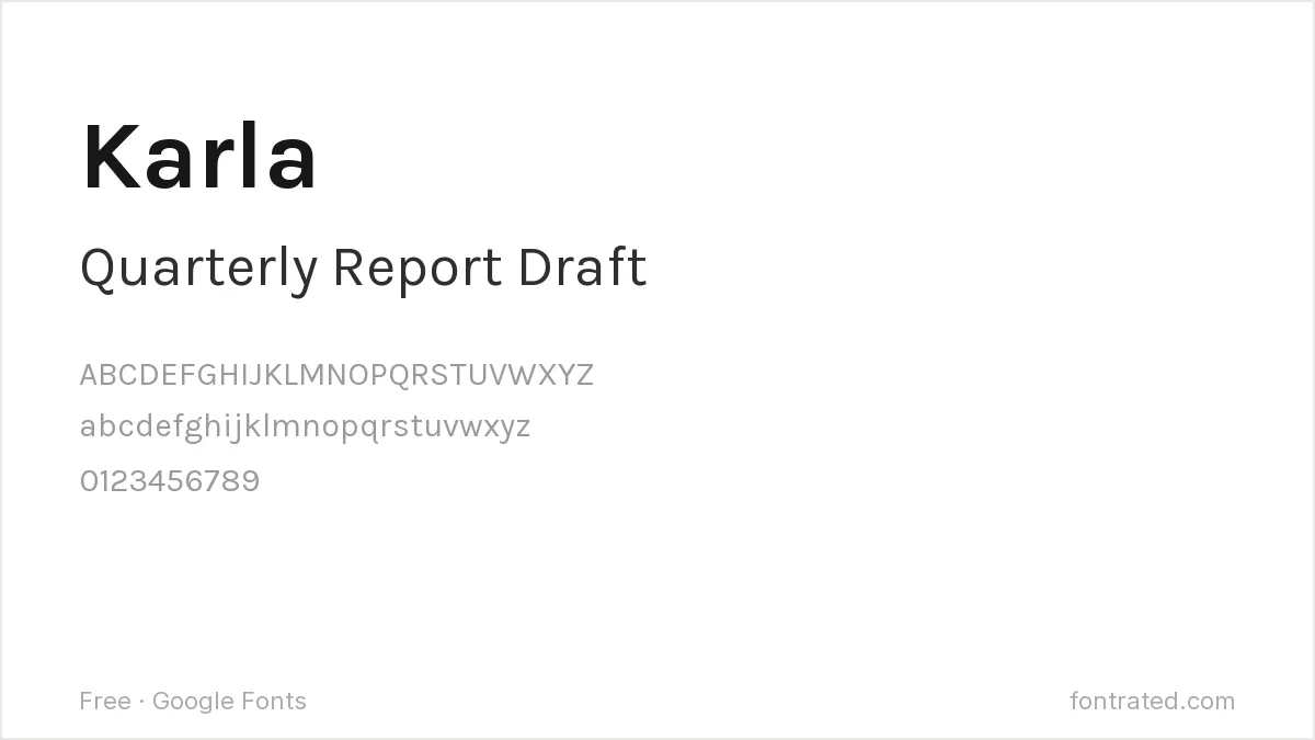
Karla’s rounded corners give it some of Calibri’s softness without the ‘default Office font’ association that can make Calibri itself feel like a placeholder rather than a real choice.
Mulish
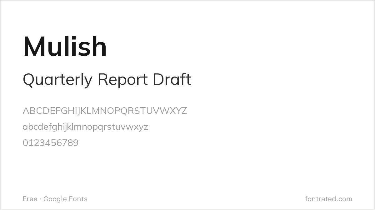
About as neutral as a sans-serif gets, Mulish suits a document or interface that wants Calibri’s inoffensive safety without much personality of its own — useful when the content should do all the talking.
Inter
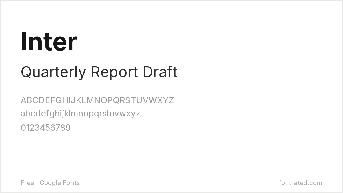
Where Calibri was engineered for ClearType rendering in a word processor, Inter was built from the ground up for screens and interfaces — the natural upgrade path if the project has moved from documents to a digital product.
Public Sans

Built for U.S. government digital services with neutrality as an explicit design goal, Public Sans works well anywhere a document needs to feel official and unbranded, the same role Calibri quietly filled for years.
Quick Comparison
| Font | Style | Best For |
|---|---|---|
| Lato | Humanist sans | Closest free match |
| Karla | Grotesque, rounded corners | A less generic-feeling alternative |
| Mulish | Low-contrast humanist sans | Maximum neutrality |
| Inter | UI-optimized sans | Screens and interfaces specifically |
| Public Sans | US federal design system sans | Neutral, official-feeling documents |
The picks below include affiliate links — see our disclosure.
Want the authentic Calibri?
If a project specifically needs the real, licensed Calibri rather than the copy bundled with an old Office install, it’s sold directly through Microsoft’s own catalog on MyFonts.
Get the authentic Calibri on MyFonts →
Want something more unique?
HELIXA from Designova is a clean neo-grotesque family with a similarly enduring, professional feel to Calibri, but with a full 12-style range built specifically for branding and corporate identity work rather than default document text.
See HELIXA on Creative Market →
Frequently Asked Questions
If Calibri came with my copy of Microsoft Office, can I use it for other projects too?
Not automatically — a font bundled with Office is licensed for use inside that software, not as a blanket license to use the font file elsewhere (printed materials, a distributed app, and so on). Using it outside that context generally requires its own license.
Is Lato really as close to Calibri as people say?
Close enough that it’s the most commonly recommended free substitute — both share a warm, humanist neutrality — though a careful eye will notice Lato’s terminals are a touch more rounded than Calibri’s own restrained shapes.
Can I use Lato or Inter commercially, including in a business document template I sell?
Yes — both are licensed under the SIL Open Font License, which permits commercial use with no royalties or attribution required.
Why did Microsoft eventually replace Calibri as the default font?
Microsoft introduced Aptos as the new Office default in 2023 after over 15 years with Calibri, citing a desire for a fresh, more modern default — a reminder that even a font used by hundreds of millions of documents eventually gets retired.


Leave a Reply