
Social graphics get seen at thumbnail size on a phone before anyone decides to tap in — so the fonts that work here need to read instantly, not reward close inspection like a print font would. If you’ve been searching for free fonts for instagram, these picks are curated with exactly that in mind.
Quick Comparison
| Font | Style | Best For |
|---|---|---|
| Fredoka | Rounded bouncy sans | Reels covers and Story text |
| Caveat | Casual handwriting | Personal-feeling captions |
| Pacifico | Retro brush script | Lifestyle and food content |
| Bebas Neue | Condensed all-caps display | Headline text over photos |
| Permanent Marker | Bold marker script | Quote graphics and callouts |
| Amatic SC | Condensed hand-drawn display | Distinctive feed content |
| Lobster | Bold retro script | Logo-style social text |
| Righteous | Rounded retro-futuristic display | Gaming, music, entertainment content |
| Comfortaa | Rounded geometric sans | Calm body-text partner |
| Quicksand | Rounded geometric sans | Caption text at small sizes |
Fredoka
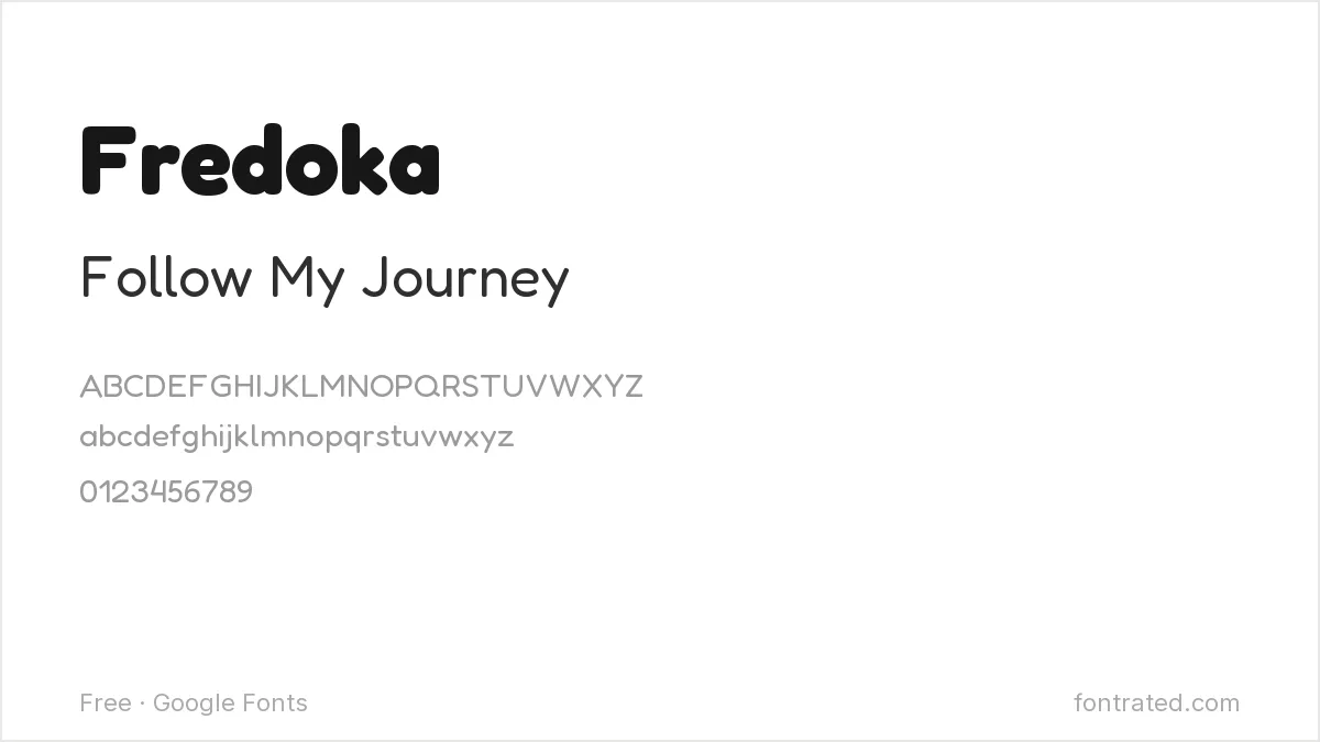
A rounded, bouncy sans with a lot of personality at heavier weights. Reads as young and approachable — a strong pick for Reels covers and Story text.
Caveat
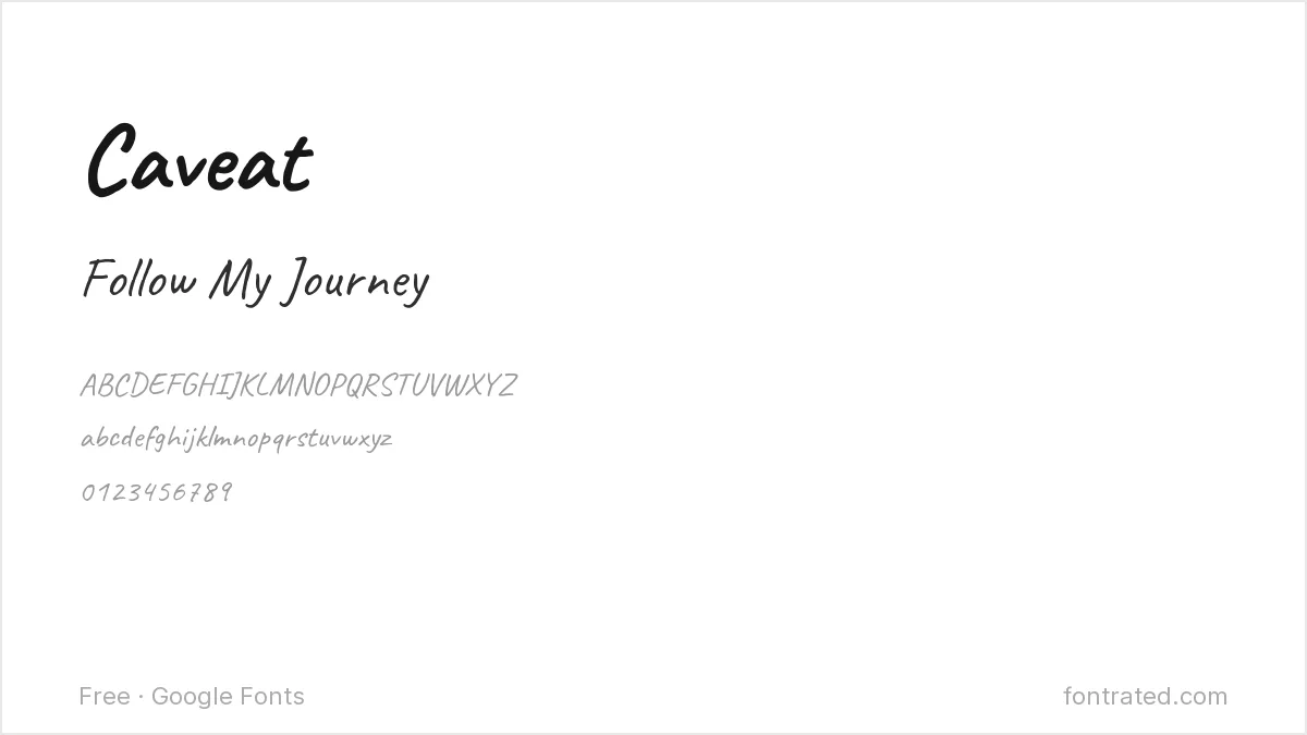
A casual handwriting font with natural variation between letters, avoiding the too-perfect look of a script font. Good for captions that want to feel personal rather than designed.
Pacifico
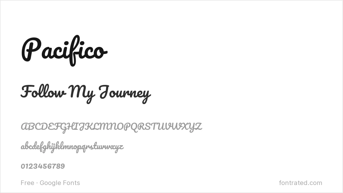
A retro brush script inspired by 1950s American surf culture. Instantly recognizable and slightly nostalgic — works well for lifestyle and food content.
Bebas Neue
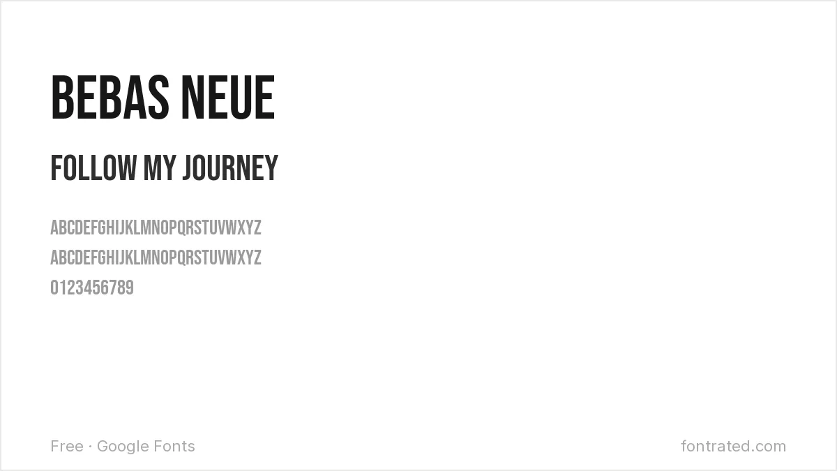
Tall, condensed, all-caps, and loud without needing bold weight — a reliable choice for headline text over a photo where you need words to be readable at a glance.
Permanent Marker
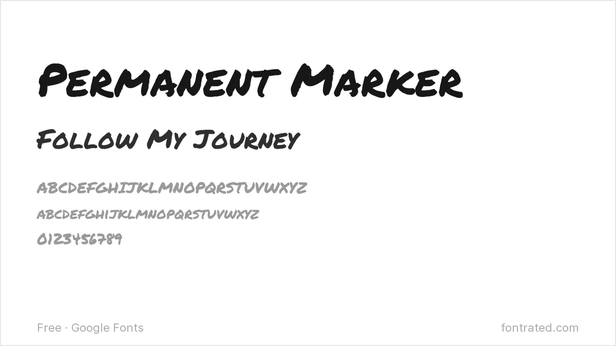
A bold, marker-style font that looks genuinely hand-drawn rather than digitally faked. Great for quote graphics or “before/after” style callouts.
Amatic SC
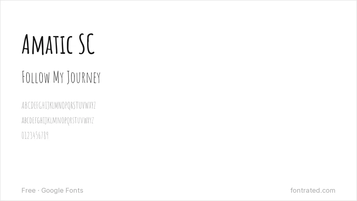
A tall, condensed, hand-drawn style font with a distinctive thin, slightly wobbly line quality. Quirky enough to stand out in a feed of polished, uniform templates.
Lobster
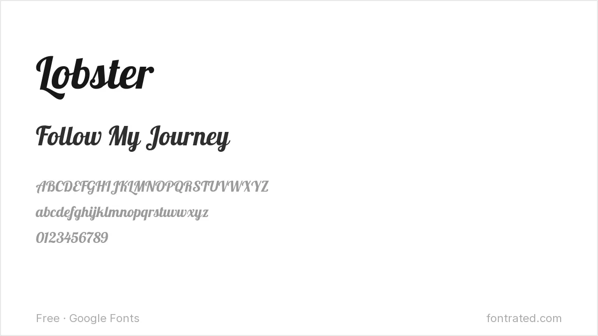
A bold retro script with heavy, confident curves — one of the most recognizable “logo-style” fonts on social platforms, best used sparingly for exactly that reason.
Righteous
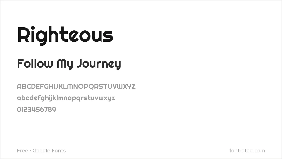
A rounded display font with a retro-futuristic edge, good for gaming, music, or entertainment-adjacent content that wants a bit of attitude.
Comfortaa
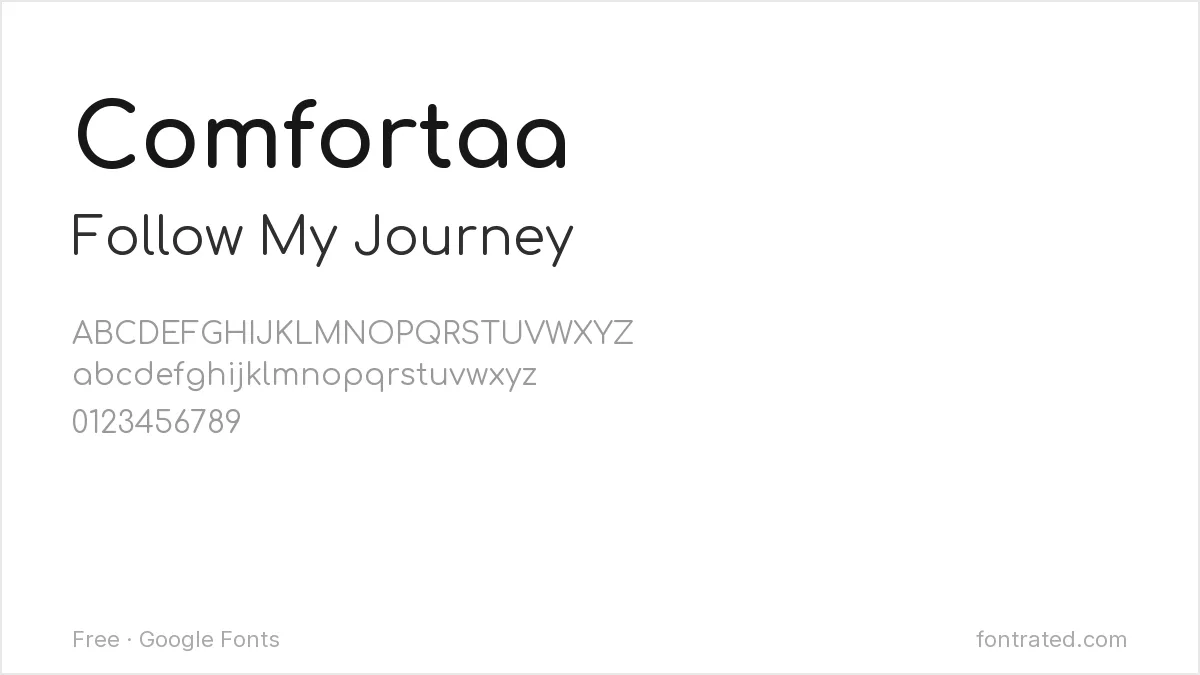
Rounded and geometric with a soft, bubble-like feel — pairs well as a calmer body-text partner underneath a louder headline font like Lobster or Pacifico.
Quicksand
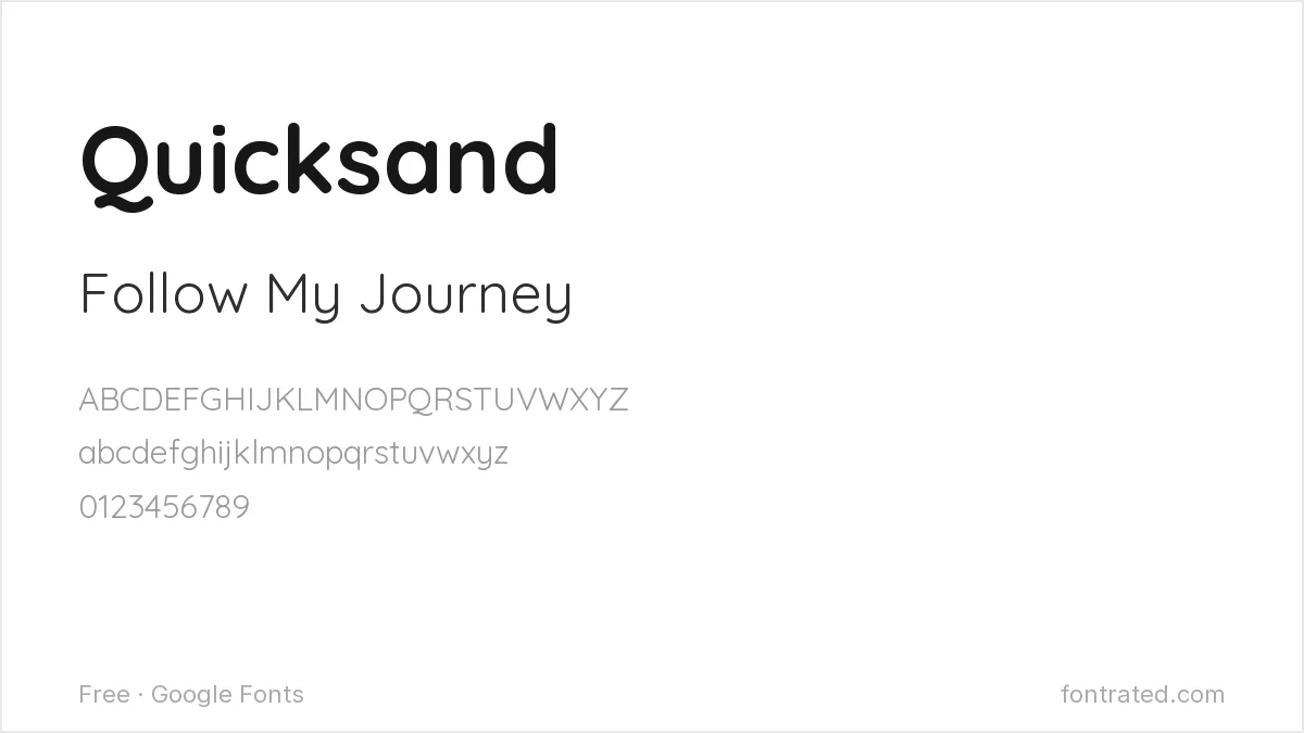
A rounded geometric sans that stays legible even at small caption sizes, making it one of the safer choices when a post needs more than a few words of text overlay.
One habit worth keeping: whatever font you pick for headlines, test it over a busy photo background, not a plain color swatch — that’s the actual condition it needs to survive.
If you design in Canva rather than Photoshop or Illustrator, our 10 Best Free Google Fonts for Canva Designs covers the same territory with Canva-specific picks. If video is more your speed, 10 Best Free Fonts for YouTube Thumbnails covers that closely related format.
For a specific branded look rather than a general style, free alternatives to Circular covers the rounded geometric sans behind a lot of app branding, and free alternatives to Brandon Grotesque covers the warmer vintage-geometric look common on lifestyle feeds.
Frequently Asked Questions
Are these fonts free to use in Instagram graphics I’m making for a client or business account?
Yes. All ten are Google Fonts under the SIL Open Font License, which allows commercial use — client work, brand accounts, templates you sell — with no attribution or royalty required.
Will these fonts still look sharp after Instagram compresses my Story or post image?
Bold, simple shapes (Bebas Neue, Righteous, Fredoka) survive Instagram’s compression better than fonts with very fine strokes — thin serifs or delicate scripts can look slightly blurred after upload. Exporting your graphic at a higher resolution than you think you need (1080×1920 for Stories) helps offset that.
How do I actually add one of these fonts to a Canva or Photoshop Instagram template?
Download the font family from its Google Fonts page above, then either upload it as a Brand Font in Canva (Pro/Teams plans) or install the .ttf/.otf file system-wide so it shows up directly inside Photoshop, Procreate, or any other design app.
Why does a font look slightly different on my phone than in the preview images here?
The specimen images above render at a fixed weight and size; on your own device the font can look different depending on the weight you selected, your screen’s rendering engine, and whether the app embeds the font correctly. Always preview the actual export on a phone screen before posting, not just the desktop canvas.
Want more personality than a free script offers?
Nicky Laatz built Pink Champagne Script with deliberately inky, wobbly edges — closer to real handwriting than the too-smooth curves most script fonts default to.
That imperfection is what makes it read as personal rather than templated in a feed where everyone’s already using the same three free scripts — worth it for a quote graphic or Story text that needs to actually stand out.
This pick includes an affiliate link — see our disclosure.


Leave a Reply