
Mark Simonson drew Proxima Nova in 2005, and it quietly became one of the most-licensed fonts of the entire following decade — its humanist proportions read as clean and modern without the coldness of a purely geometric sans, which made it a default choice for startup branding and app interfaces for years. There’s an unusual wrinkle with Proxima Nova specifically: it’s no longer sold through MyFonts at all — the listing exists but purchasing is disabled. That makes a free alternative less of a cost-saving move and more of a practical necessity for anyone discovering the font today. If you’ve been searching for free alternatives to proxima nova, this list is built exactly for that.
Montserrat

The classic stand-in for Proxima Nova, and the one most designers reach for first. It’s not a precise match — Montserrat’s letterforms are slightly more geometric and less optically corrected — but it’s close enough, and familiar enough, that it rarely draws attention to itself.
Figtree
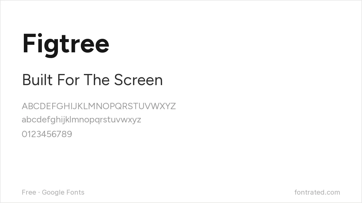
Closer to Proxima Nova’s actual humanist proportions than Montserrat, with capital letterforms drawn to work well at UI sizes. If you’re replacing Proxima Nova in an app or product interface specifically, start here.
Sora
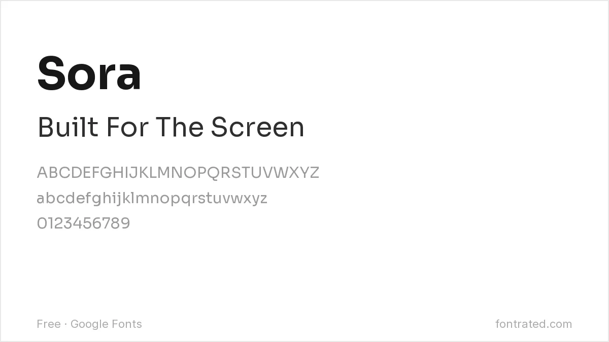
A more rounded, slightly geometric take that’s become popular in tech and SaaS branding over the last few years — a reasonable choice if you want something that reads as current rather than a direct Proxima Nova substitute.
Manrope
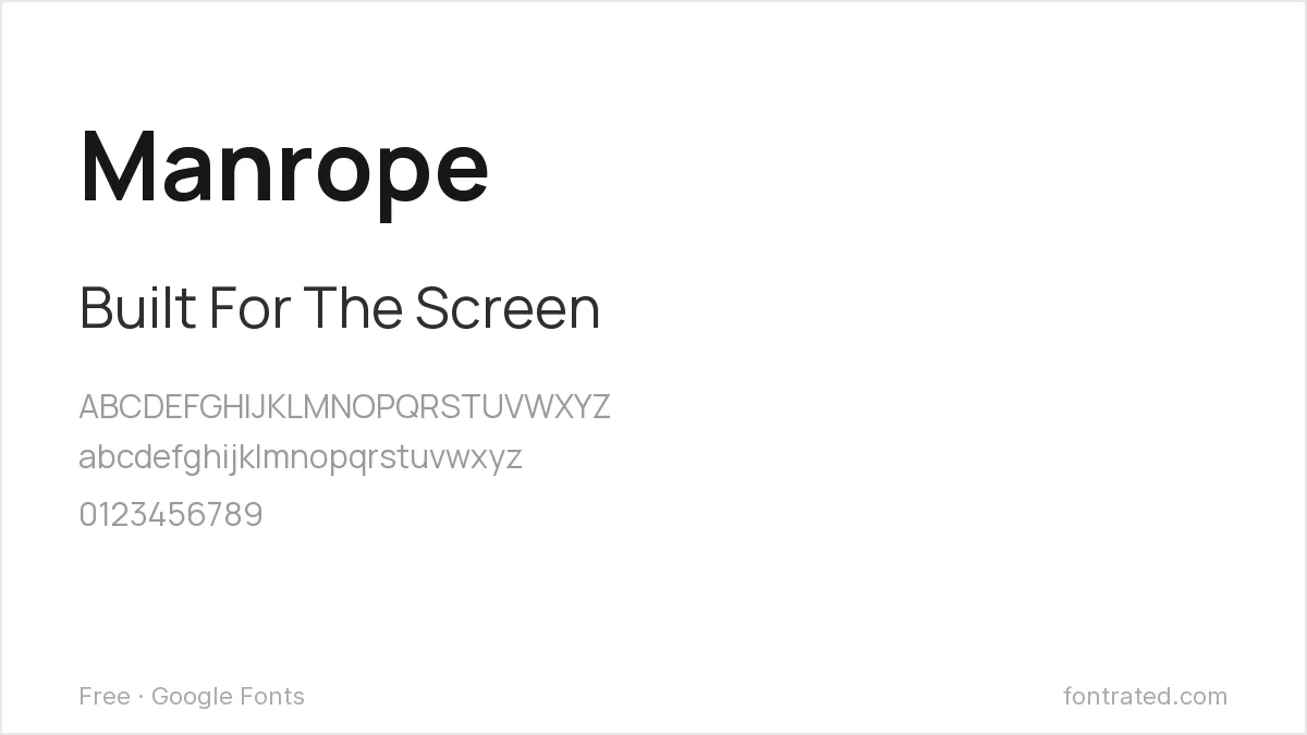
A modern, semi-condensed sans built with web and app interfaces in mind, with an efficient character width that works well in tight UI spaces the way Proxima Nova often did.
DM Sans
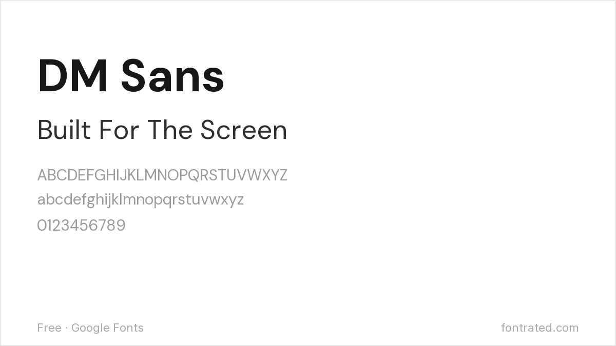
Low-contrast and quietly versatile, designed as part of Google’s own Material-Design-adjacent type system — a safe, neutral choice for interfaces that just need clean, unobtrusive text.
Quick Comparison
| Font | Style | Best For |
|---|---|---|
| Montserrat | Geometric-humanist | General-purpose substitute |
| Figtree | Humanist sans | UI and product interfaces |
| Sora | Rounded-geometric | Tech/SaaS branding |
| Manrope | Semi-condensed sans | Tight UI spaces |
| DM Sans | Low-contrast sans | Neutral interface text |
The picks below include affiliate links — see our disclosure.
A quick note on buying the original: Proxima Nova’s listing on MyFonts is no longer purchasable — the page exists but the buy button is gone. If you specifically need the licensed original rather than a free alternative, Mark Simonson still sells it directly through his own studio site: marksimonson.com.
Want something more unique?
CAIRO from Viswell is a clean, minimalist humanist sans in a similar spirit to Proxima Nova, at a lower price point than most premium type foundry fonts — worth a look if you want something with a bit more distinct character.
See CAIRO on Creative Market →
Frequently Asked Questions
Why was Proxima Nova pulled from MyFonts?
MyFonts hasn’t published a reason, and Mark Simonson Studio hasn’t issued a public statement either — the listing simply shows as no longer available for purchase. The font remains available directly from Mark Simonson’s own site.
Is Montserrat really similar to Proxima Nova?
Similar enough to work as a drop-in replacement in most contexts, though a trained eye will notice Montserrat’s slightly more geometric, less optically-refined letterforms next to Proxima Nova’s original.
Can I still use Proxima Nova if I already licensed it?
Yes — a purchase you made before the listing changed remains valid under whatever license terms you agreed to at the time; this only affects new purchases.
Are these free alternatives OK for commercial products?
Yes, all five are released under open licenses (primarily the SIL Open Font License) that explicitly permit commercial use without royalties or attribution.


Leave a Reply