
Paul Renner drew Futura in 1927 out of pure geometry — circles, triangles, and squares, with almost no adjustment for optical comfort. Almost a century later it’s still everywhere: Louis Vuitton and Supreme both use it for branding, Wes Anderson leans on it for nearly every film poster, and it was the typeface engraved on the plaque Apollo 11 left on the moon. Licensing the original today (Monotype now owns the Bauer Type Foundry catalog) can run from around $90 for a single style to several hundred for a full family. These five Google Fonts borrow the same geometric logic without the licensing bill. If you’ve been searching for free alternatives to futura, this list is built exactly for that.
Jost
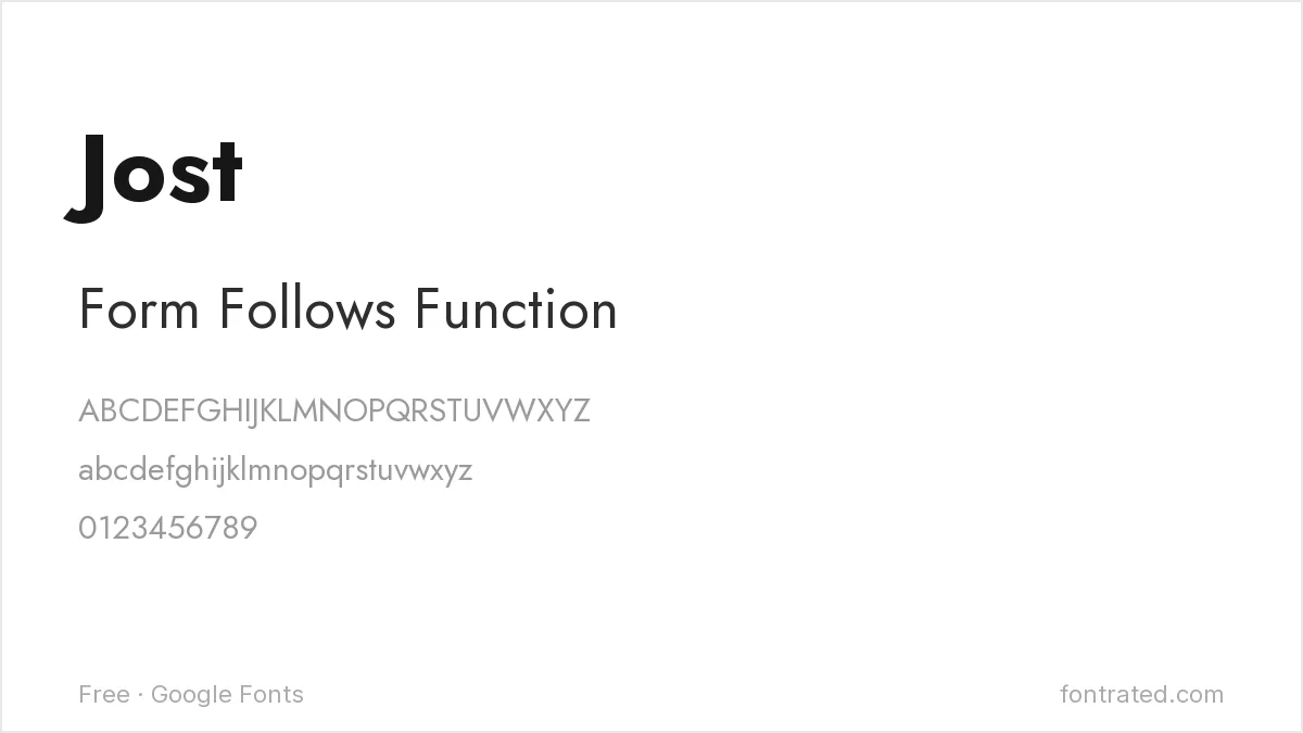
The most direct free tribute to Futura’s geometry — Jost was explicitly drawn in the spirit of 1920s geometric sans-serifs, matching Futura’s near-perfect circles and triangles almost stroke for stroke. If you want the closest free match on this list, start here.
League Spartan
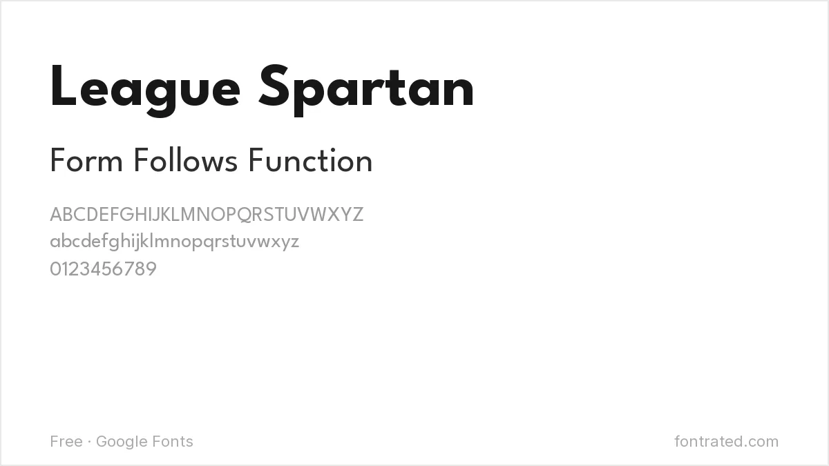
Part of The League of Moveable Type’s open-source collection, built on the same geometric “Spartan” proportions that were themselves early American competitors to Futura. Bolder and more condensed than Futura by default, which makes it read louder at large sizes.
Poppins

Rounder and friendlier than Futura’s stricter geometry, but built from the same circular logic. A good choice when you want geometric structure without Futura’s slightly cold, architectural edge.
Questrial
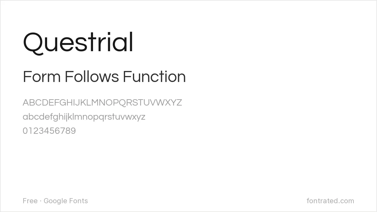
Futura’s minimalism taken even further — one weight, no frills, built for short headlines rather than paragraphs. Works well for the kind of spare, confident wordmark Futura is often hired for.
Josefin Sans
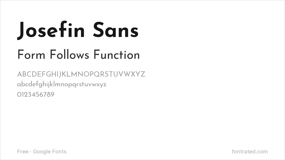
Drawn with an explicit nod to 1920s Art Deco geometric proportions — the same design era that produced Futura itself — but with narrower, more elegant proportions that suit editorial and fashion contexts particularly well.
Quick Comparison
| Font | Style | Best For |
|---|---|---|
| Jost | Geometric sans | Closest free match to Futura |
| League Spartan | Bold geometric sans | Loud, condensed headlines |
| Poppins | Geometric sans (rounder) | Friendlier geometric feel |
| Questrial | Geometric sans (single weight) | Minimal wordmarks |
| Josefin Sans | Art Deco geometric | Editorial and fashion contexts |
The picks below include affiliate links — see our disclosure.
Want the authentic Futura?
Futura’s exact proportions — engineered by Paul Renner down to the millimeter — are still sold today through Monotype’s own catalog. If your project calls for the real thing, it’s available on MyFonts.
Get the authentic Futura on MyFonts →
Want something more unique?
All Round Gothic from Dharma Type takes a similar geometric-sans foundation but pushes it in its own direction — a solid pick if you like Futura’s DNA but want something with less of an obvious paper trail.
See All Round Gothic on Creative Market →
Futura started the geometric sans lineage, and two of its descendants have their own free-substitute problem: free alternatives to Century Gothic covers the softer, wider interpretation, and free alternatives to Avenir covers Frutiger’s more readable take on the same geometry. Futura’s clean shapes also print well on apparel — our t-shirt and merch font picks covers that use case.
Frequently Asked Questions
Why do luxury brands like Louis Vuitton use a font from 1927?
Futura’s pure geometric forms read as timeless rather than trend-driven — because it isn’t tied to any particular decade’s aesthetic beyond its Bauhaus origins, it doesn’t date the way more expressive typefaces do.
Is Futura free anywhere legitimately?
No — Futura itself is commercial, currently licensed through Monotype and a few other foundries (URW, Bitstream, and Paratype each sell their own version). The fonts in this article are separate, independently licensed designs, not free copies of Futura.
Which free alternative is closest for a logo?
Jost for something that reads almost identically to Futura, or Questrial if you want an even more minimal, single-weight wordmark.
Can I use Jost or League Spartan for a commercial project?
Yes, both are released under the SIL Open Font License, which permits commercial use without royalties.


Leave a Reply