
A font that looks great on a screen can fall apart the moment it’s screen-printed, embroidered, or shrunk onto a mug — fine details clog up, thin strokes disappear, and tight letter-spacing turns into a blob of ink. These ten were picked specifically for print survival, not just on-screen good looks. If you’ve been searching for free fonts for t-shirts, these picks are curated with exactly that in mind.
We picked these for boldness (thin strokes are the enemy of screen printing), open counters that won’t clog when printed small, and a free commercial license that covers a shirt or product you’re selling. All ten are Google Fonts under the SIL Open Font License.
Quick Comparison
| Font | Style | Best For |
|---|---|---|
| Anton | Ultra-condensed impact sans | Streetwear and statement tees |
| Bungee | Urban display | Retro, playful merch |
| Permanent Marker | Marker-style display | Hand-drawn, DIY-feeling merch |
| Bebas Neue | Condensed all-caps display | Minimalist, text-only merch |
| Luckiest Guy | Cartoon-bold display | Playful, humor-driven merch |
| Passion One | Rounded bold display | Youth and sports-team merch |
| Rubik Mono One | Bold geometric monospace | Modern streetwear |
| Alfa Slab One | Heavy slab serif | Vintage and rustic merch |
| Fjalla One | Condensed sans | Clean, minimal merch text |
| Bowlby One SC | Ultra-bold small-caps display | Poster-style merch |
Anton
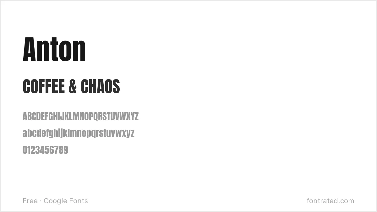
About as heavy and condensed as a Google Font gets, Anton reads as loud and confident at any size — a reliable pick when the design is basically just bold text and nothing else.
Bungee
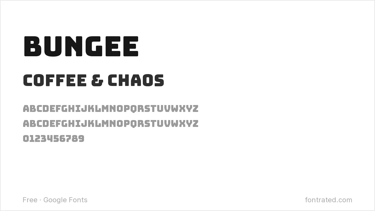
Inspired directly by urban street signage, Bungee’s thick, confident strokes were built for maximum visibility — well suited to merch that wants energy over subtlety.
Permanent Marker
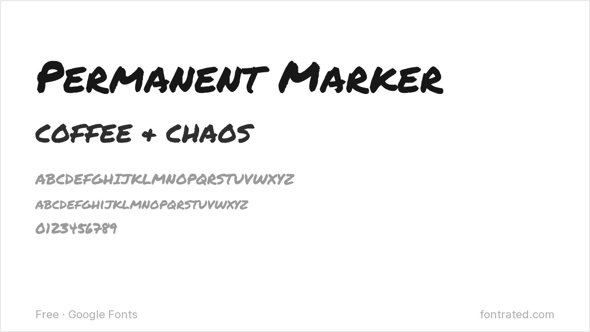
Genuinely mimics a felt-tip marker rather than faking the look digitally, which gives merch design an authentic hand-made feel without an actual illustrator.
Bebas Neue
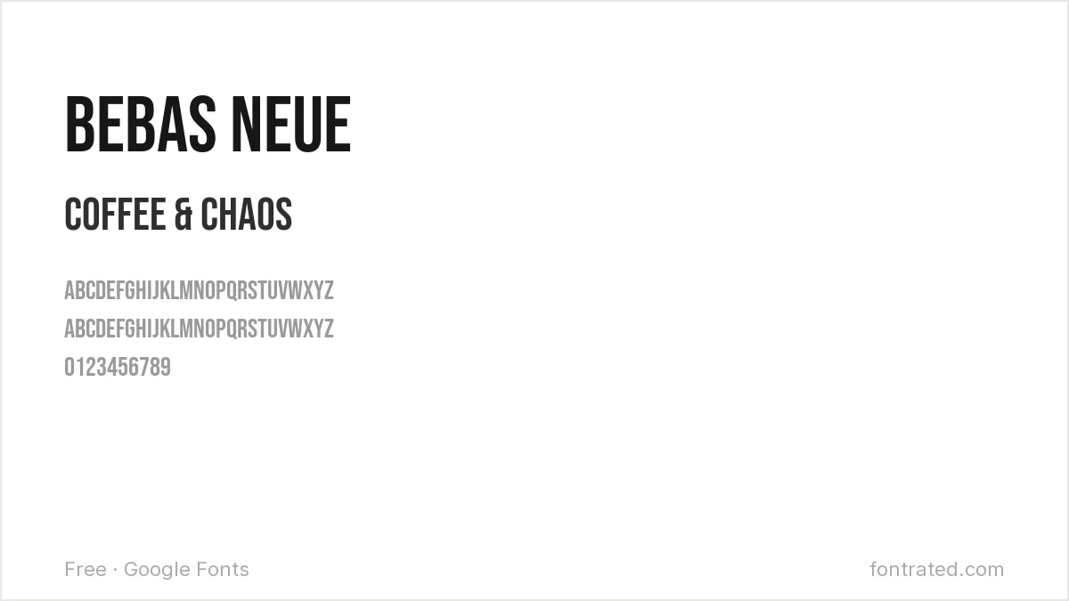
A tall, condensed, all-caps font with no lowercase at all, Bebas Neue takes up very little horizontal space while staying loud — good for a minimalist one-word or short-phrase design.
Luckiest Guy
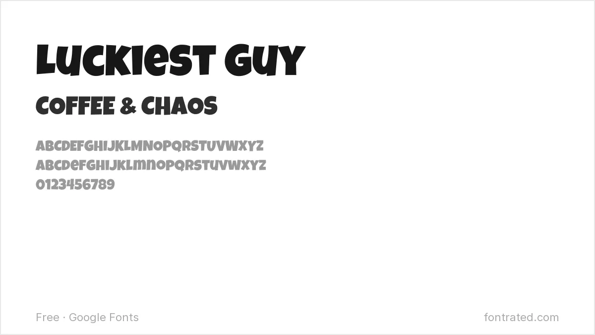
A rounded, ultra-bold cartoon font with real bounce and personality, Luckiest Guy fits merch that’s meant to be funny or lighthearted rather than sleek.
Passion One
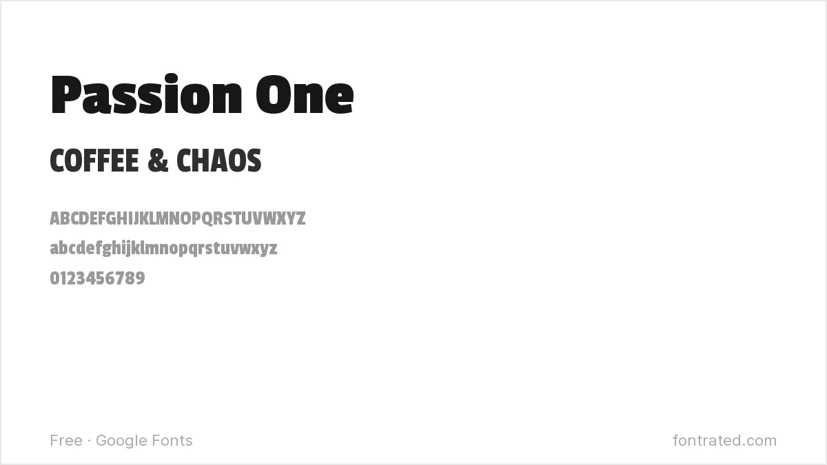
A rounded, heavy sans with a friendly, energetic feel, Passion One is a common choice for youth sports teams, camps, and events that want something bold but not aggressive.
Rubik Mono One
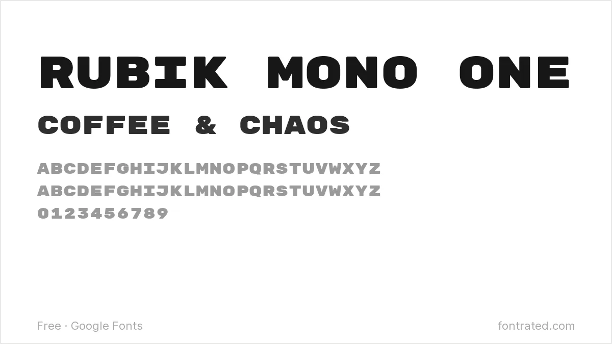
A monospaced, ultra-bold geometric font, Rubik Mono One has a distinctly current, tech-adjacent streetwear feel — every character takes up equal width, which gives designs a rigid, grid-like structure.
Alfa Slab One
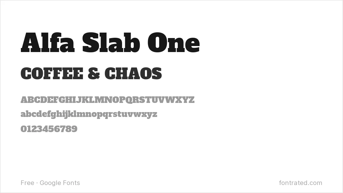
Thick, blocky serifs give Alfa Slab One a hand-carved, vintage-signage feel — a strong match for merch leaning into an old-fashioned or rustic aesthetic.
Fjalla One
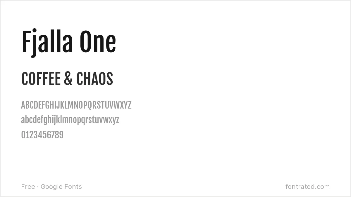
A condensed sans with sturdy, no-nonsense proportions, Fjalla One works well when merch design wants text to read clearly without adding much visual noise of its own.
Bowlby One SC
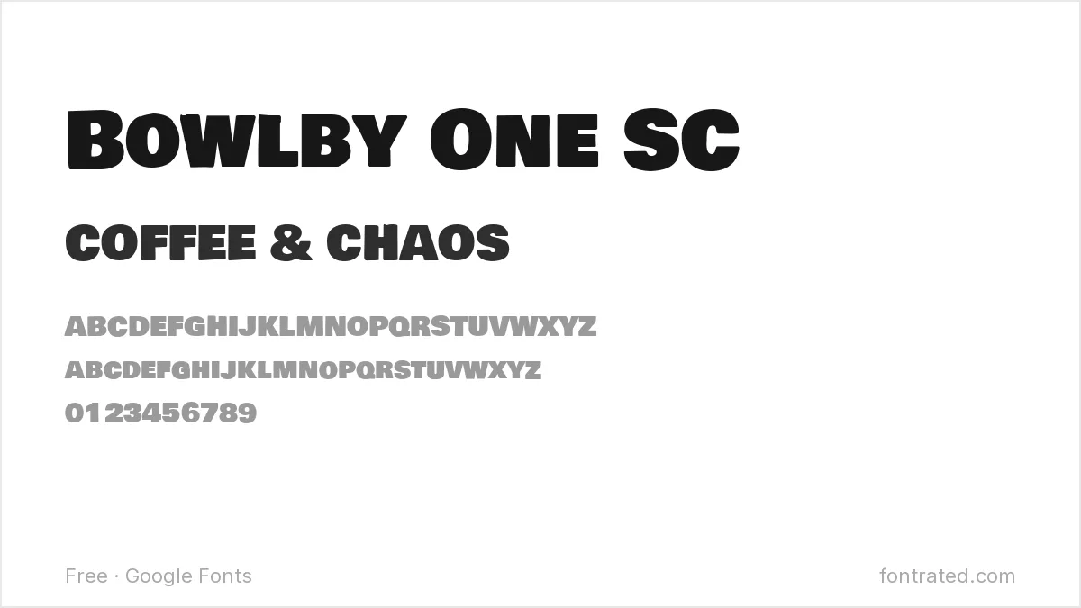
An extremely heavy, small-caps-only display font, Bowlby One SC works best as a short, poster-style statement — not for anything that needs to fit more than a few words.
Which one should you actually pick? Anton or Bebas Neue for anything text-focused and minimal, Luckiest Guy or Permanent Marker when the design wants personality over polish. Always test the exact print size before finalizing — what looks bold on-screen can still clog at 2 inches on a sleeve print.
Looking for more? Browse the rest of our Print, Merch & Creative Projects font picks.
Frequently Asked Questions
Are these fonts free to use on merch I’m designing and selling, like on Etsy or a print-on-demand store?
Yes. All ten are Google Fonts under the SIL Open Font License, which permits commercial use — including merch you design and sell — with no royalties or attribution required.
Will a bold font like Anton or Bungee actually print cleanly through screen printing?
Generally yes — their thick, simple strokes are exactly what screen printing handles well. The fonts to watch out for are thin, high-contrast ones (delicate scripts or fine serifs), where hairline strokes can drop out or clog during printing.
What’s the minimum size text should be for a shirt print?
It depends on the printing method, but as a rough floor, avoid going below about 0.25 inches (roughly 18pt at print resolution) for screen printing — smaller than that and fine details in most fonts start to lose definition.
Do I need to convert the font to outlines before sending a design to a printer?
Most print-on-demand platforms accept a flattened image (PNG/JPG) rather than editable text, which sidesteps the issue entirely. If you’re sending an editable vector file to a local print shop, converting text to outlines avoids any font-substitution issues on their end.
Want something with more built-in character than a free grotesque?
Swell is a geometric display font that draws its inspiration from Kabel Black and other 1970s-80s classics like Avant Garde — the same design lineage that gives a lot of vintage merch its distinctive look, plus more than 50 alternate glyphs to swap in.
If a design brief calls for that specific retro, slightly funky feel rather than a generic modern bold sans, it’s a fast way to get there without hand-building custom lettering.
This pick includes an affiliate link — see our disclosure.



Leave a Reply