
A book cover font has one job a resume or business card font doesn’t: signal genre before anyone reads the blurb. A thriller in a delicate script or a romance novel in a heavy slab serif both work against the reader’s expectations before the story even starts — these ten are grouped loosely by the genres they actually signal. If you’ve been searching for free fonts for book covers, these picks are curated with exactly that in mind.
We picked these for genre signaling (does it look like the shelf it’s competing on), legibility at thumbnail size (most KDP sales happen from a small cover image, not a physical shelf), and a free commercial license that covers a book you’re selling. All ten are Google Fonts under the SIL Open Font License.
Quick Comparison
| Font | Style | Best For |
|---|---|---|
| Cinzel | Roman inscriptional serif | Fantasy and historical fiction titles |
| Playfair Display | High-contrast display serif | Romance and literary fiction titles |
| Oswald | Condensed sans | Thriller and nonfiction titles |
| Crimson Text | Old-style serif | Literary and historical novel body text |
| Cormorant | Delicate display serif | Romance and poetry titles |
| Special Elite | Typewriter-style display | Noir, mystery, and spy fiction covers |
| UnifrakturMaguntia | German blackletter | Horror and gothic fiction titles |
| Libre Baskerville | Classic book serif | Literary fiction and memoir body text |
| Bangers | Bold comic display | Humor, YA, and graphic novel covers |
| PT Serif | Reading-optimized serif | Nonfiction and memoir titles |
Cinzel

Modeled on the capital letterforms carved into Roman monuments, Cinzel signals epic scale and history at a glance — a reliable choice for fantasy, historical fiction, or anything set in the ancient world.
Playfair Display
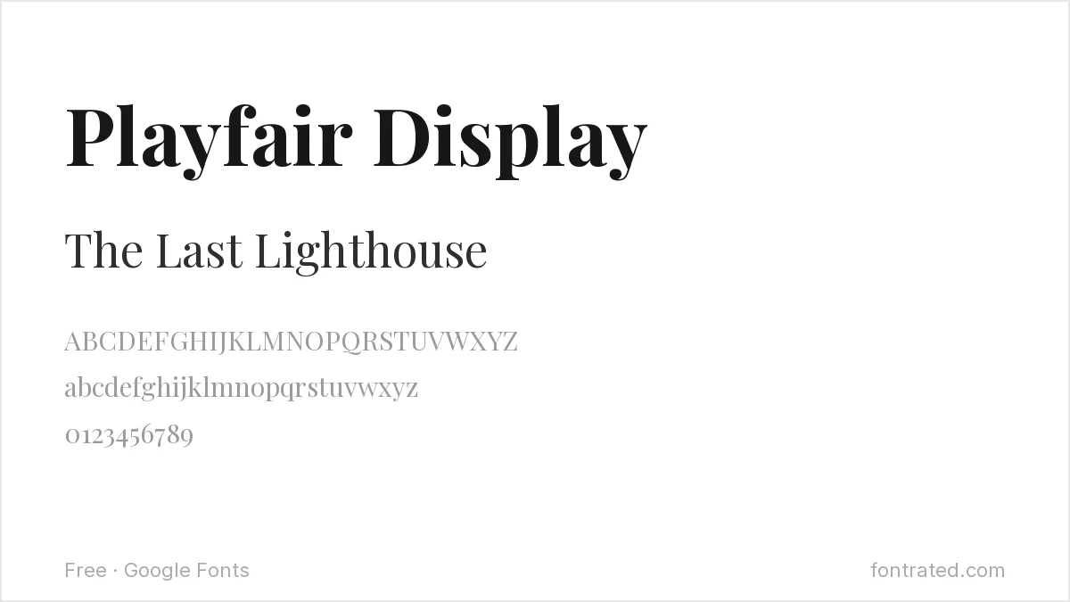
Playfair Display’s thin hairlines against thick stems read as elegant and a little dramatic — a strong match for romance and upmarket literary fiction covers.
Oswald
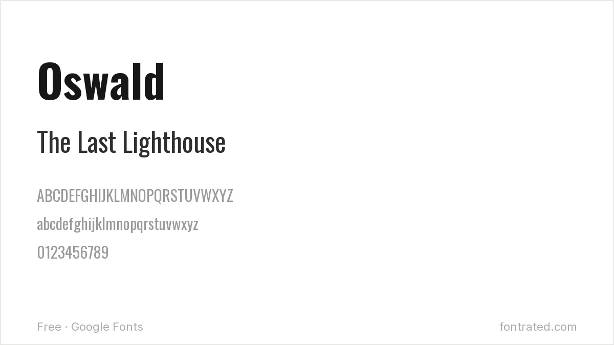
A condensed, no-nonsense grotesque with roots in early American gothic signage, Oswald reads as urgent and confident — well suited to thrillers, true crime, or direct nonfiction titles.
Crimson Text
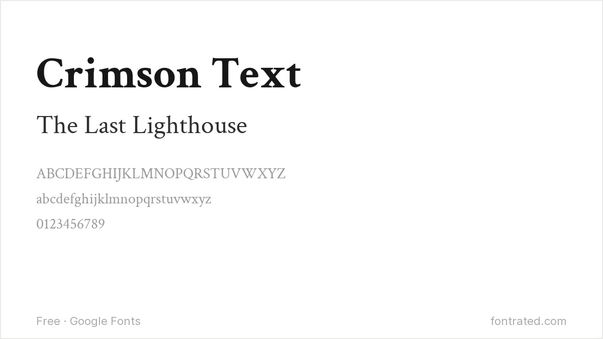
Modeled on old-style book typefaces from before the 20th century, Crimson Text was built specifically for long-form reading — as useful for the back-cover blurb and interior as it is for a restrained literary title.
Cormorant
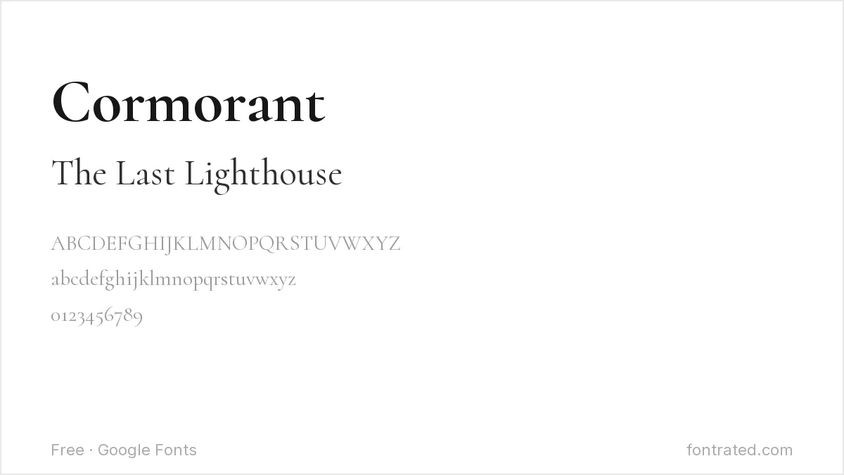
An extreme high-contrast serif with very fine hairlines, Cormorant works best set large — a romantic, editorial choice for a title, though too delicate to survive at very small thumbnail sizes.
Special Elite
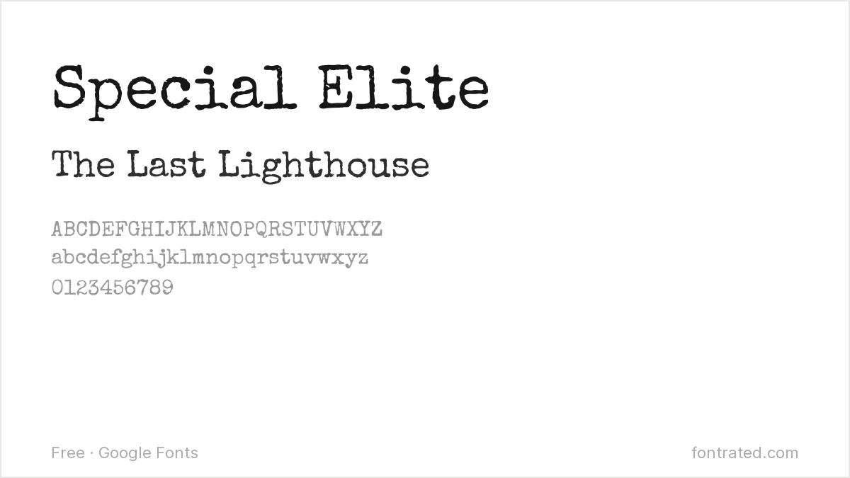
Designed to mimic a worn manual typewriter, Special Elite instantly signals noir, mystery, or Cold War-era spy fiction without any other design cues needed.
UnifrakturMaguntia
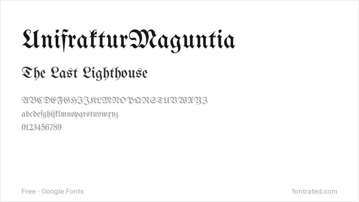
A genuine blackletter face in the German gothic tradition, this is a shorthand the horror and gothic-fiction genres use constantly — legible enough for a short title, though best avoided for anything longer than a few words.
Libre Baskerville
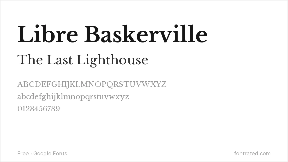
Adapted specifically from the metal type original for on-screen and print reading, Libre Baskerville is a safe, respected choice for literary fiction or memoir — the kind of cover that signals “serious book” through restraint rather than flourish.
Bangers
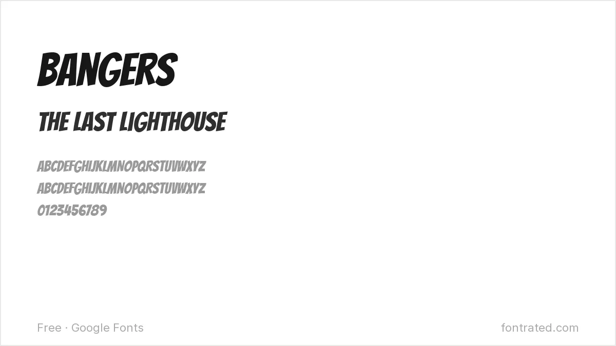
Drawn with the exaggerated, slightly wobbly energy of a comic-book sound effect, Bangers works well for humor, YA, or anything cover design wants to feel loud and a little fun rather than serious.
PT Serif
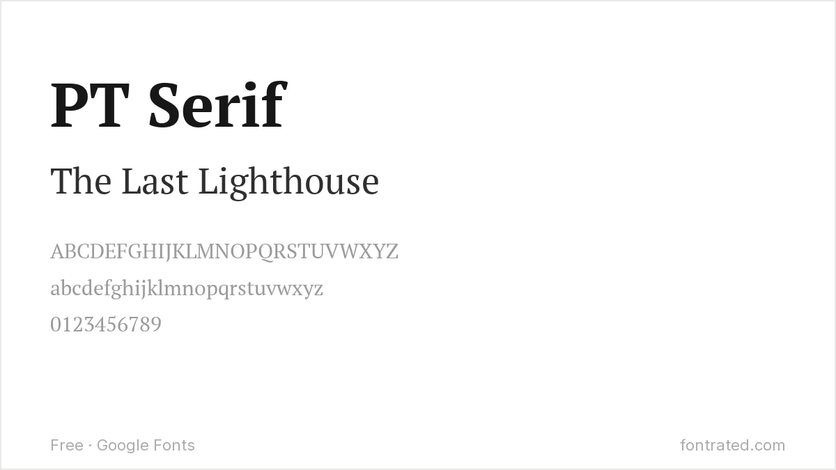
A humanist serif built with generous counters for extended reading, PT Serif gives a nonfiction or memoir cover a trustworthy, readable feel without romance fiction’s drama.
Which one should you actually pick? Match the font to the genre shelf your book is actually competing on — Playfair Display and Cormorant for romance, Oswald and Special Elite for thriller/mystery, Cinzel for fantasy. A genre-appropriate free font will outperform a beautiful font that signals the wrong shelf.
Looking for more? Browse the rest of our Print, Merch & Creative Projects font picks.
Frequently Asked Questions
Are these fonts free to use on a book cover I’m selling through KDP or another platform?
Yes. All ten are Google Fonts under the SIL Open Font License, which explicitly permits commercial use — including a book cover you’re selling — with no royalties or attribution owed.
Will a delicate font like Cormorant still be legible at the tiny thumbnail size Amazon shows in search results?
Not reliably below a certain size — very high-contrast serifs lose their fine hairlines when scaled down to a 100-150px thumbnail. Test your cover at actual Amazon thumbnail size before finalizing, and consider a sturdier serif (Libre Baskerville, PT Serif) if the title needs to stay small.
How many fonts should a book cover use?
Usually two at most — one for the title, one for the author name and any subtitle — matched in tone. Using more than two starts to look amateurish and undermines whatever genre signal the title font is sending.
Can I use a genre-typical font like UnifrakturMaguntia even if it’s been used on other horror covers?
Yes — using a genre-typical font isn’t copying a specific book, it’s meeting reader expectations for that shelf, the same way most thrillers use bold condensed sans-serifs. What matters legally is that you’re using an independently licensed font file, not a copy of another book’s exact cover design.
Want something with more built-in drama?
Nicky Laatz built NOIR et BLANC around a deliberate contrast: bold, voluptuous capital letters set against a sleek, restrained italic lowercase — the kind of built-in tension a lot of genre covers have to construct from scratch by combining two separate fonts.
For a cover that needs to read as dramatic and literary at once — upmarket romance, literary thriller, elevated horror — having that contrast baked into a single, cohesive family is worth the license fee.
This pick includes an affiliate link — see our disclosure.


Leave a Reply