
A thumbnail font has about half a second to be read before someone scrolls past it, usually at a size smaller than a postage stamp on a phone screen. That rules out anything with fine detail or tight spacing — these ten were picked specifically for maximum legibility at a tiny, low-attention size. If you’ve been searching for free fonts for youtube thumbnails, these picks are curated with exactly that in mind.
We picked these for boldness and letter-shape distinction at small sizes, since most viewers see a thumbnail shrunk down in a sidebar or grid before ever opening the video. All ten are Google Fonts under the SIL Open Font License, free for commercial channel use.
Quick Comparison
| Font | Style | Best For |
|---|---|---|
| Anton | Ultra-condensed impact sans | Big, punchy callout text |
| Poppins | Geometric sans | Clean, modern thumbnail text |
| Bebas Neue | Condensed all-caps display | Classic minimalist thumbnail text |
| Archivo Black | Heavy grotesque | Bold callout text |
| Luckiest Guy | Playful cartoon-bold display | Reaction and comedy thumbnails |
| Passion One | Rounded bold display | Vlog and lifestyle thumbnails |
| Oswald | Condensed sans | News and commentary thumbnails |
| Bungee Shade | 3D-shadow display | Gaming and high-energy thumbnails |
| Righteous | Retro-futuristic display | Tech and gaming content |
| Fredoka | Rounded bouncy sans | Family and kids’ content thumbnails |
Anton
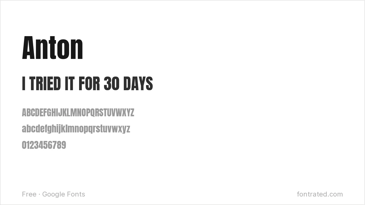
The default choice for a reason: Anton’s extreme weight and condensed width let you fit a short, urgent phrase into a small thumbnail area without shrinking it into illegibility.
Poppins
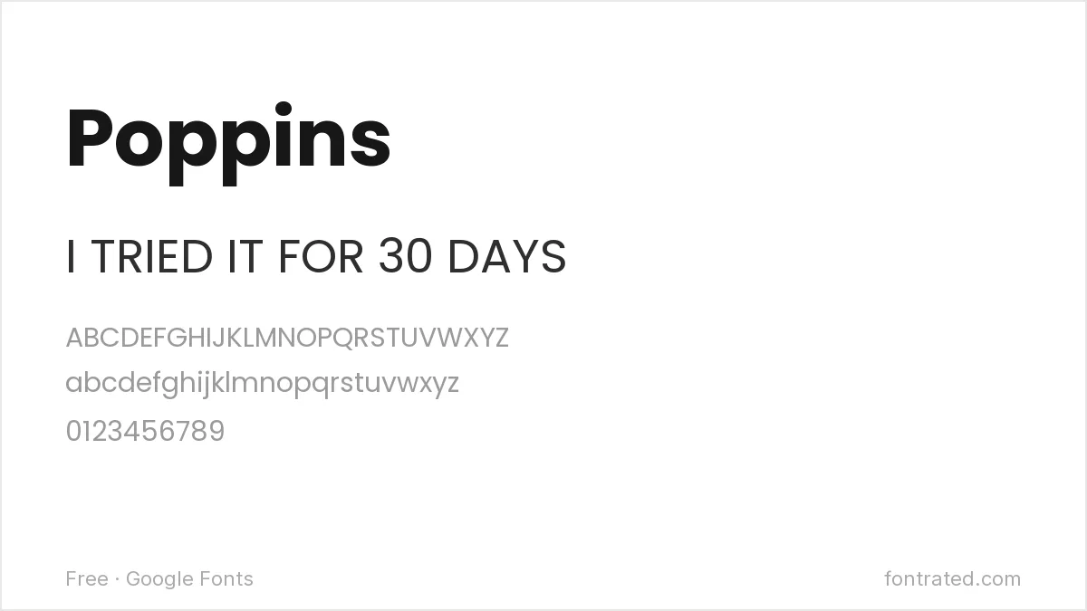
Less aggressive than Anton but still bold at heavier weights, Poppins gives a thumbnail a more polished, modern feel — a common choice for tech, education, or lifestyle channels.
Bebas Neue
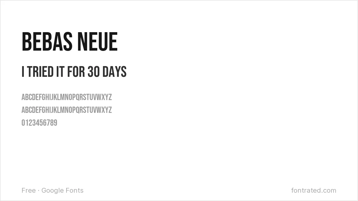
One of the most recognizable thumbnail fonts on the platform for a reason: tall, condensed, all-caps letterforms read instantly even shrunk down in a subscription feed.
Archivo Black
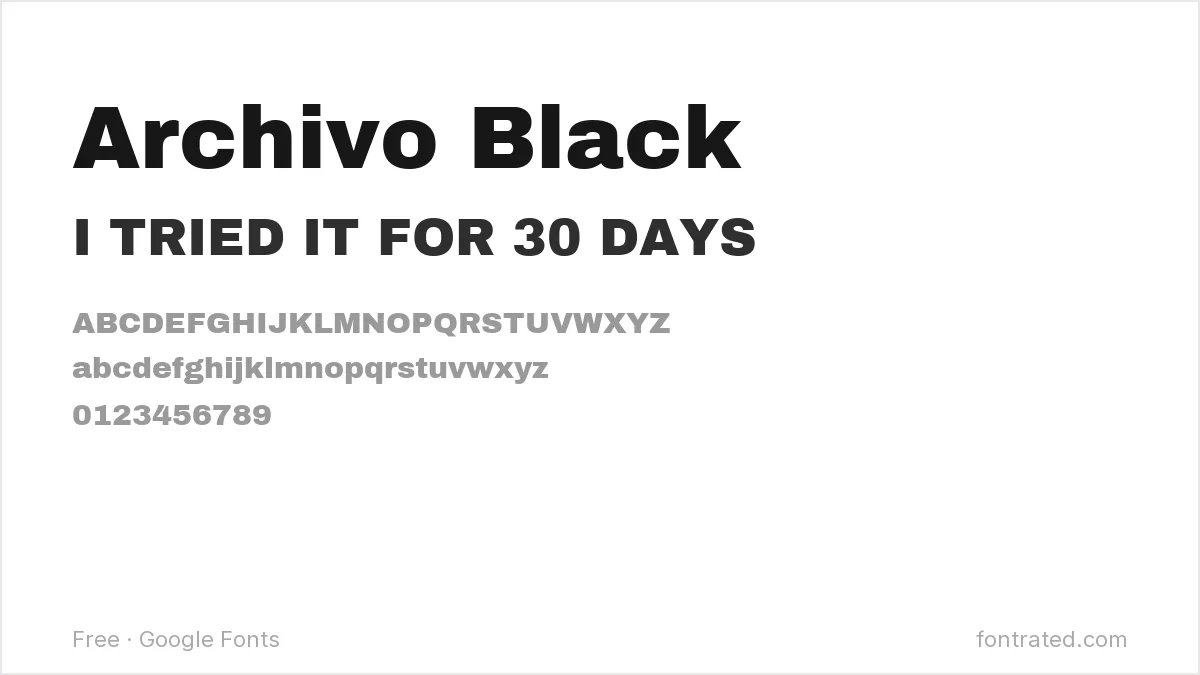
An extremely heavy, no-frills grotesque, Archivo Black works well for a short callout word or number (like a big percentage or countdown) that needs to dominate the frame.
Luckiest Guy
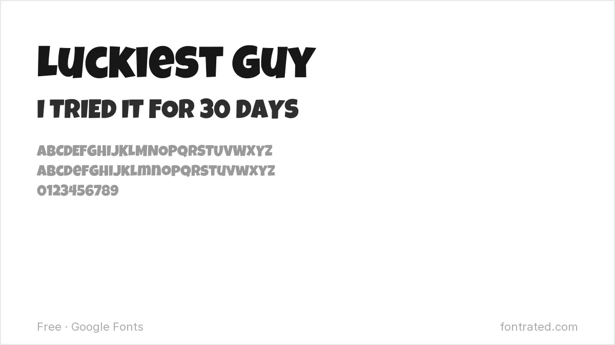
Rounded and bouncy with real cartoon energy, Luckiest Guy signals “this is going to be fun” before anyone reads the actual words — a strong fit for reaction or comedy content.
Passion One
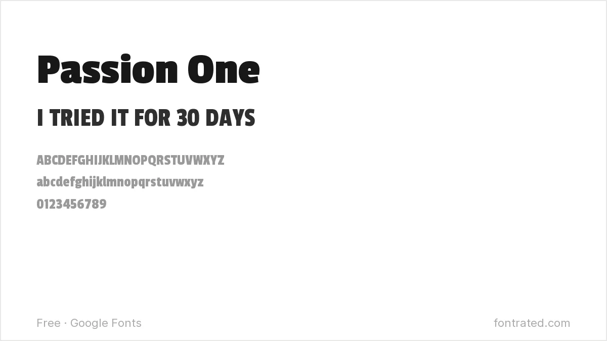
A friendly, rounded heavyweight font that reads as approachable rather than aggressive, Passion One suits vlog or lifestyle channels that want boldness without shouting.
Oswald
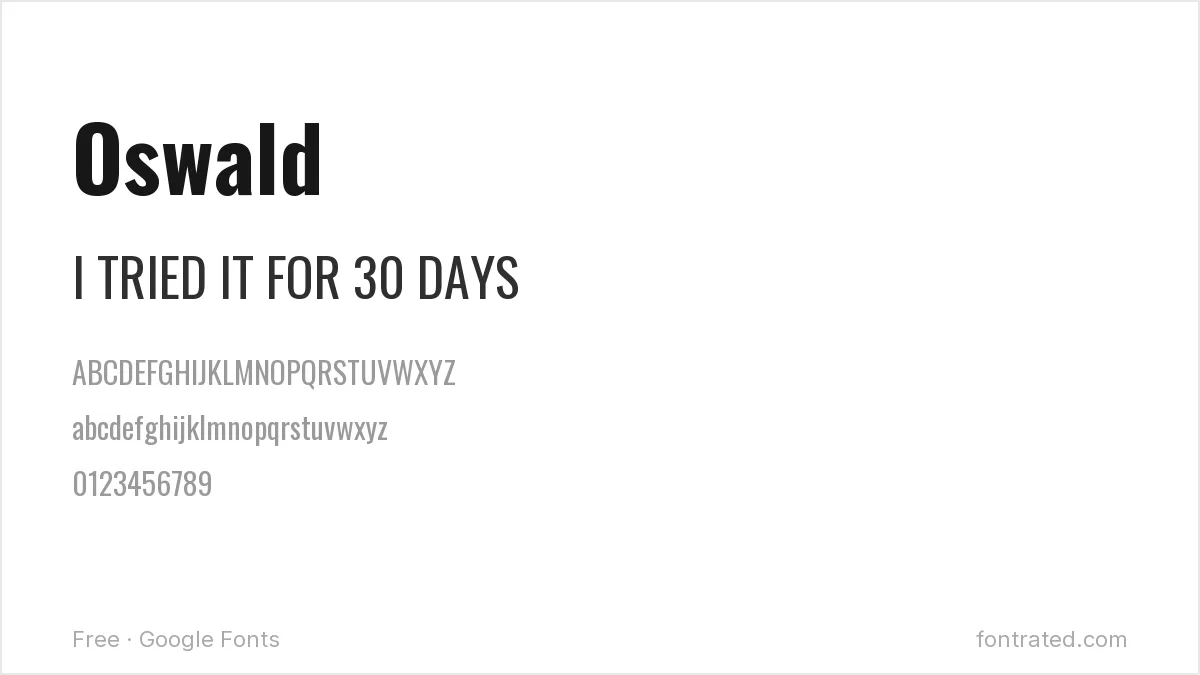
Oswald’s confident, slightly industrial feel (drawn from classic gothic signage) gives news, commentary, or explainer-style thumbnails a serious, credible tone.
Bungee Shade
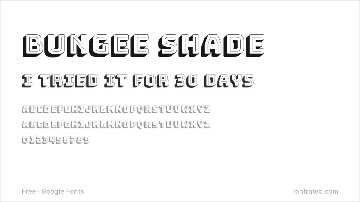
Bungee Shade’s built-in drop-shadow effect gives text a 3D, poster-like pop with zero extra design work — a fast way to make gaming or high-energy content stand out in a crowded feed.
Righteous
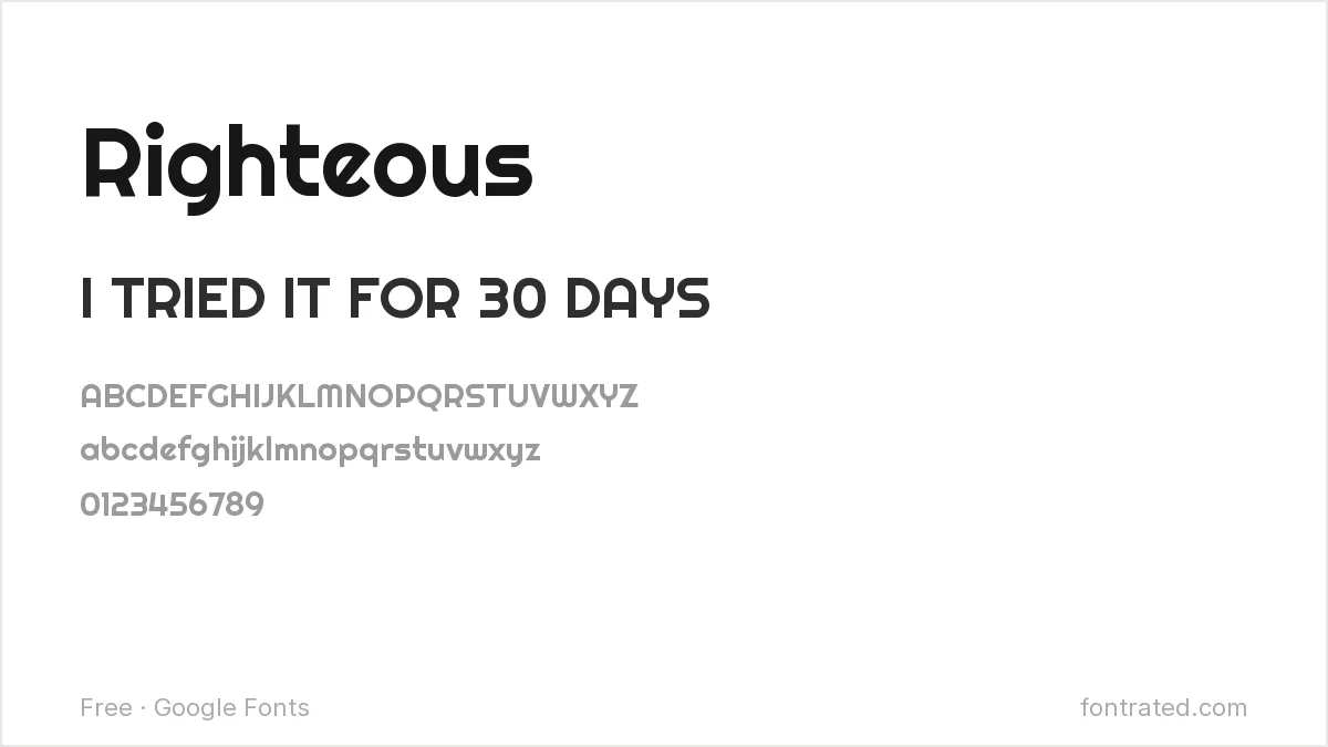
A rounded display font with a slightly retro-futuristic edge, Righteous adds a bit of attitude that suits tech, gaming, or entertainment-adjacent channels.
Fredoka
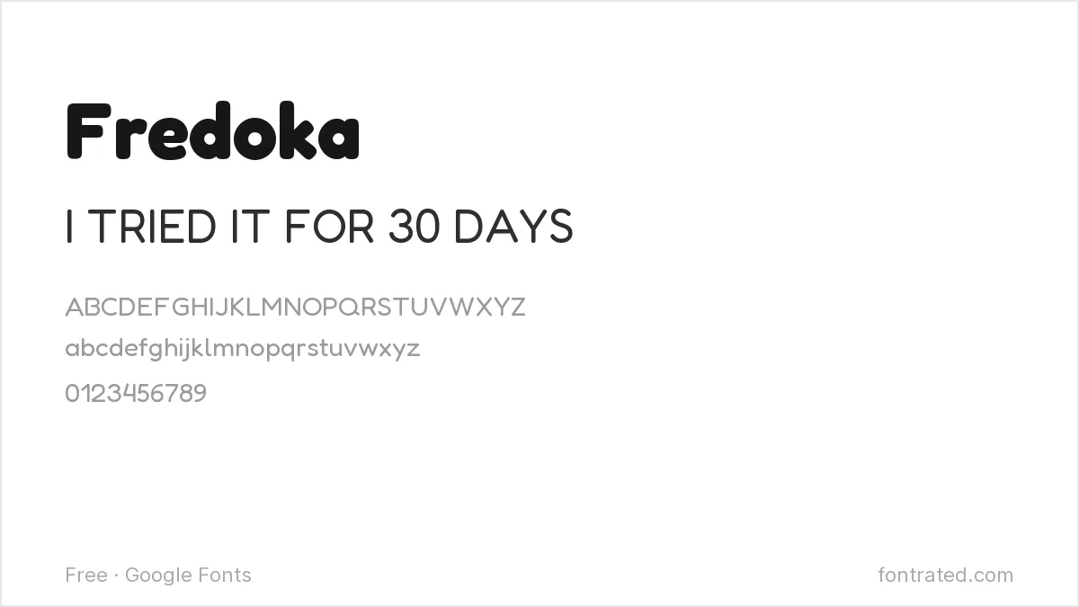
Friendly and approachable at heavier weights, Fredoka is a common choice for family, kids’, or education channels that want a thumbnail to feel warm rather than intense.
Which one should you actually pick? Anton or Bebas Neue if you want the tried-and-tested YouTube look; Luckiest Guy or Fredoka if your channel’s tone is more playful than intense. Whatever you pick, test it shrunk down to actual thumbnail size in a mock sidebar — legibility at a glance is the only metric that matters here.
Thumbnail text needs weight and width more than anything else, which is why two commercial faces keep coming up: free alternatives to FF DIN covers condensed, high-impact options, and free alternatives to Gotham covers the bold geometric look.
Looking for more? Browse the rest of our Social Media & Content Creation font picks.
Frequently Asked Questions
Are these fonts free to use in thumbnails for a monetized YouTube channel?
Yes. All ten are Google Fonts under the SIL Open Font License, which permits commercial use — including thumbnails on a monetized channel — with no royalties or attribution required.
What’s the ideal font size for thumbnail text?
As a rough guide, keep any text large enough to read clearly at roughly 120×67 pixels (a typical mobile thumbnail size) — for a 1280×720 canvas, that usually means text no smaller than about 60-80px, often much larger for a short callout word.
How much text should actually go on a thumbnail?
As little as possible — most high-performing thumbnails use three to five words at most. A thumbnail’s job is to be scanned in under a second, not read like a headline; the video title (visible right next to it) can carry the rest of the context.
Should thumbnail text be a different font than my channel’s logo or intro?
It can be, and often should be — a thumbnail font needs to prioritize small-size legibility above all else, while a logo font can afford to be more distinctive since it’s usually shown larger and read less urgently.
Want to stand out from the usual thumbnail fonts?
Most thumbnails on the platform reach for the same handful of bold condensed sans-serifs. Ponte, a ten-style display serif from Silktype, takes a different approach — high contrast, smooth serifs built specifically for impactful headlines rather than body text.
If your channel’s whole visual identity is already more editorial or premium than the average gaming or reaction channel, a distinctive serif can make a thumbnail stand out in a feed where everyone else is using the same three fonts.
This pick includes an affiliate link — see our disclosure.


Leave a Reply