
A business card gives a font almost no room to work with — a name, a title, maybe a tagline, all set small enough to fit in a pocket. That rules out anything too delicate (fine serifs disappear at 8-9pt) or too loud (a display font meant for headlines reads as amateurish on a 3.5-inch card). These ten hold up at the size that actually matters. If you’ve been searching for free fonts for business cards, these picks are curated with exactly that in mind.
We picked these on legibility at small point sizes, a weight range wide enough to separate a name from a title without switching typefaces, and a professional character that doesn’t skew too casual or too corporate for general use. All ten are Google Fonts under the SIL Open Font License.
Quick Comparison
| Font | Style | Best For |
|---|---|---|
| Montserrat | Geometric sans | Safe default for any industry |
| Libre Franklin | American gothic sans | Traditional, trustworthy default |
| Barlow | Low-contrast grotesque | Modern, tech-friendly cards |
| Spectral | Screen-optimized serif | Refined, editorial feel |
| Nunito Sans | Humanist sans | Approachable but still professional |
| Cabin | Humanist sans, rounded touches | Friendly, consultant-style cards |
| Manrope | Modern geometric-ish sans | Startup and tech cards |
| EB Garamond | Classic serif revival | Law, finance, and luxury cards |
| Space Grotesk | Grotesque, quirky details | Design and creative-industry cards |
| Mulish | Minimalist low-contrast sans | Clean, minimal cards |
Montserrat

Julieta Ulanovsky drew Montserrat from the geometric lettering on old signs in Buenos Aires’ Montserrat neighborhood, and it’s become one of the most reliable all-purpose sans-serifs on Google Fonts — clean enough for a law firm, contemporary enough for a startup.
Libre Franklin

Based on Morris Fuller Benton’s Franklin Gothic from 1902, Libre Franklin keeps that typeface’s sturdy, no-nonsense character while adding a much wider weight range — useful for separating a name (bold) from a title (regular) on the same card.
Barlow
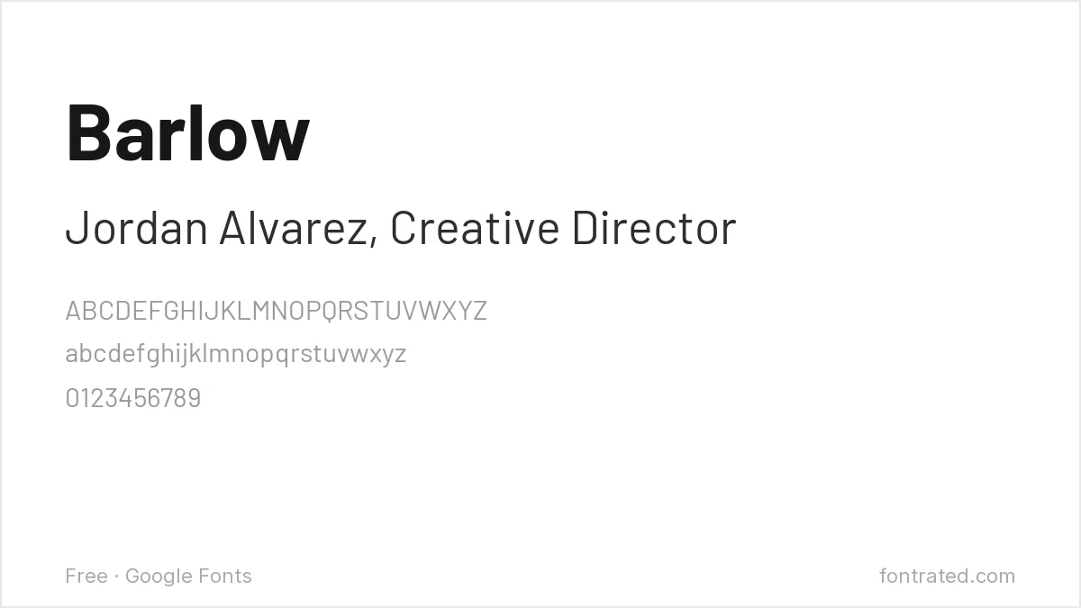
Drawn with the slightly rounded corners and low contrast common to California car-culture signage, Barlow reads as current without any of the quirks that date a typeface — a solid pick for tech and product-focused cards.
Spectral
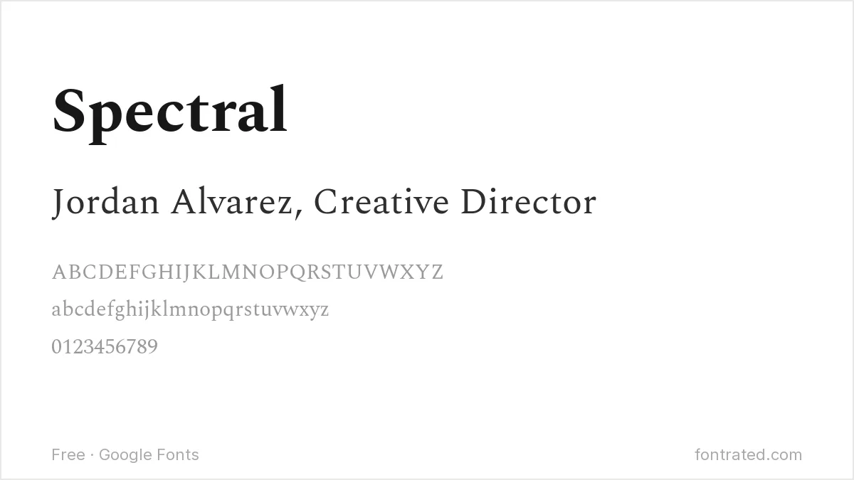
Commissioned specifically for on-screen reading, Spectral brings a serif’s gravitas to a business card without the fragility of a print-only serif at small sizes — a good choice when ‘sans-serif default’ feels too plain.
Nunito Sans
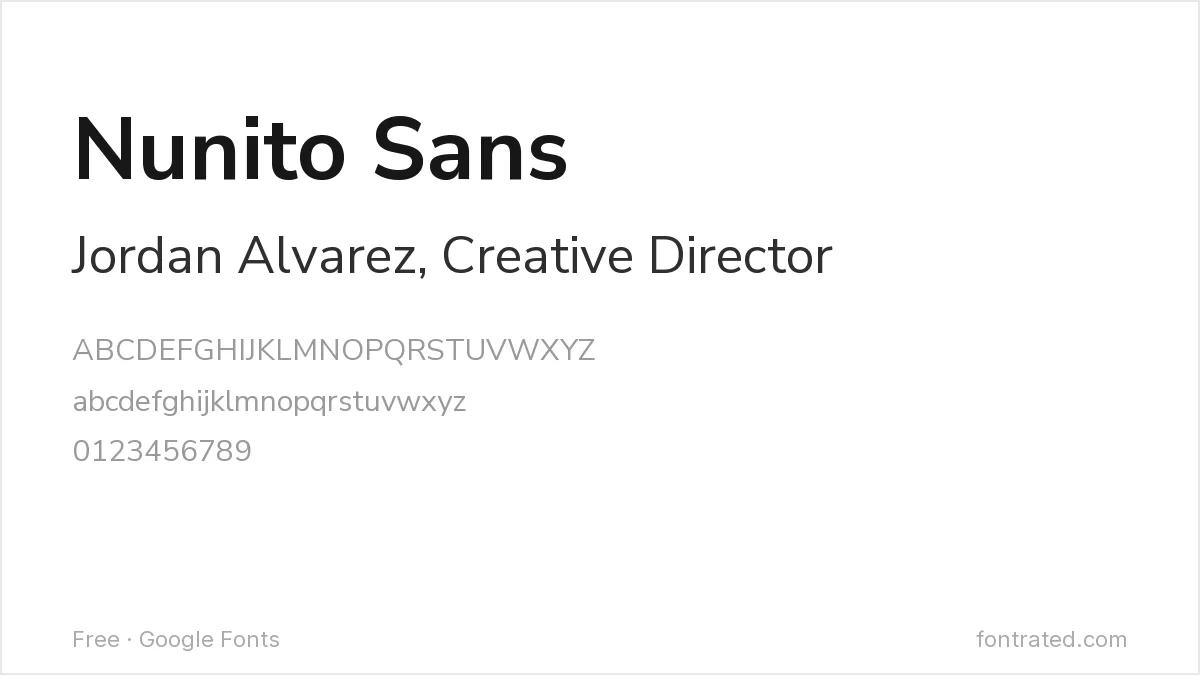
The sans companion to the rounder Nunito, this version straightens out the terminals for a more buttoned-up feel while keeping the warmth that makes Nunito easy to read at a glance.
Cabin
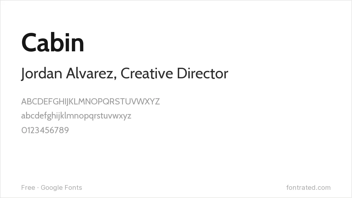
Inspired by Edward Johnston’s and Eric Gill’s classic humanist sans work, Cabin has just enough rounding in its terminals to feel personable — a good fit for consultants, coaches, or anyone whose business is built on approachability.
Manrope
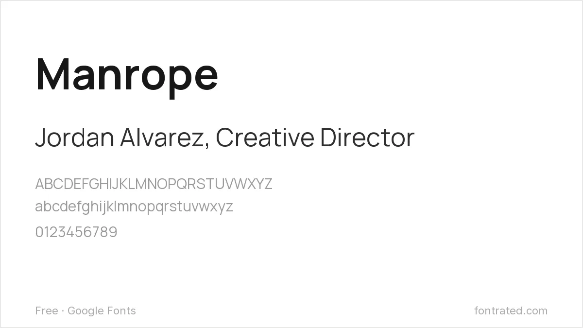
A newer addition to Google Fonts with tight spacing and a slightly geometric skeleton, Manrope has become a default in startup branding — reach for it when a card needs to look current rather than established.
EB Garamond

A digital revival of Claude Garamont’s 16th-century originals, EB Garamond signals exactly the kind of old-money seriousness that a law firm, financial advisor, or luxury brand wants a business card to convey.
Space Grotesk

Adapted from the monospaced Space Mono, Space Grotesk keeps a few of its parent’s unusual details (look at the lowercase “g”) while working as a proportional text face — distinctive enough to signal “designer” without sacrificing legibility.
Mulish
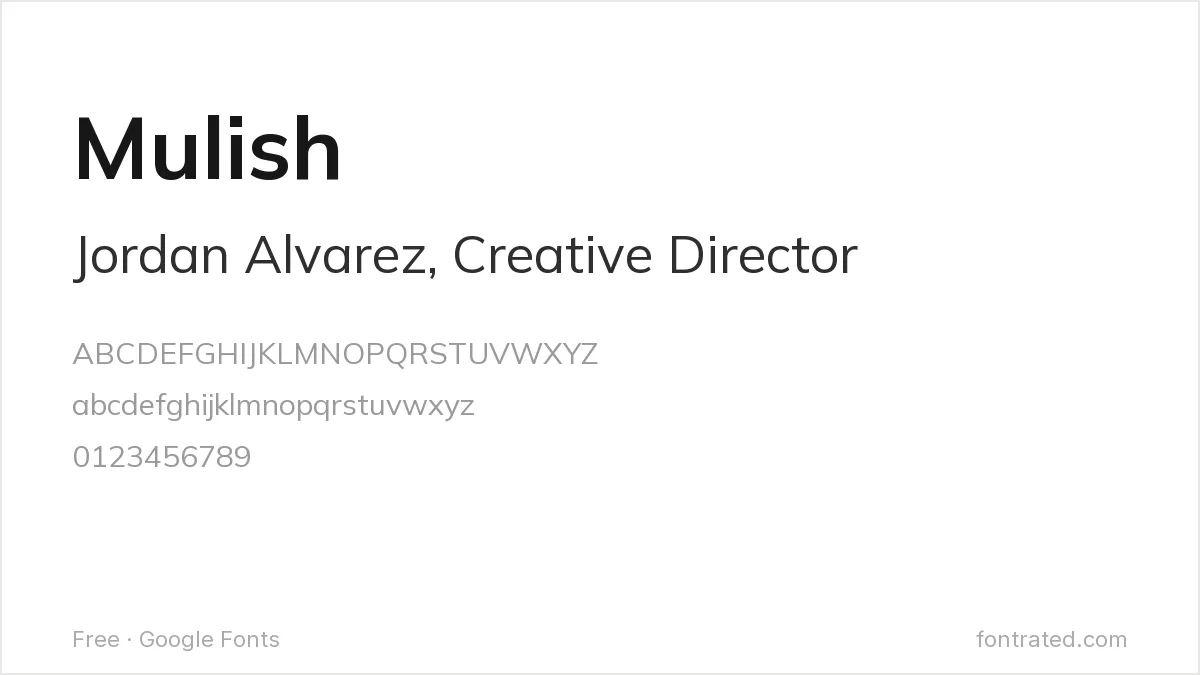
About as neutral as a sans-serif gets, Mulish has almost no distinguishing personality by design — which is exactly the point on a card where the layout and paper stock are doing the talking, not the typeface.
Which one should you actually pick? Libre Franklin or Montserrat cover the widest range of industries safely. Save EB Garamond for when the brand specifically wants to look established, and Space Grotesk for when it wants to look new.
If your brand already uses a specific paid typeface, it may be cheaper to match it than to license it — free alternatives to Calibri and free alternatives to Avenir cover two of the most common corporate faces.
Looking for more? Browse the rest of our Business & Professional font picks.
Frequently Asked Questions
Are these fonts free to use on a business card I’m printing and distributing commercially?
Yes. All ten are hosted on Google Fonts under the SIL Open Font License, which permits commercial use — including printed business cards for a company — with no royalties or attribution required.
What font size should I actually use for a name and title on a business card?
A common structure is 10-12pt for a name (often in the bold weight), 8-9pt for a title or tagline, and 7-8pt for contact details — small enough to fit comfortably on a 3.5×2 inch card, large enough that none of these ten fonts lose legibility.
Should I use the same font for my business card as my logo?
Not necessarily — many brands use a distinctive display font for the logo/wordmark and a plainer, more legible font (like the ones above) for supporting text such as a title or address, since a display font often becomes hard to read at very small sizes.
How do I make sure the font prints correctly instead of substituting a default?
Embed the font in your print-ready PDF (most design tools, including Canva and Adobe InDesign, do this automatically on export) so the printer’s system displays it correctly even without the font installed locally.
Want a more premium, complete family?
Sofia Pro comes from designer Olivier Gourvat, built as an 18-weight system running from Ultra Light to Black with matching italics — a much wider range than any single Google Font on this list offers.
That range matters on a card where you’re juggling a name, a title, and contact details in one small space: a full weight system lets you build clear hierarchy from a single, cohesive typeface instead of mixing two unrelated fonts.
This pick includes an affiliate link — see our disclosure.


Leave a Reply