

Max Miedinger and Eduard Hoffmann designed the original Helvetica (first released as Neue Haas Grotesk) in 1957 at Switzerland’s Haas Type Foundry; Linotype renamed it Helvetica in 1960, and the more refined, systematically organized Neue Helvetica arrived in 1983 with over 50 coordinated styles. What followed is arguably the most-used typeface in history — American Airlines, BMW, Target, Lufthansa, and the New York City subway system all run on it, alongside a documentary devoted entirely to its cultural footprint. Individual styles typically run several dozen dollars each on MyFonts, with the complete Neue Helvetica family (51+ styles) costing well into four figures. These five Google Fonts borrow the same neutral clarity for free. If you’ve been searching for free alternatives to helvetica, this list is built exactly for that.
Inter
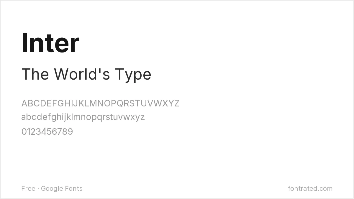
Built from the ground up for screens rather than print, Inter shares Helvetica’s commitment to disappearing into the background and letting content lead — arguably the closest free equivalent for digital-first work.
Roboto
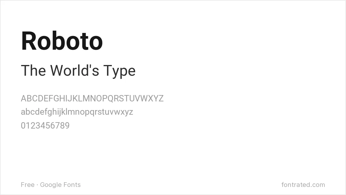
Google’s own system font was explicitly designed with Helvetica’s geometric neutrality in mind, then softened slightly at the terminals — a safe, extremely common free substitute.
Archivo

With nine weights plus condensed and expanded widths, Archivo can cover the kind of full type-system range that made Neue Helvetica’s 51+ styles useful in the first place, without the licensing cost.
IBM Plex Sans
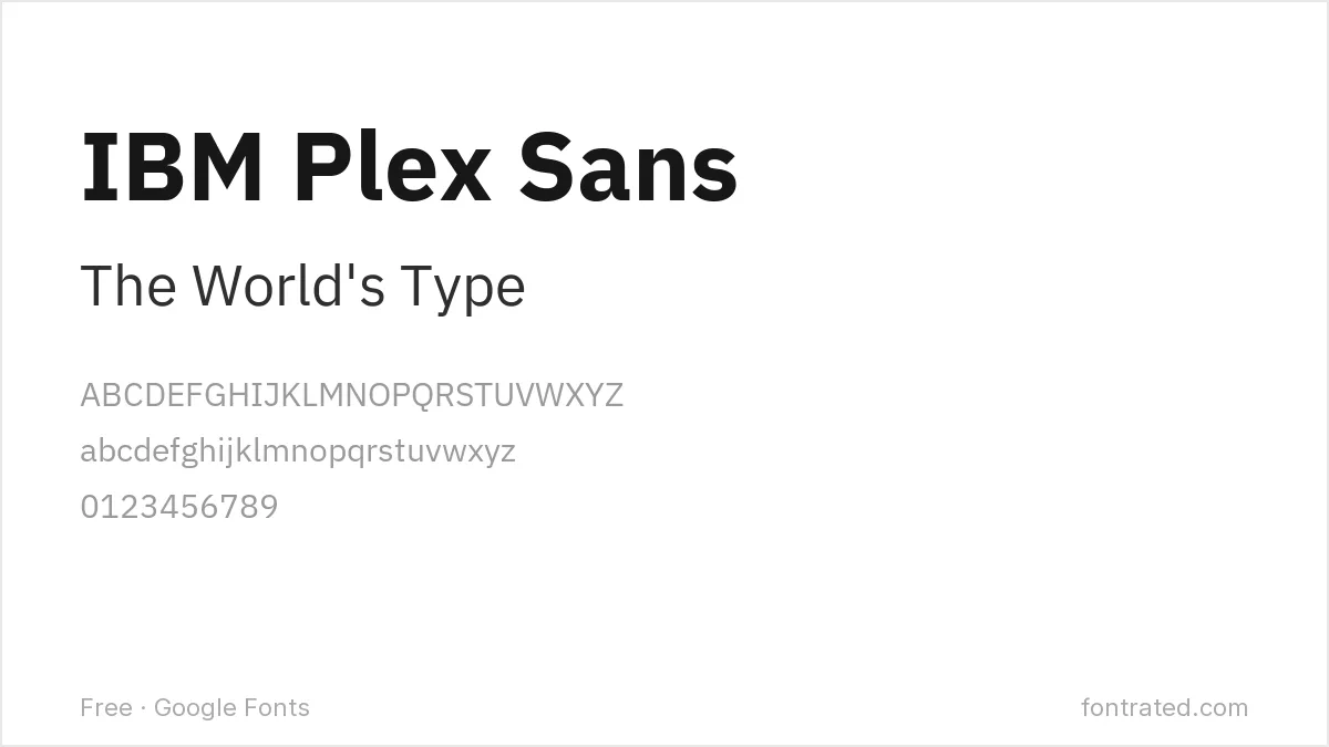
Designed in-house at IBM with flat-cut terminals and subtle technical quirks, Plex Sans channels some of the same corporate-neutral confidence Helvetica built its reputation on.
Work Sans
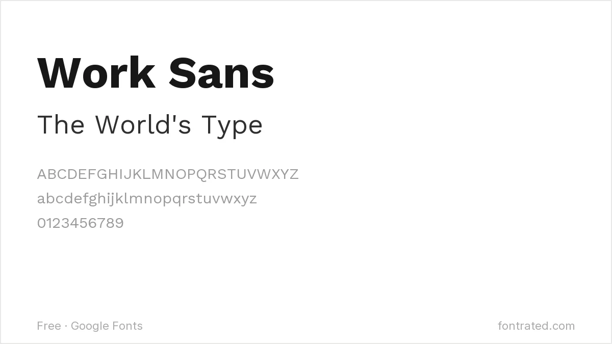
Optimized specifically for on-screen text, Work Sans draws on the same early-20th-century grotesque tradition (Neue Haas Grotesk among them) that produced Helvetica in the first place.
Quick Comparison
| Font | Style | Best For |
|---|---|---|
| Inter | UI-optimized neutral sans | Screens and interfaces specifically |
| Roboto | Mechanical-humanist sans | General-purpose Helvetica substitute |
| Archivo | Grotesque, huge weight range | Full type systems needing many weights |
| IBM Plex Sans | Technical grotesque | Engineering and product content |
| Work Sans | Screen-optimized grotesque | Body text at medium sizes |
The picks below include affiliate links — see our disclosure.
Want the authentic Helvetica Neue?
None of these fully replicate the exact optical spacing Miedinger and Hoffmann refined over decades — the reason Helvetica still looks ‘right’ in a way imitators rarely do. If the project justifies it, the original is available through Linotype’s own catalog on MyFonts.
Get the authentic Helvetica Neue on MyFonts →
Want something more unique?
Tipique from Section Type revives a 1930s geometric sans from the same Bauhaus-adjacent era that shaped Helvetica’s own ancestors — a good option if you want that mid-century neutrality with a bit more period character than Helvetica’s own studied blankness.
See Tipique on Creative Market →
If Helvetica Neue is the reference point, its two closest rivals are worth reading next: free alternatives to Univers covers Frutiger’s more systematic answer to the same brief, and free alternatives to Calibri covers the softer screen-first grotesque most people actually type in. For headers specifically, our website header font roundup shows how neutral sans faces hold up large.
Frequently Asked Questions
Is it legal to use a font that looks like Helvetica instead of buying it?
Yes. Typeface designs have very limited copyright protection in most jurisdictions, including the US — only the specific font software file is protected. Inter, Roboto, and the others here are independently designed, fully licensed fonts, not copies of Helvetica’s files.
Isn’t Arial basically a free Helvetica already?
Arial was designed specifically to be metrically compatible with Helvetica (same spacing, so documents don’t reflow when swapped), but it isn’t a Google Font and carries its own separate Monotype license depending on how it’s used — it’s a common misconception that it’s simply ‘free Helvetica.’
What’s the biggest visual difference between Helvetica and Roboto?
Roboto has slightly more open curves and a touch of mechanical geometry in letters like the lowercase ‘a’, while Helvetica’s forms are more purely static and squared-off — side by side, Helvetica reads as a little more rigid and Roboto a little more contemporary.
Can I use Inter or Roboto commercially, including in a product I sell?
Yes — both are licensed under the SIL Open Font License, which permits commercial use with no royalties or attribution required.


Leave a Reply