
A logo font has one job most body-text fonts never have to do: hold up at 24px on a phone screen and 20 feet tall on a storefront sign. These ten are built for that kind of range. If you’ve been searching for free fonts for logo, these picks are curated with exactly that in mind.
Quick Comparison
| Font | Style | Best For |
|---|---|---|
| Bebas Neue | Condensed all-caps display | Minimal, tight wordmarks |
| Archivo Black | Ultra-heavy grotesque | Short, bold brand names |
| Oswald | Condensed sans | Industrial, signage-style branding |
| Anton | Ultra-condensed display | Sports and high-impact branding |
| Righteous | Rounded retro-futuristic display | Playful, retro brands |
| Fjalla One | Condensed sans | Balanced, general-purpose wordmarks |
| Alfa Slab One | Heavy slab serif | Vintage, rustic branding |
| Rubik | Rounded geometric sans | Tech and app logos |
| Bungee | Urban display | Youthful, energetic brands |
| Cinzel | Classical Roman-inscription serif | Luxury, heritage brands |
Bebas Neue
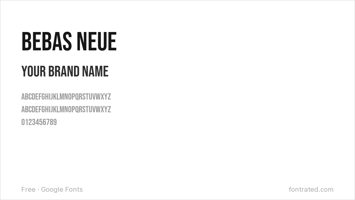
A tall, condensed, all-caps display font with no lowercase at all. It’s become a default for minimal wordmarks because it takes up almost no horizontal space while staying loud.
Archivo Black
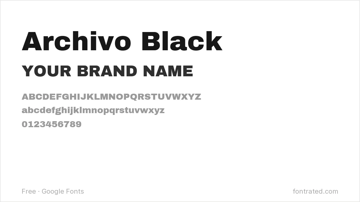
An ultra-heavy grotesque with almost no daylight inside its letterforms. Best for short names — it gets visually heavy fast in long words.
Oswald
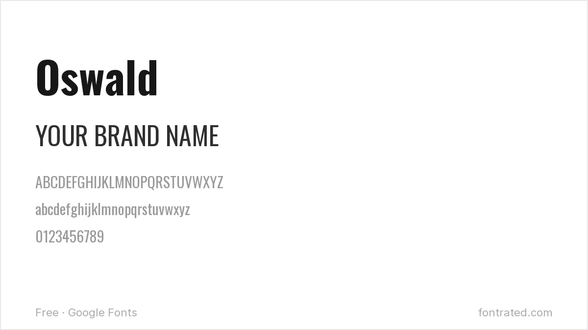
A condensed sans reworked from classic gothic sans typefaces like Alternate Gothic, Oswald has the confident, slightly industrial feel of old American signage.
Anton
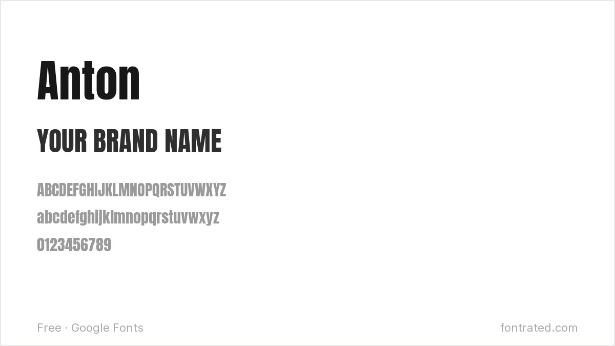
Even more condensed and heavier than Bebas Neue, Anton is built for maximum impact in minimum space — think sports team branding and bold headline logos.
Righteous
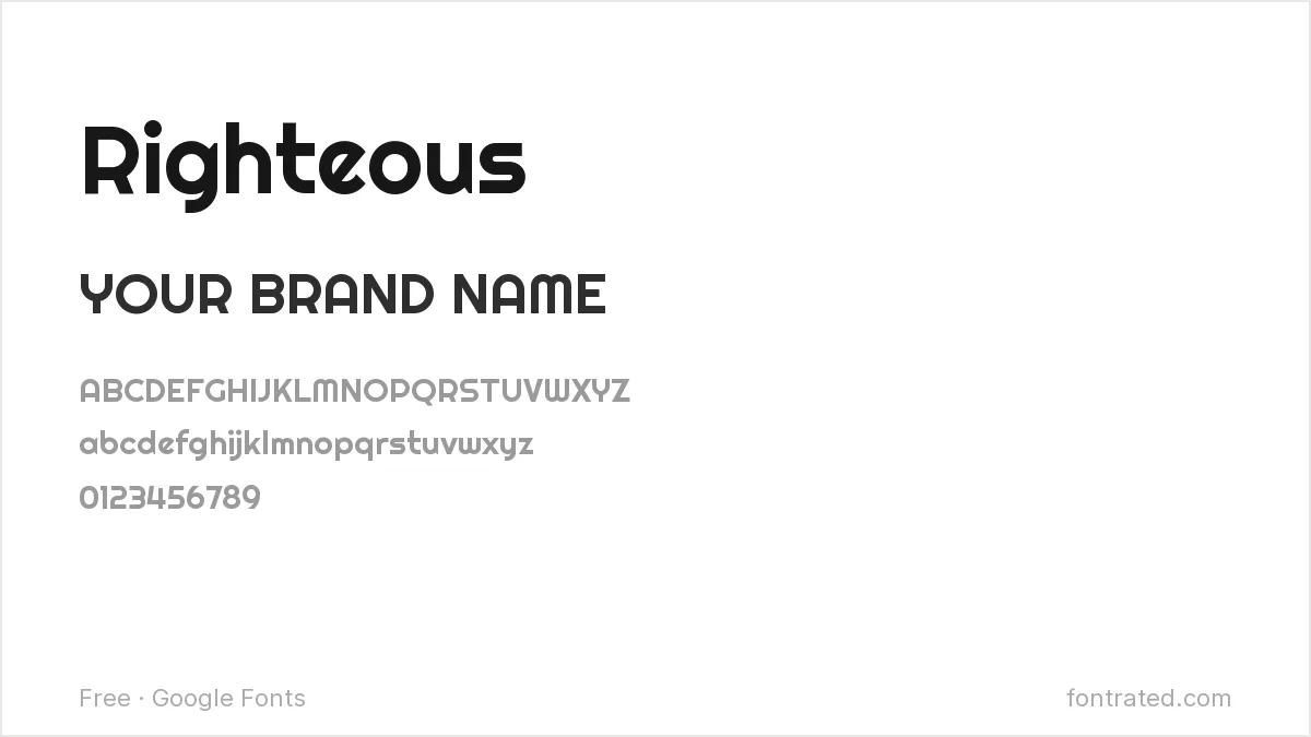
A rounded display font with a slightly retro-futuristic feel, borrowed from 70s signage. Good for playful or nostalgic brands that don’t want to look like a tech startup.
Fjalla One
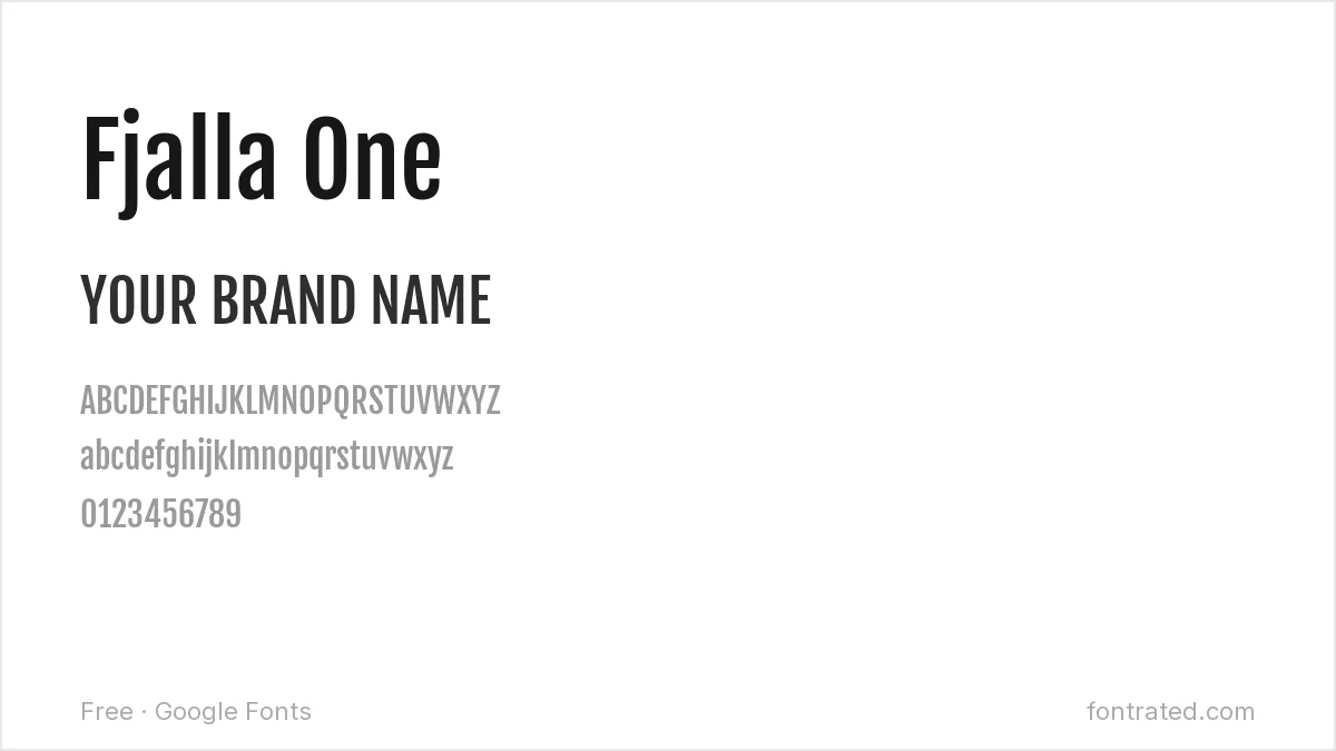
A condensed sans with sturdy, no-nonsense proportions — narrower than Oswald but less severe than Anton, sitting in a useful middle ground.
Alfa Slab One
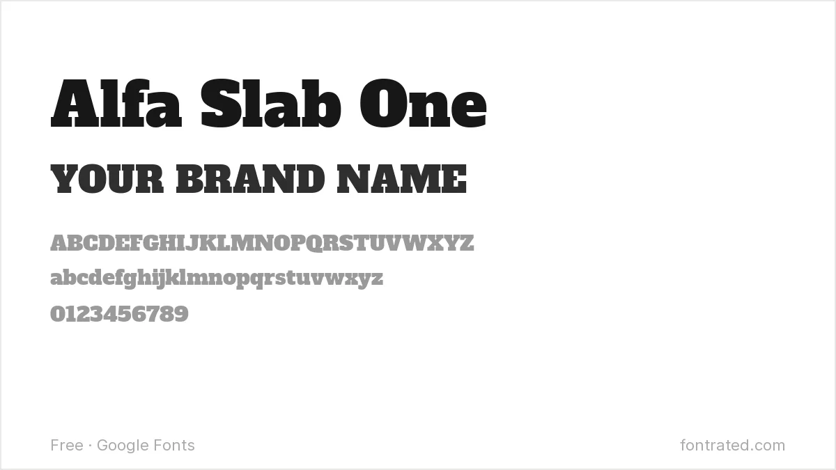
A heavy slab serif with thick, blocky serifs. Works well for brands leaning into a vintage, hand-carved, or rustic identity.
Rubik
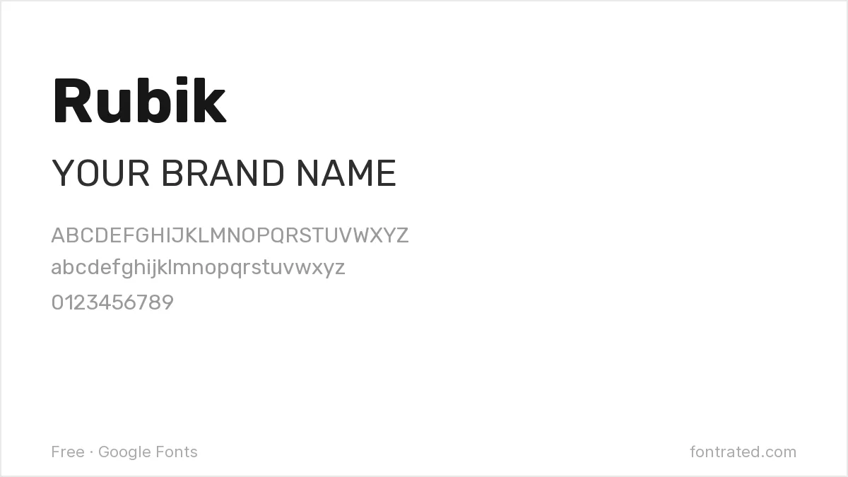
A geometric sans with subtly rounded corners on otherwise sharp shapes — reads as modern and approachable without being generic, a common choice for tech and app logos.
Bungee
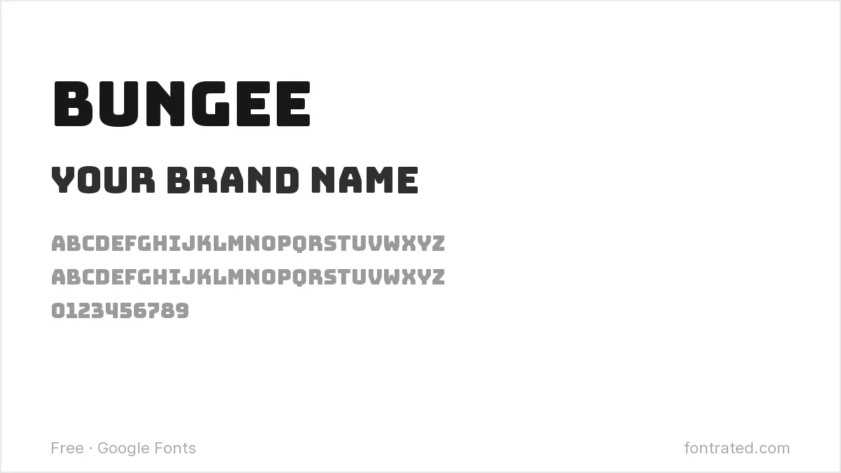
Inspired directly by urban street signage, Bungee has thick, confident strokes built for maximum visibility. Suits youthful, energetic brands that want to stand out rather than blend in.
Cinzel
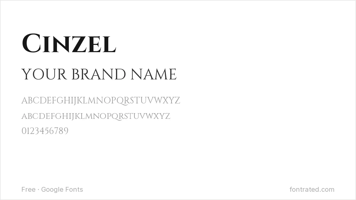
Modeled on classical Roman inscriptional capitals, Cinzel signals heritage, permanence, and formality — a strong pick for law firms, wineries, or luxury goods.
Before you commit: test your name in all caps and lowercase, and at both a 32px favicon size and a full-width banner. A surprising number of “great” logo fonts fall apart at one end of that range.
Frequently Asked Questions
Are these fonts free to use in a logo I plan to trademark?
Yes. All ten are released under the SIL Open Font License, which allows commercial use — including in a logo you trademark — with no royalties or attribution owed to the designer. The trademark protects your specific logo design, not the underlying typeface.
What’s the difference between using a font directly and having a custom logotype designed?
These fonts work well as a starting point or a fast, functional wordmark, but a font alone won’t be unique to your brand — any competitor can use the same one. A custom logotype (a designer modifying letterforms specifically for you) is what actually becomes ownable, distinctive brand property.
Should I convert the font to outlines before finalizing my logo?
Yes, for print or vector use. Converting text to outlines (curves/paths) in Illustrator or similar software locks in the exact shapes so the logo displays correctly on any device, even one that doesn’t have the font installed.
Can two different brands legally use the same free font for their logos?
Yes — since the license isn’t exclusive, any number of brands can use the same free Google Font. That’s exactly why a font alone rarely makes a logo distinctive; the customization around it (spacing, color, an icon, minor letter tweaks) is what differentiates one brand’s wordmark from another’s.
Want the font this whole style is chasing?
Gotham was drawn by Tobias Frere-Jones directly from the flat-cut lettering on mid-century New York storefront signage — literally the same “readable up close and from 20 feet away” problem this article opens with, solved by one of the most licensed logo typefaces of the last two decades.
If a client’s brand can carry the license cost, it’s worth knowing what the free condensed sans-serifs above are all, in one way or another, chasing.
This pick includes an affiliate link — see our disclosure.


Leave a Reply