
A presentation font has to survive being projected on a screen 20 feet from the back row, which is a very different job from looking good on a printed page or a phone screen. Thin serifs and tightly-spaced letters that read fine on paper can turn into a gray smear from across a conference room — these ten were picked to hold up at a distance. If you’ve been searching for free fonts for presentations, these picks are curated with exactly that in mind.
We picked these for clarity at a distance, a wide enough weight range to separate a slide title from body text, and reliable rendering across PowerPoint, Keynote, and Google Slides (all three handle Google Fonts differently, and a few fonts render inconsistently between them). All ten are free under the SIL Open Font License.
Quick Comparison
| Font | Style | Best For |
|---|---|---|
| Inter | UI-optimized sans | Versatile slide body text |
| Montserrat | Geometric sans | Bold, confident slide titles |
| Merriweather Sans | Sans companion to a serif | Readable body text with warmth |
| Barlow Condensed | Condensed grotesque | Space-saving headers on busy slides |
| Public Sans | US federal design system sans | Neutral, corporate decks |
| Bitter | Slab serif | Confident headline text with more character |
| Karla | Grotesque, rounded corners | Approachable body text |
| Archivo | Grotesque, huge weight range | Flexible hierarchy across a whole deck |
| Fraunces | Soft serif with character | Creative or narrative-driven pitch decks |
| IBM Plex Mono | Monospace | Data, code, and stats slides |
Inter
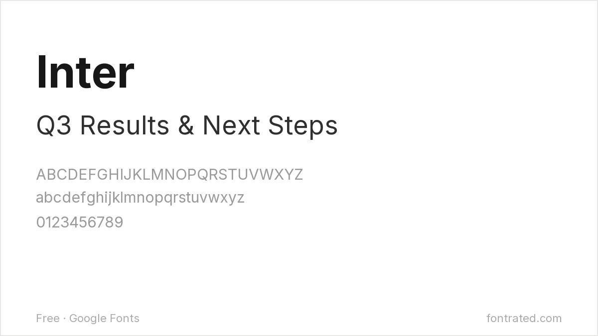
Designed specifically for screens and interfaces, Inter has a tall x-height and open counters that keep it legible even set small on a dense slide — the safest all-purpose body font on this list.
Montserrat
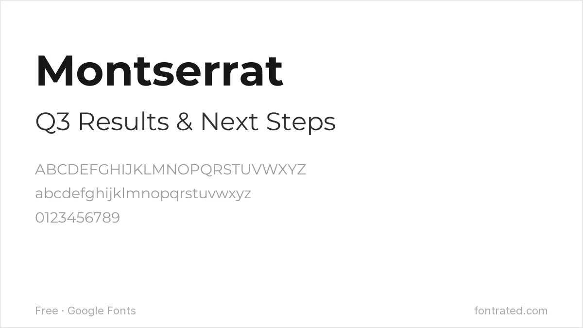
Montserrat’s geometric confidence makes it a strong choice for slide titles specifically — set it bold at 36pt+ and it reads clearly from the back of most rooms without shouting.
Merriweather Sans
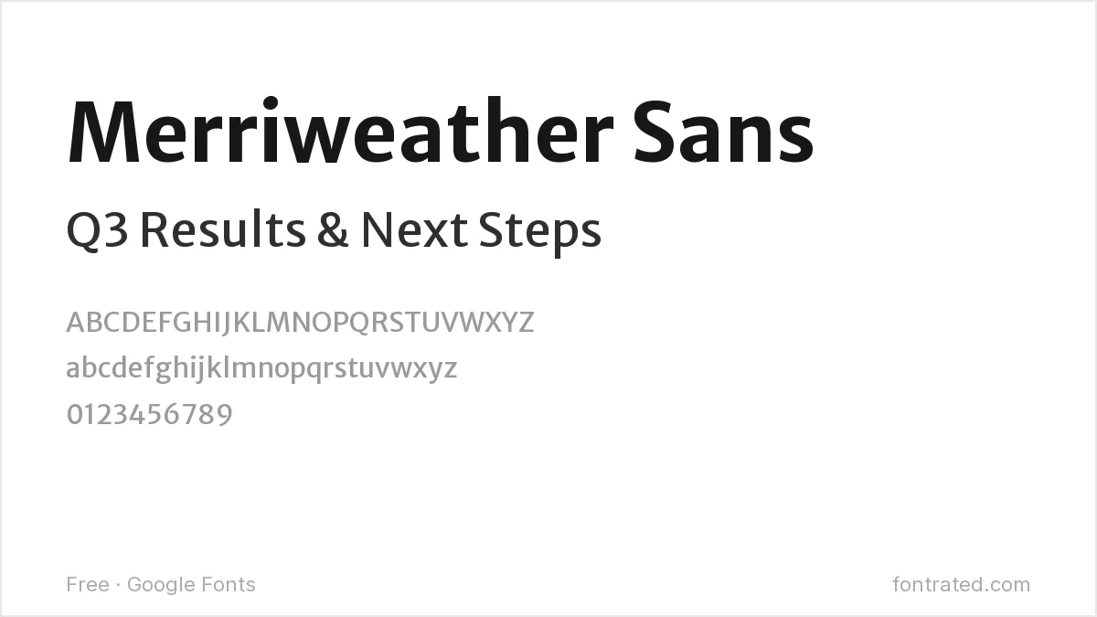
Built as the sans-serif sibling to the serif Merriweather, this version keeps that font’s screen-reading optimization while fitting more naturally alongside a serif headline if you want to mix the two.
Barlow Condensed
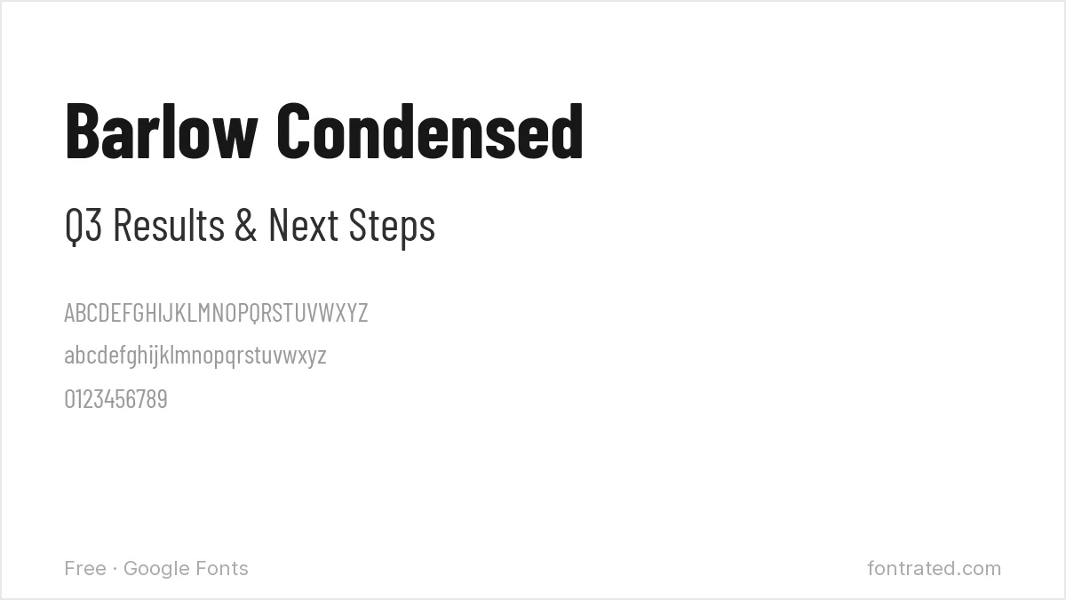
When a slide title runs long and a regular-width font would wrap awkwardly, Barlow Condensed’s narrower letterforms buy back horizontal space without needing to shrink the point size.
Public Sans
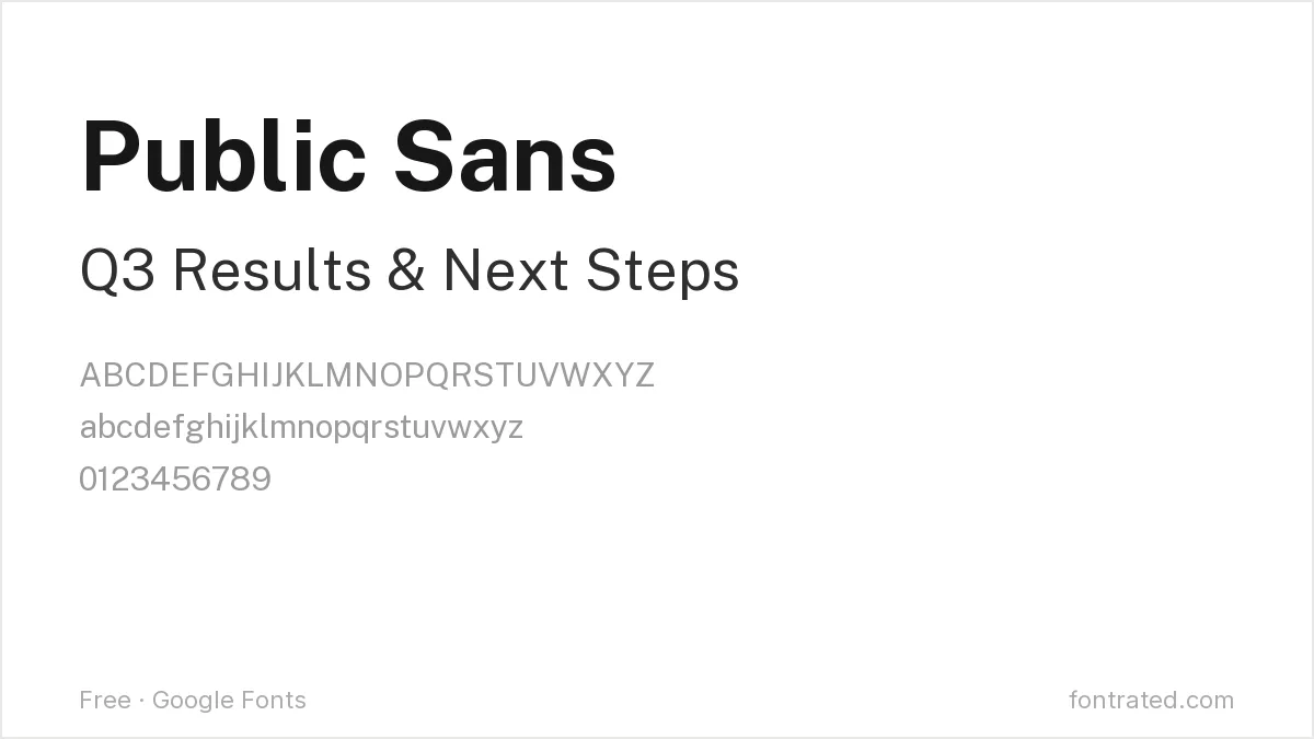
Originally developed for U.S. government digital services, Public Sans was built to be as neutral and unbranded as possible — a deliberately safe choice for a deck going to a broad, formal audience.
Bitter
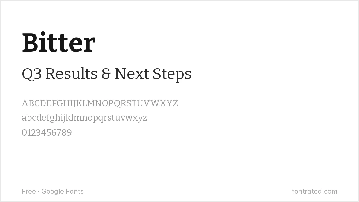
A slab serif with sturdy, squared-off strokes, Bitter gives a headline more visual weight than a thin serif would while still reading clearly from a distance — a good alternative to yet another bold sans-serif title.
Karla
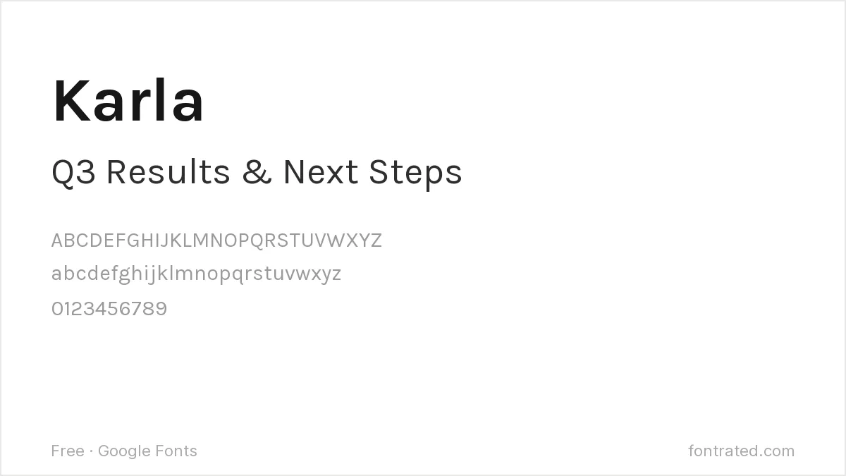
Karla’s slightly rounded corners keep it from feeling cold in body-heavy slides, without adding enough personality to distract from the content.
Archivo
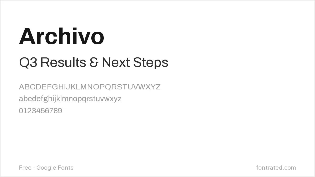
Archivo’s range (nine weights, plus condensed and expanded widths) makes it possible to build titles, subheadings, and body text from one consistent family instead of mixing fonts.
Fraunces
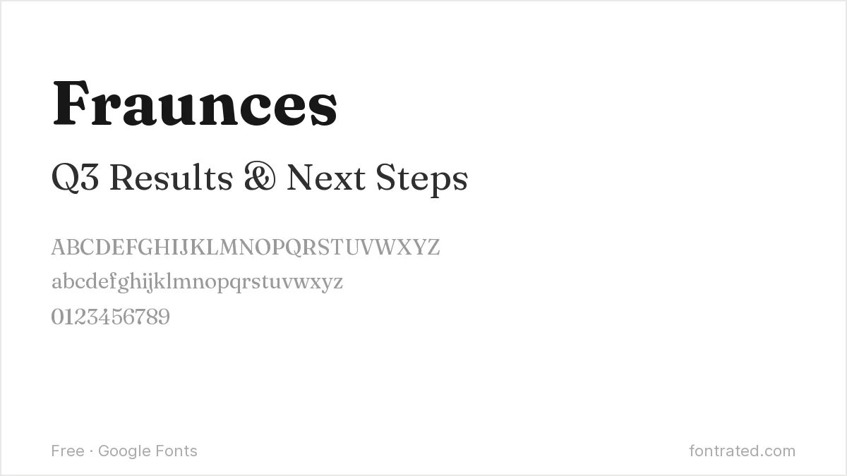
A serif with soft, almost hand-finished curves, Fraunces works well for pitch decks or narrative presentations that want to feel less like a corporate template and more like a considered story.
IBM Plex Mono
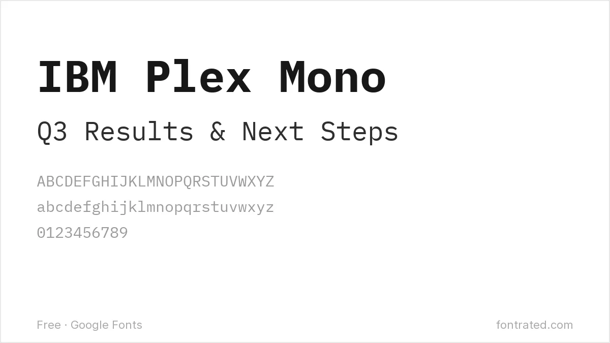
When a slide is showing a statistic, a code snippet, or a data table, switching briefly to a monospace like IBM Plex Mono signals “this is data” at a glance — use it as an accent, not your main body font.
Which one should you actually pick? Inter for body text and Montserrat for titles is a safe, tested pairing for almost any deck. Swap in Bitter or Fraunces for titles specifically when the presentation is more narrative than corporate.
Looking for more? Browse the rest of our Business & Professional font picks.
Frequently Asked Questions
Are these fonts free to use in a client presentation or a deck I’m selling as a template?
Yes. All ten are Google Fonts under the SIL Open Font License, which permits commercial use — including client decks and templates you sell — with no royalties or attribution required.
Will these fonts actually show up correctly if I open my slides on someone else’s computer?
Only if the font is installed on that computer or embedded in the file. PowerPoint can embed fonts on save (File → Options → Save → “Embed fonts in the file”); Google Slides renders Google Fonts correctly for anyone since it loads them from Google’s own servers automatically.
What’s a safe minimum font size for a presentation?
A common rule of thumb is nothing smaller than 24pt for body text and 36-44pt for titles, assuming a typical conference room — smaller than that risks becoming unreadable from the back rows regardless of which font you pick.
Should I use different fonts for titles and body text, or just one?
One family in different weights (like Archivo’s nine weights) keeps a deck feeling cohesive and is usually safer; pairing two different families (like a serif title with a sans body) can look more considered but requires more care to avoid clashing.
Want one family built specifically for small, readable text?
Hannes von Döhren built Brandon Text as the small-text companion to his popular display face Brandon Grotesque — explicitly engineered, in his words, for “long texts, small sizes, and screens” rather than headlines.
That’s precisely the problem a dense slide full of bullet points has: most display and headline fonts start to blur at 18-24pt, but a font actually designed for small on-screen text stays crisp.
This pick includes an affiliate link — see our disclosure.



Leave a Reply