
Most resume advice tells you to “avoid Times New Roman and Calibri” without saying what to use instead. The fonts below are all free, all pass through applicant tracking systems cleanly (no exotic ligatures or unusual character shapes that confuse parsers), and each has a distinct personality so your resume doesn’t look like everyone else’s template. If you’ve been searching for free fonts for resume, these picks are curated with exactly that in mind.
Updated July 2026 — all 10 download links checked and working.
We picked these ten on three criteria: how cleanly they parse through an Applicant Tracking System (no stylistic ligatures or unusual glyph shapes that confuse a resume scanner), how legible they stay at 10-11pt when a resume needs to fit on one page, and whether the license actually allows commercial use — not just personal projects. All ten are hosted on Google Fonts under the SIL Open Font License, so there’s no ambiguity about using one on a document you send to an employer.
Quick Comparison
| Font | Style | Best For |
|---|---|---|
| Lato | Sans-serif | A safe, broad default for any industry |
| Source Sans Pro | Sans-serif | Roles where you want zero attention on the font |
| Merriweather | Serif | Traditional or formal resumes |
| Roboto | Sans-serif | Neutral, universally safe choice |
| Karla | Sans-serif | An alternative to overused Calibri |
| PT Serif | Serif | Finance, law, or academic resumes |
| Work Sans | Sans-serif | Resumes read mostly on-screen |
| Raleway | Sans-serif | Creative or design-adjacent roles |
| IBM Plex Sans | Sans-serif | Engineering and product resumes |
| Noto Sans | Sans-serif | Maximum rendering compatibility |
Lato
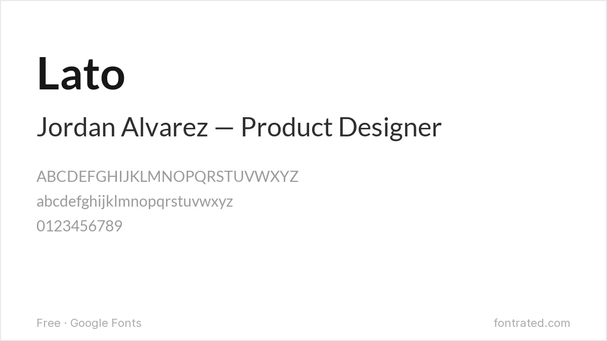
Designed by Łukasz Dziedzic, Lato has semi-rounded letter terminals that read as warm without tipping into casual. Its tall x-height keeps body text legible even at 10pt, which matters when you’re trying to fit a career onto one page.
Source Sans Pro
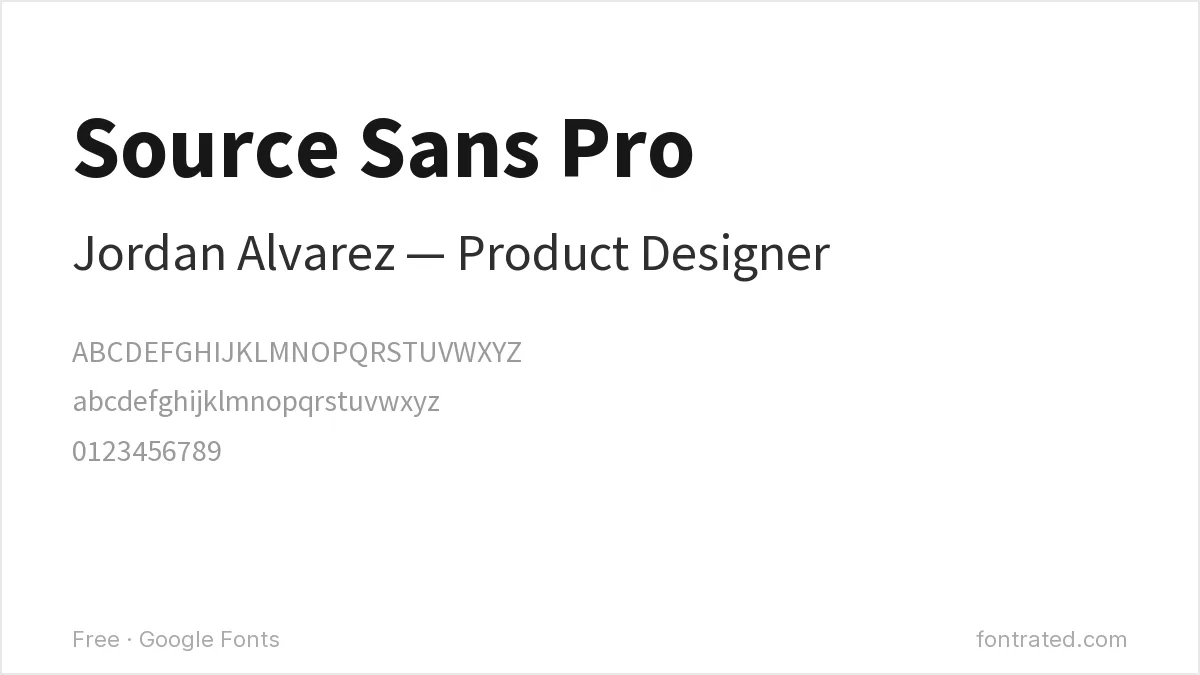
Adobe’s first open-source typeface was built for UI text, which means it was engineered to disappear and let the content lead. Use it when you want the hiring manager focused on your experience, not your font choice.
Merriweather
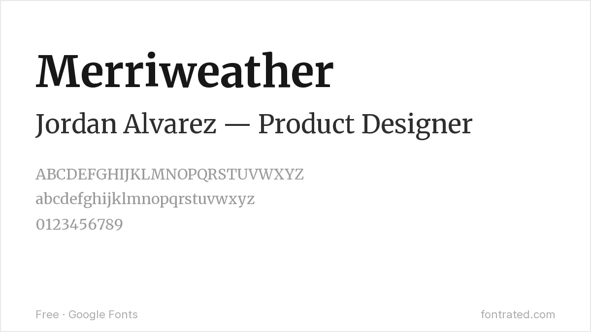
A serif designed specifically for screen reading rather than print, with sturdy strokes that hold up at small sizes. It gives a resume a touch more gravitas than a sans-serif without the stiffness of Times New Roman.
Roboto
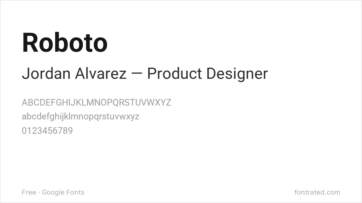
Google’s own system font has a mechanical skeleton softened with friendly curves at the terminals. It’s an extremely safe, neutral choice — the typographic equivalent of a well-tailored blazer.
Karla
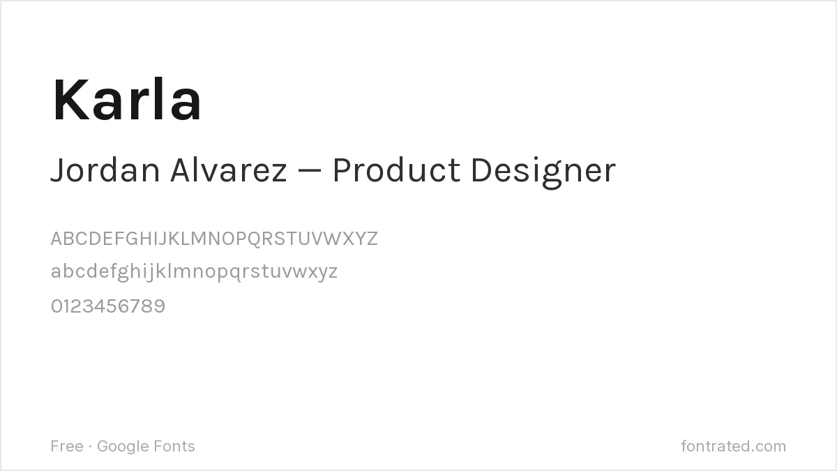
A grotesque sans with slightly rounded corners that keeps it from feeling cold. Karla is a good escape hatch if you’re tired of seeing Calibri on every other resume in the pile.
PT Serif
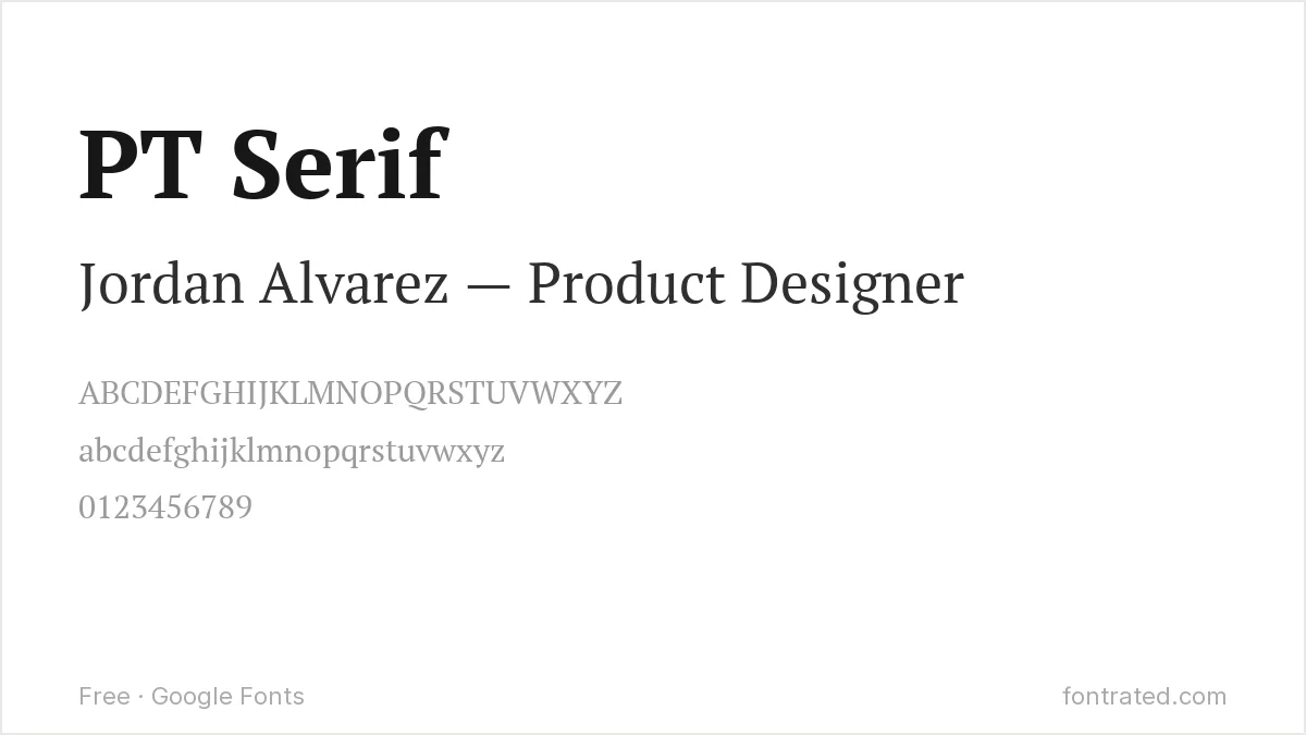
Built with humanist proportions and generous counters, PT Serif reads as traditional and trustworthy — a solid pick for finance, law, or academic resumes where a serif signals seriousness.
Work Sans
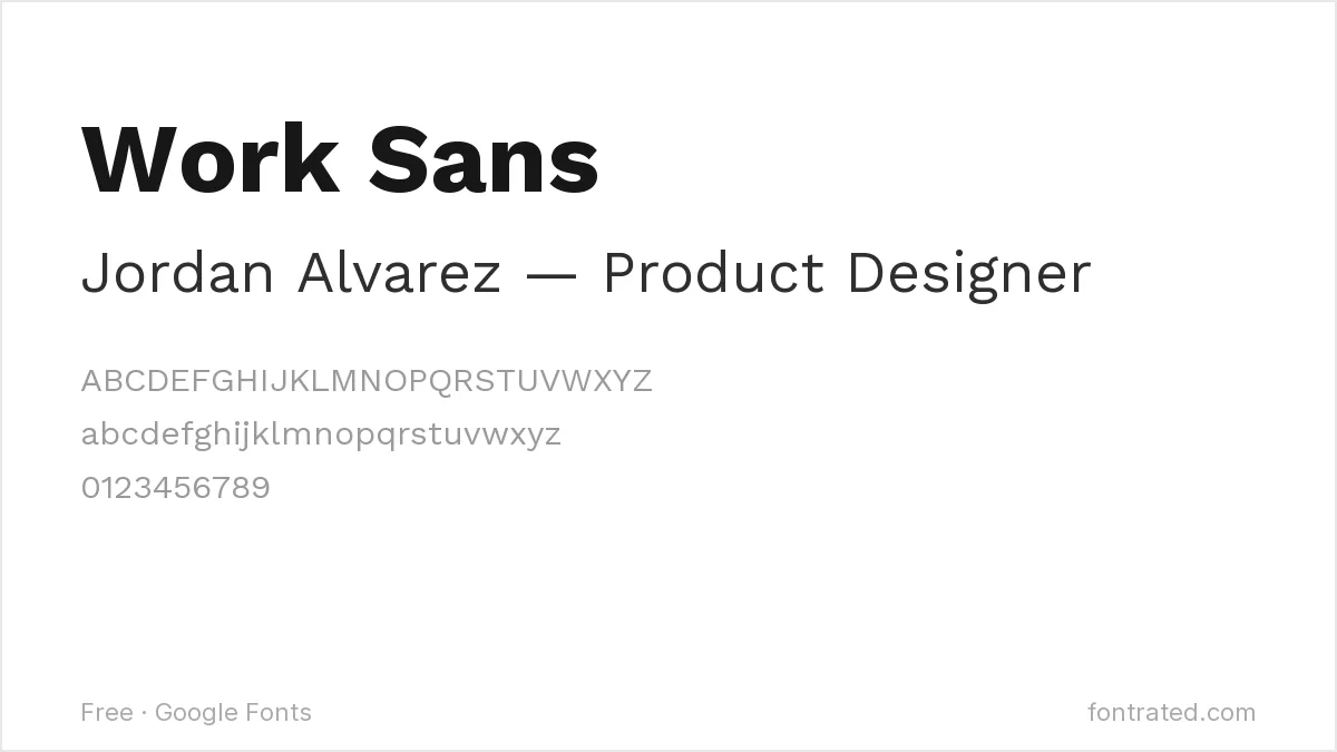
Optimized specifically for on-screen text at medium sizes, drawing on early 20th-century grotesques like Neue Haas Grotesk. It has enough character to feel considered without calling attention to itself.
Raleway
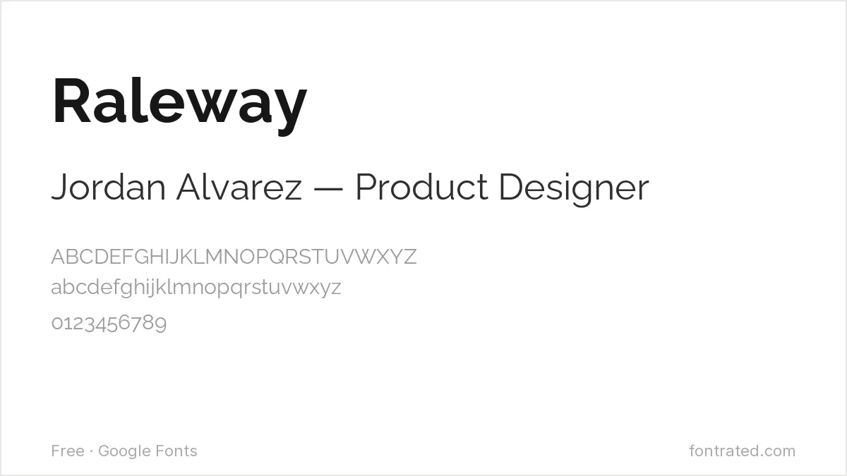
Originally released as a single thin weight before growing into a full family, Raleway keeps a distinctive single-story “w” and elegant proportions. Best for creative or design-adjacent roles where a resume can show a little personality in the header.
IBM Plex Sans
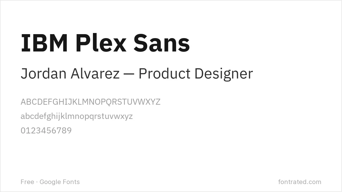
Designed in-house at IBM with flat-cut terminals and subtle technical quirks, Plex Sans reads as precise and current. A strong choice for engineering and product resumes.
Noto Sans
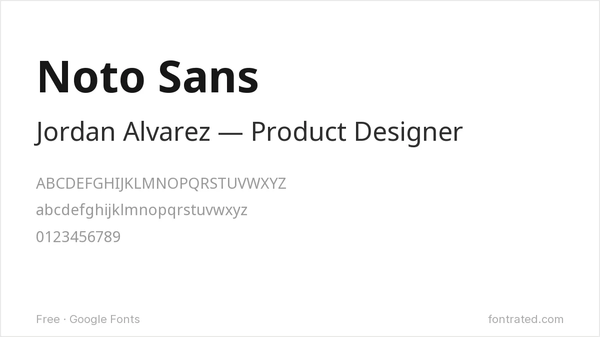
Part of Google’s project to support every written language without “tofu” (missing character boxes), Noto Sans is plain by design — genuinely the safest possible choice if you just want zero risk of rendering issues across any system that opens your PDF.
Which one should you actually pick? If you’re unsure, Lato or Source Sans Pro cover the widest range of industries. Save the more distinctive choices (Raleway, PT Serif) for roles where a little visual personality works in your favor.
If a job posting or template specifies a particular font you do not own, free alternatives to Calibri and free alternatives to Garamond Premier cover the two most commonly requested document faces.
Looking for more? Browse the rest of our Business & Professional font picks.
Once you’ve landed the job, 10 Best Free Fonts for Business Cards covers the next piece of professional stationery you’ll need.
Frequently Asked Questions
Are these fonts really free to use on a resume?
Yes. All ten are hosted on Google Fonts under the SIL Open Font License, which allows personal and commercial use — including a resume you send to an employer — with no attribution required.
How do I add one of these fonts to Microsoft Word or Google Docs?
Click the font’s link above, then “Download family” on its Google Fonts page. For Word, unzip the download and double-click each .ttf file to install it system-wide — it will then show up in Word’s font list. Google Docs can’t install system fonts directly: instead, open the font dropdown in Docs, choose “More fonts,” and search for the name — Google Fonts are already available there with no download needed.
What makes a font “ATS-friendly”?
An Applicant Tracking System parses your resume as plain text before a human sees it. Fonts with standard letterforms, no decorative ligatures, and a clear difference between similar characters (like “I,” “l,” and “1”) parse reliably. All ten fonts above avoid the unusual shapes that can trip up a parser.
Can I use these fonts if my resume is made in Canva or exported as a PDF?
Yes — as long as the font is embedded in the final PDF, which most export tools (including Canva and Word’s “Save as PDF”) do automatically. An embedded font displays correctly even on a computer that doesn’t have it installed.
Want a more polished option?
Museo Sans comes from Dutch type designer Jos Buivenga, built as a full ten-weight system — from a hairline thin up to a heavy black, each with a matching italic — specifically so one typeface family could carry an entire document without switching fonts halfway through.
That range is exactly what a resume needs: one weight for your name and section headers, a lighter one for body text, all from the same family so nothing looks mismatched on the page.
This pick includes an affiliate link — see our disclosure.


Leave a Reply