

Giambattista Bodoni cut the original typeface bearing his name in the late 18th century, pushing stroke contrast to an extreme that had barely been attempted before — hairline-thin serifs against dramatically thick stems, a look that reads as instantly glamorous and has made Bodoni-style serifs the default typographic shorthand for fashion and luxury ever since (Vogue’s masthead has run on Bodoni-derived lettering for decades). Licensing a proper digital revival today runs $29.99 for a single style, with full families costing considerably more. These five Google Fonts borrow the same high-contrast editorial drama for free. If you’ve been searching for free alternatives to bodoni, this list is built exactly for that.
Playfair Display
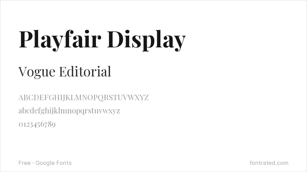
Drawing on Baskerville and Didot as much as Bodoni, Playfair Display’s thin hairlines against thick stems land closest to Bodoni’s own dramatic contrast of anything on Google Fonts.
Abril Fatface

An even more extreme take on high-contrast serif drama than Playfair Display, Abril Fatface pushes toward Bodoni’s boldest display cuts — best reserved for a headline rather than body text.
DM Serif Display

Generous, rounded curves with real editorial contrast, DM Serif Display works particularly well set large, in the spirit of a Bodoni-style magazine headline.
Cormorant
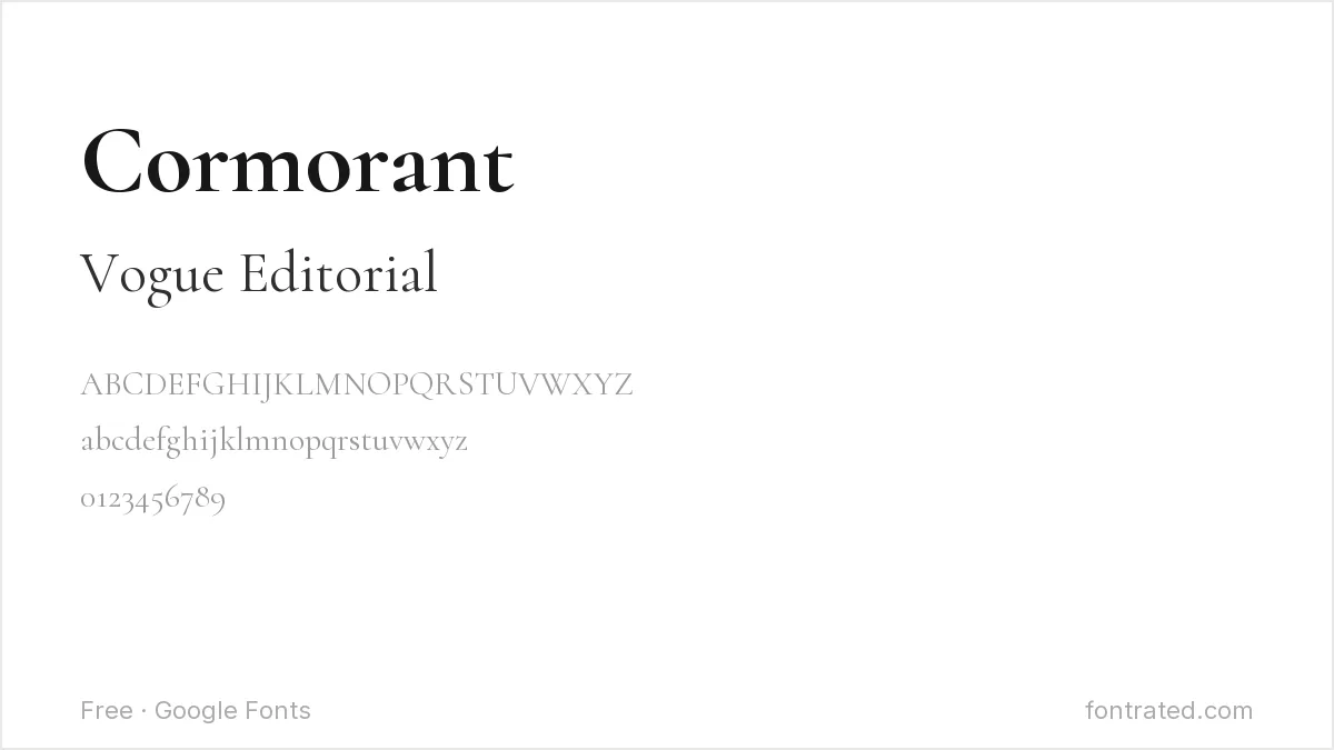
An extreme high-contrast serif with very fine hairlines, Cormorant shares Bodoni’s dramatic thin-thick contrast in a more restrained, literary register.
Italiana
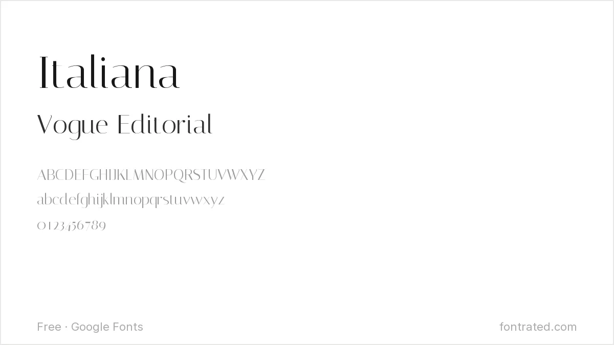
A high-contrast serif with an explicitly old-Italian-fashion-magazine character, Italiana leans directly into the same glamour Bodoni built its reputation on.
Quick Comparison
| Font | Style | Best For |
|---|---|---|
| Playfair Display | High-contrast display serif | Closest general match |
| Abril Fatface | Ultra-bold display serif | Maximum stroke contrast |
| DM Serif Display | Editorial display serif | Large-format headlines |
| Cormorant | Delicate display serif | Refined, editorial titles |
| Italiana | Refined editorial serif | Old-fashion-magazine feel |
The picks below include affiliate links — see our disclosure.
Want the authentic Bodoni?
These capture the general drama, but the specific proportions refined across two centuries of Bodoni revivals (Linotype’s included) aren’t something a free alternative fully replicates. If the project justifies it, a proper digital revival is available through Linotype’s catalog on MyFonts.
Get the authentic Bodoni on MyFonts →
Want something more unique?
Dupioni from Silktype takes the same high-contrast, fashion-editorial approach as Bodoni but with its own silk-inspired flowing italics across six weights — a strong pick for fashion or luxury branding that wants Bodoni’s drama with less of an obvious paper trail.
See Dupioni on Creative Market →
Bodoni’s dramatic thick-thin contrast reads best against its opposites: free alternatives to Garamond Premier covers the gentler old-style serif it superseded, and free alternatives to Gill Sans covers a humanist sans often paired with it. Bodoni-style serifs are a fashion and stationery staple — our greeting card font roundup covers that use.
Frequently Asked Questions
Is it legal to use a font that looks like Bodoni instead of buying it?
Yes. Typeface designs have very limited copyright protection in most jurisdictions, including the US — only the specific font file is protected. Playfair Display, Abril Fatface, and the others here are independently designed, fully licensed fonts.
Why is Bodoni so associated with fashion and luxury branding?
Its extreme stroke contrast reads as glamorous and editorial in a way lower-contrast serifs don’t — fashion magazines have leaned on Bodoni-style lettering for their mastheads for so long that the association has become nearly automatic.
Will a high-contrast font like Cormorant or Abril Fatface still be legible at small sizes?
Not reliably — the thin hairlines that create the dramatic contrast tend to disappear at small text sizes. Reserve these for headlines and titles, and use a plainer serif for body text.
Can I use Playfair Display or Abril Fatface commercially, including for a fashion brand?
Yes — both are licensed under the SIL Open Font License, which permits commercial use, including fashion and luxury branding, with no royalties or attribution required.


Leave a Reply